9 Ecommerce Website Examples to Copy for Better Results
Many ecommerce websites obsess over flashy designs and trendy layouts.
Big mistake.
Instead, you should focus on conversion-centered design.
That’s the blend of buyer psychology, user experience, and strategic design working together to turn visitors into customers.
Doing this can get you:
- More sales
- Higher average order values
- Better conversion rates
Below, I’ve handpicked nine effective ecommerce website examples that follow a conversion-focused design. Use them as a blueprint to create your own online store that converts.
Crème de la Crème: Our Favorite Ecommerce Website Examples
Short on time to review every ecommerce website example on this list?
Focus on these three.
Study them. Use them as a template for your store. And watch your conversion rates improve.
1. Crutchfield
Crutchfield is a large electronics retailer specializing in audio, video, and car tech.
The company grew its business on expert product knowledge and top-tier customer service.
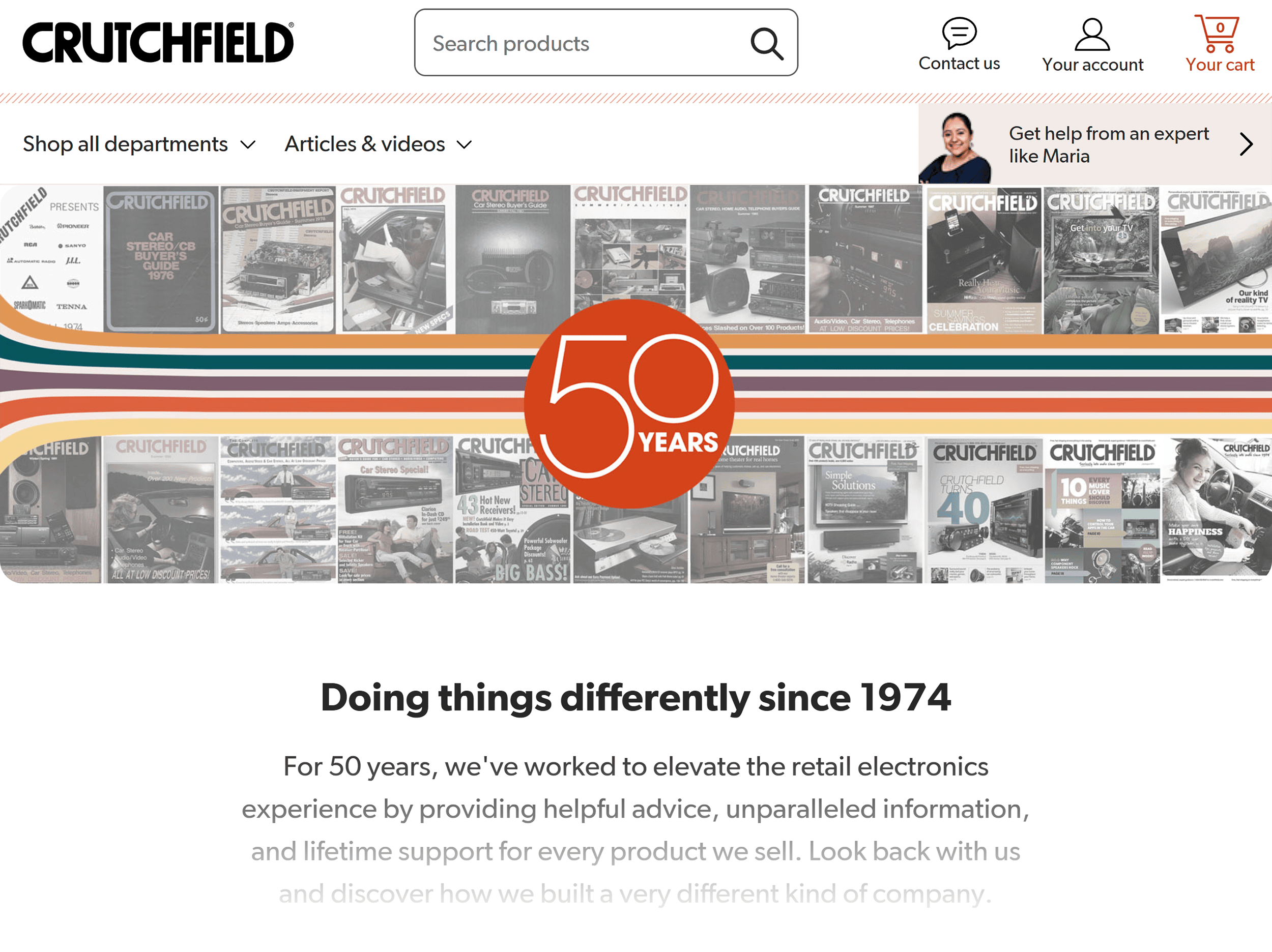
Their website stays true to this focus.
They have designed it with the customer experience in mind.
Despite offering thousands of products, the layout is clean, organized, and easy to navigate.
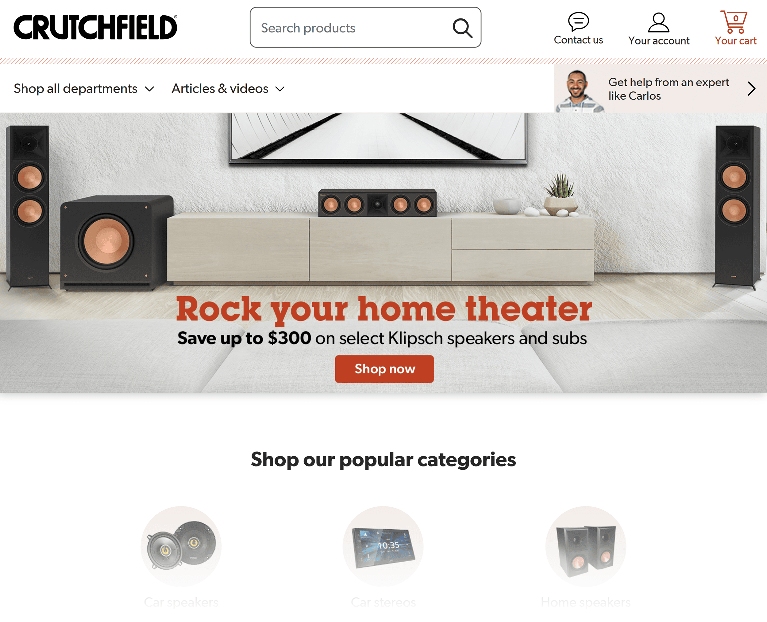
Take the homepage, for example.
It provides links only to popular products and categories.
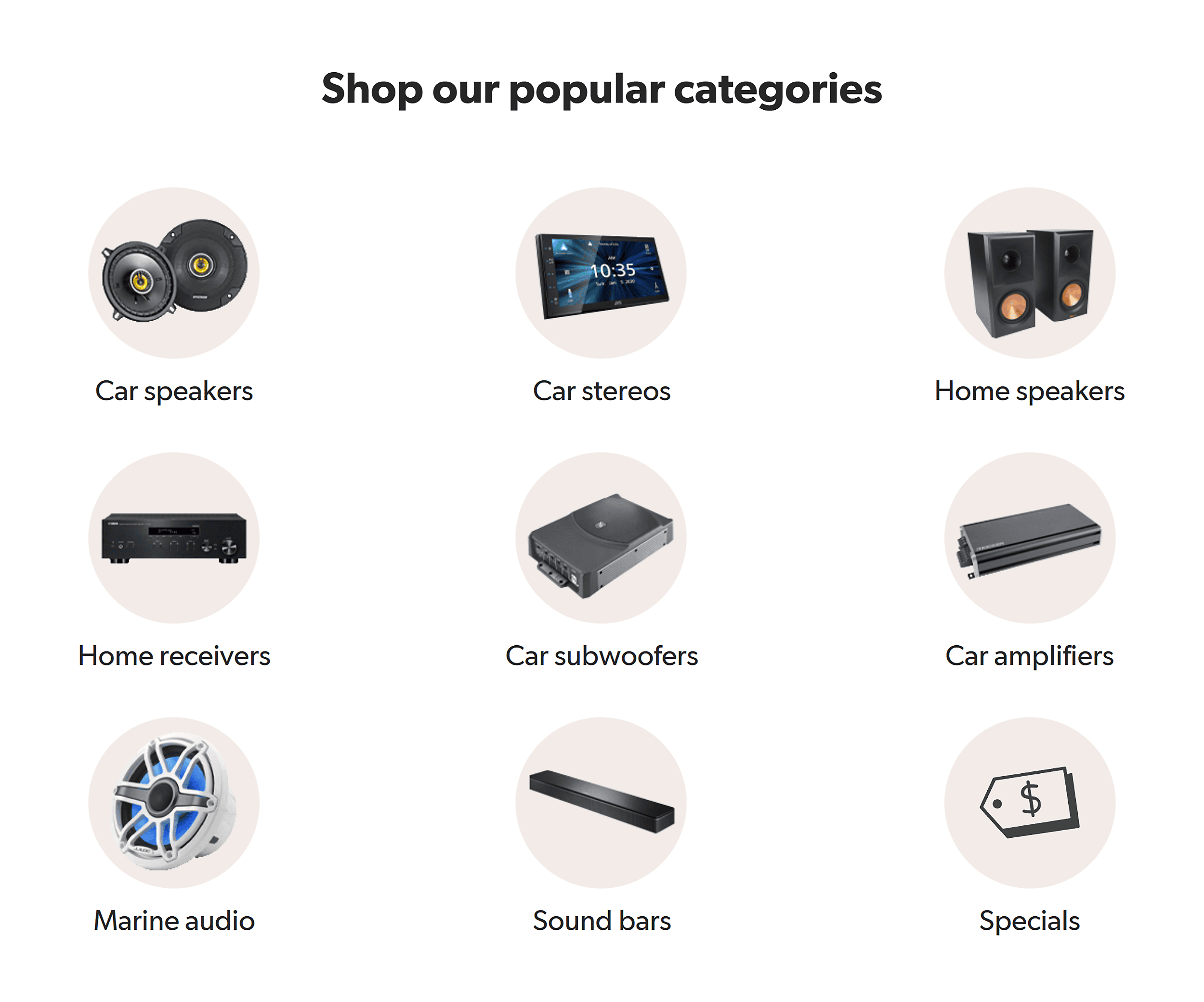
By limiting the options to these key choices, it avoids overwhelming shoppers. (While also letting them dive deeper to find exactly what they need.)
Click one of these product category links, and you’ll find the pages are just as well-organized.
Take the “Smart Home” category, for example.
Easy-to-read text and clear images make sure you move through the site with ease.
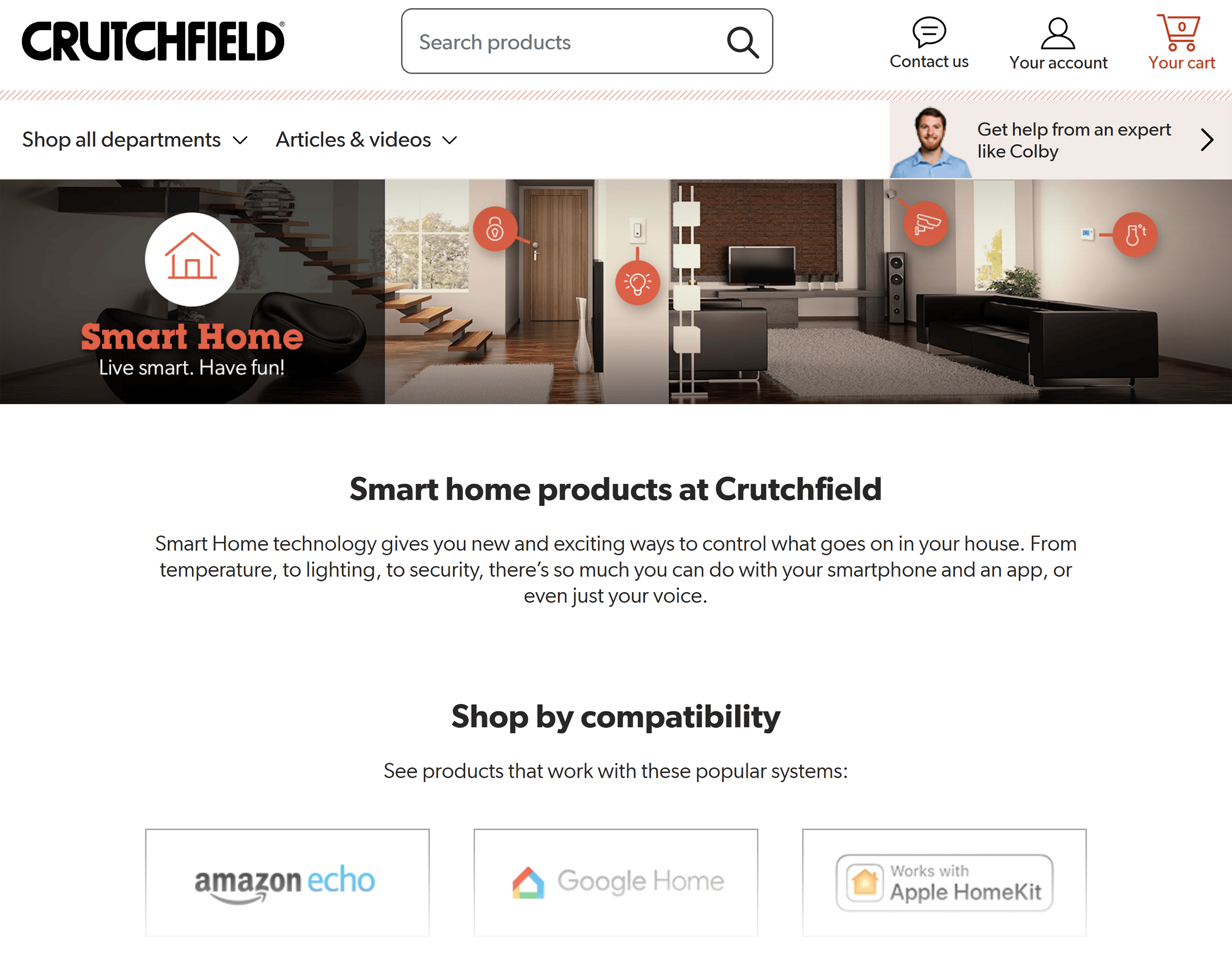
The content is also easy to skim, which simplifies browsing and finding information.
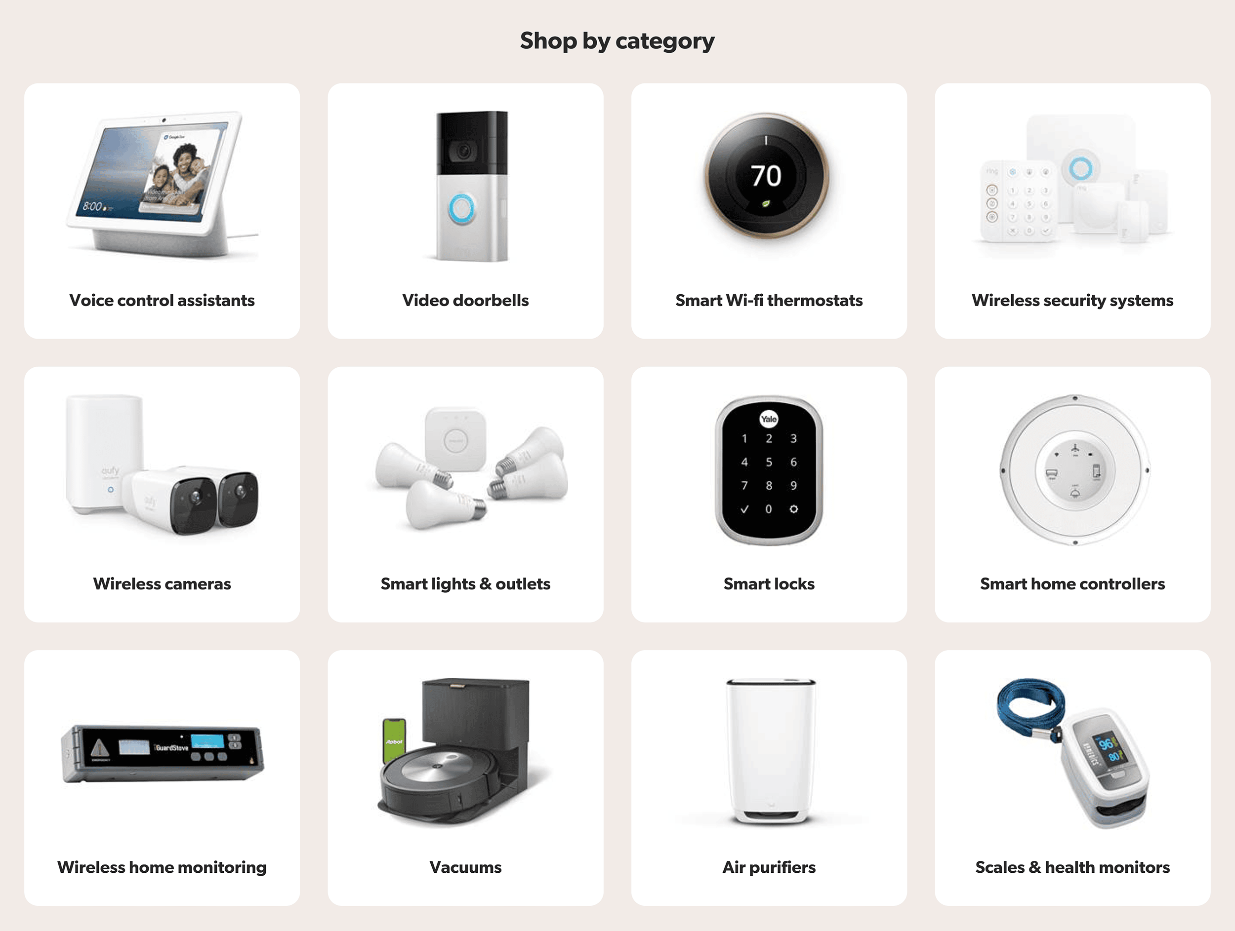
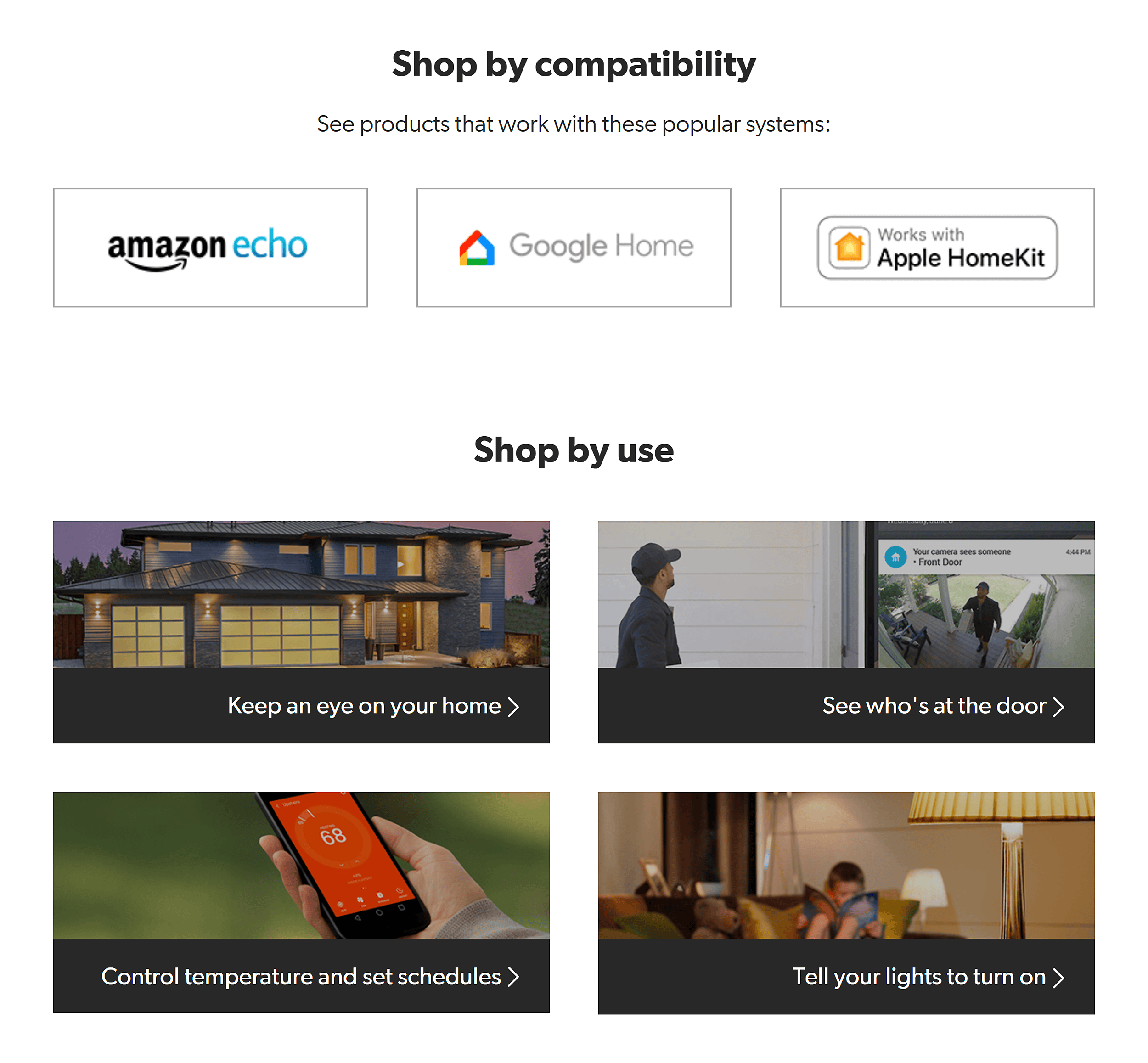
Scroll down the page, and you’ll see options to search for products in different ways:
- By use
- By brand
- By compatibility
- By subcategory
This lets you shop in the way that works best for you.
You can either search for a specific product or browse through the available options.
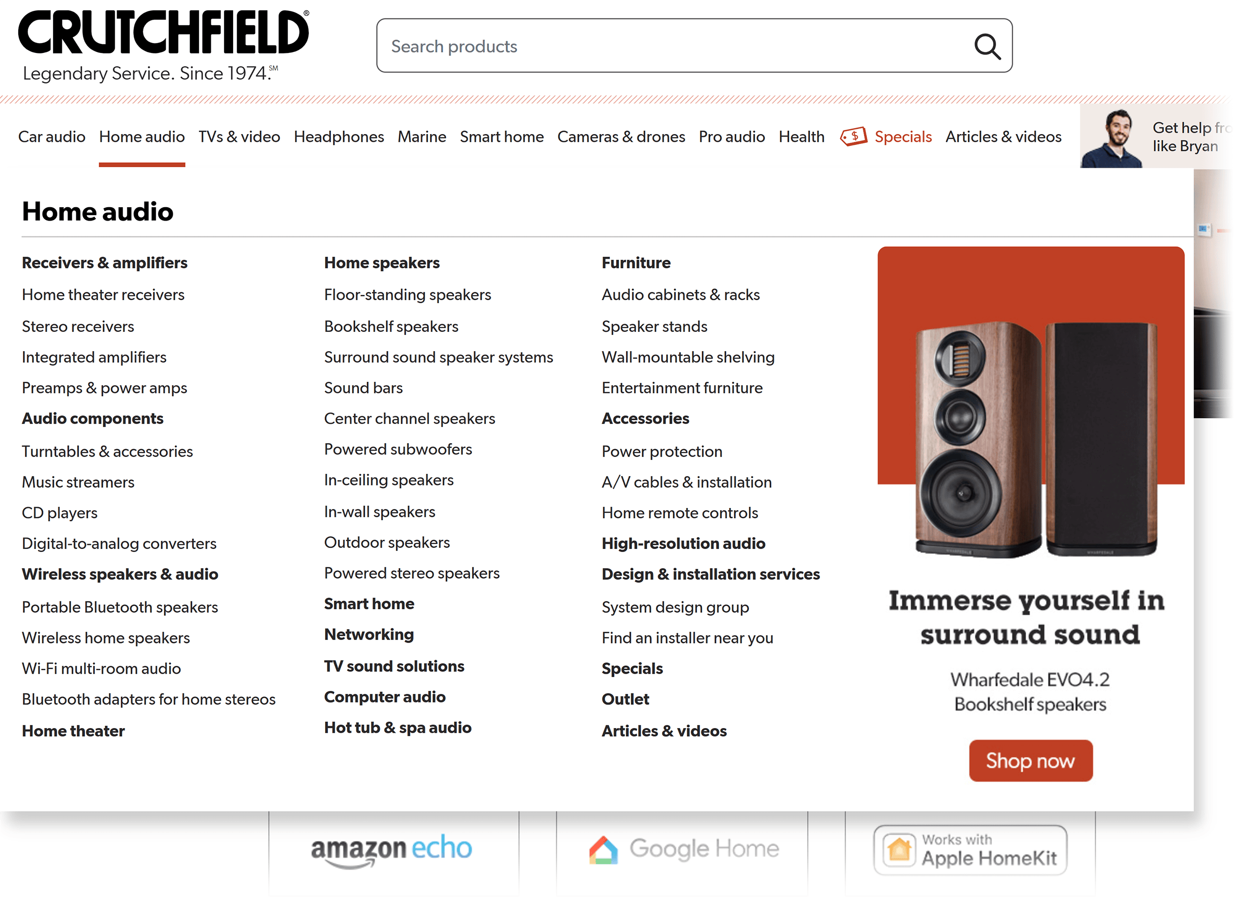
Now, check out the navigation bar.
The mega menu is clear and simple, with dropdowns that guide you to the right section.
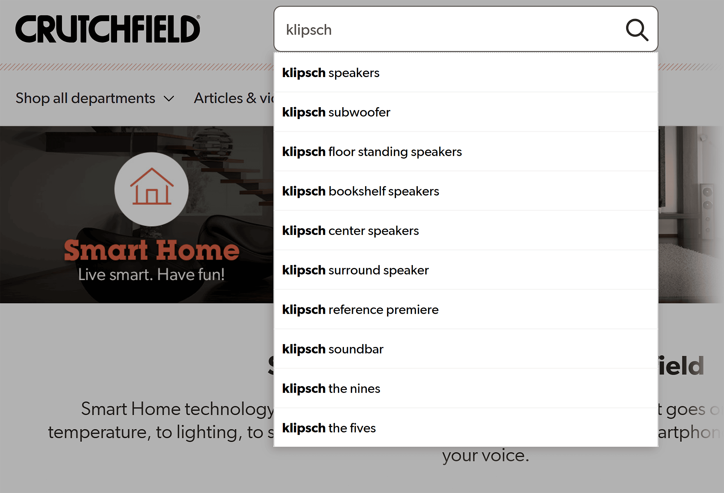
But what if you already know the specific product you’re looking for?
The intuitive search bar helps you with that.
It gives suggestions as you type—aka predictive text—to speed things up.
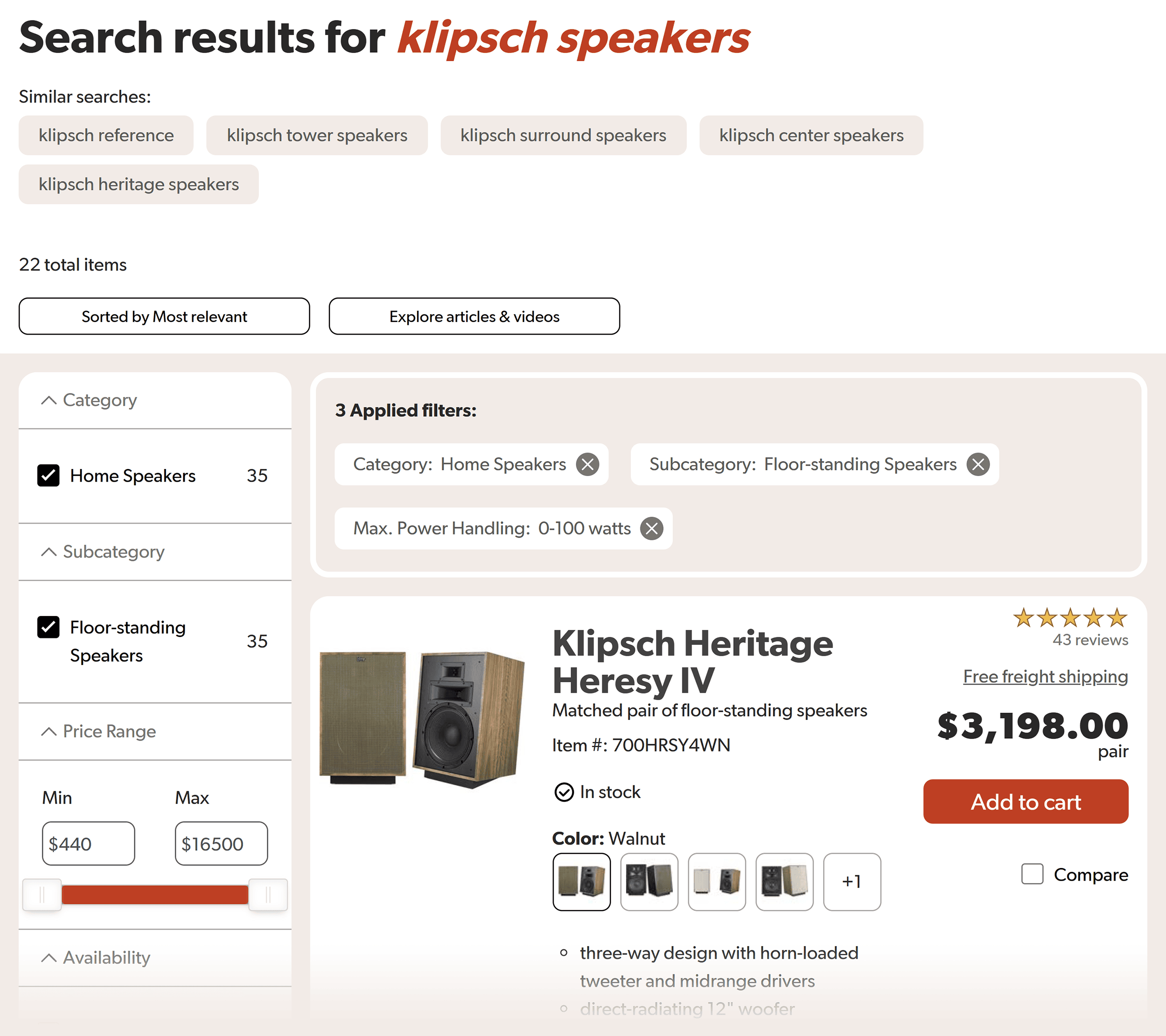
Once you’ve searched, narrowing the results is just as easy.
You can filter with options like:
- Price
- Features
- Availability of virtual audio demo
Select the filters you want, and voilà, you customize your search results.
And you know what that means:
The quicker you can find a product, the more likely you are to buy.
Now, let’s look at the product pages.
They’re a perfect mix of SEO and user experience (UX).
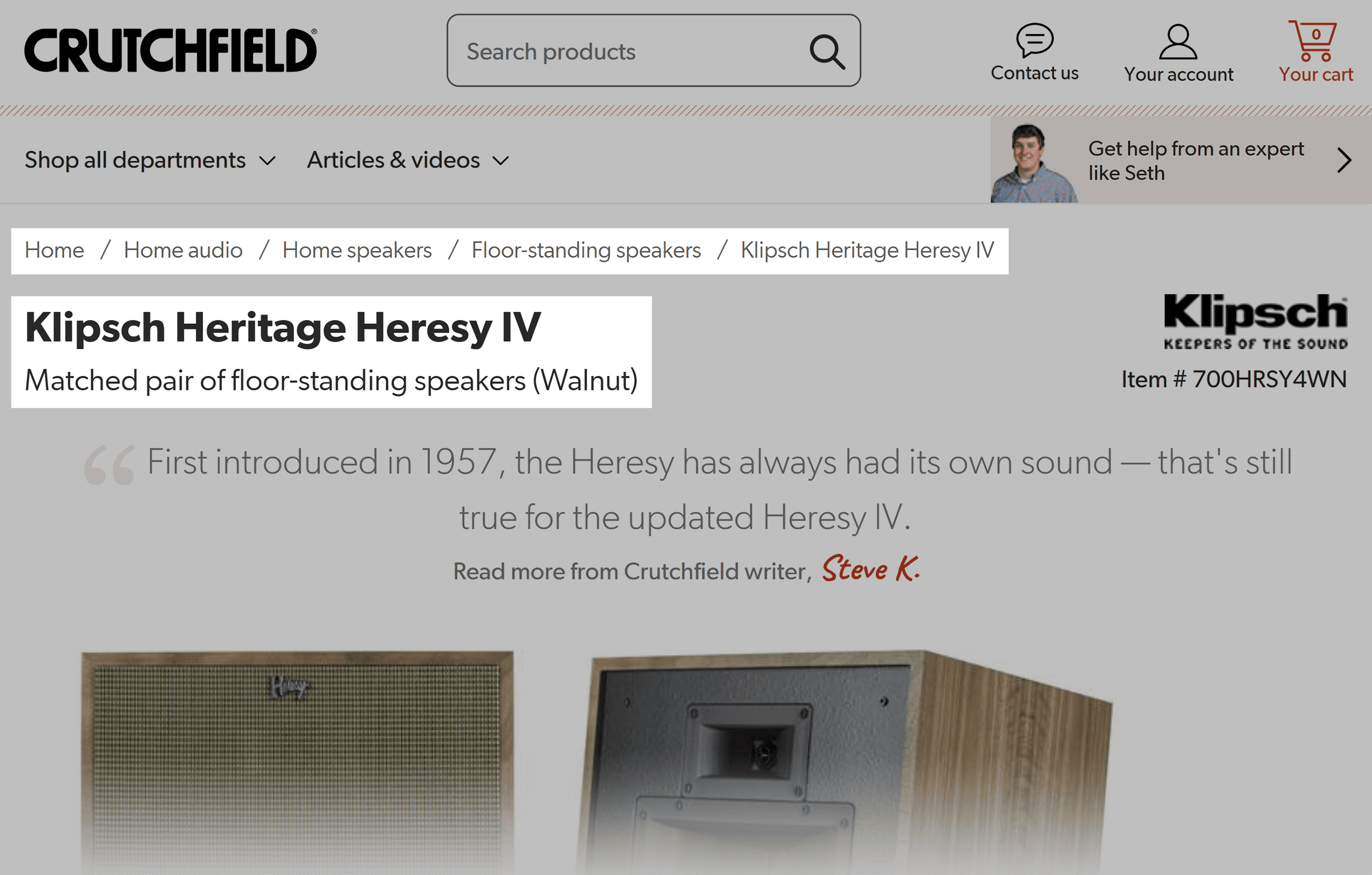
For example, breadcrumbs show exactly where you are on the site and make it easy to go back a step.
And the product names and descriptions are also clear and easy to understand. They even include target keywords to help with search rankings. A nice touch.
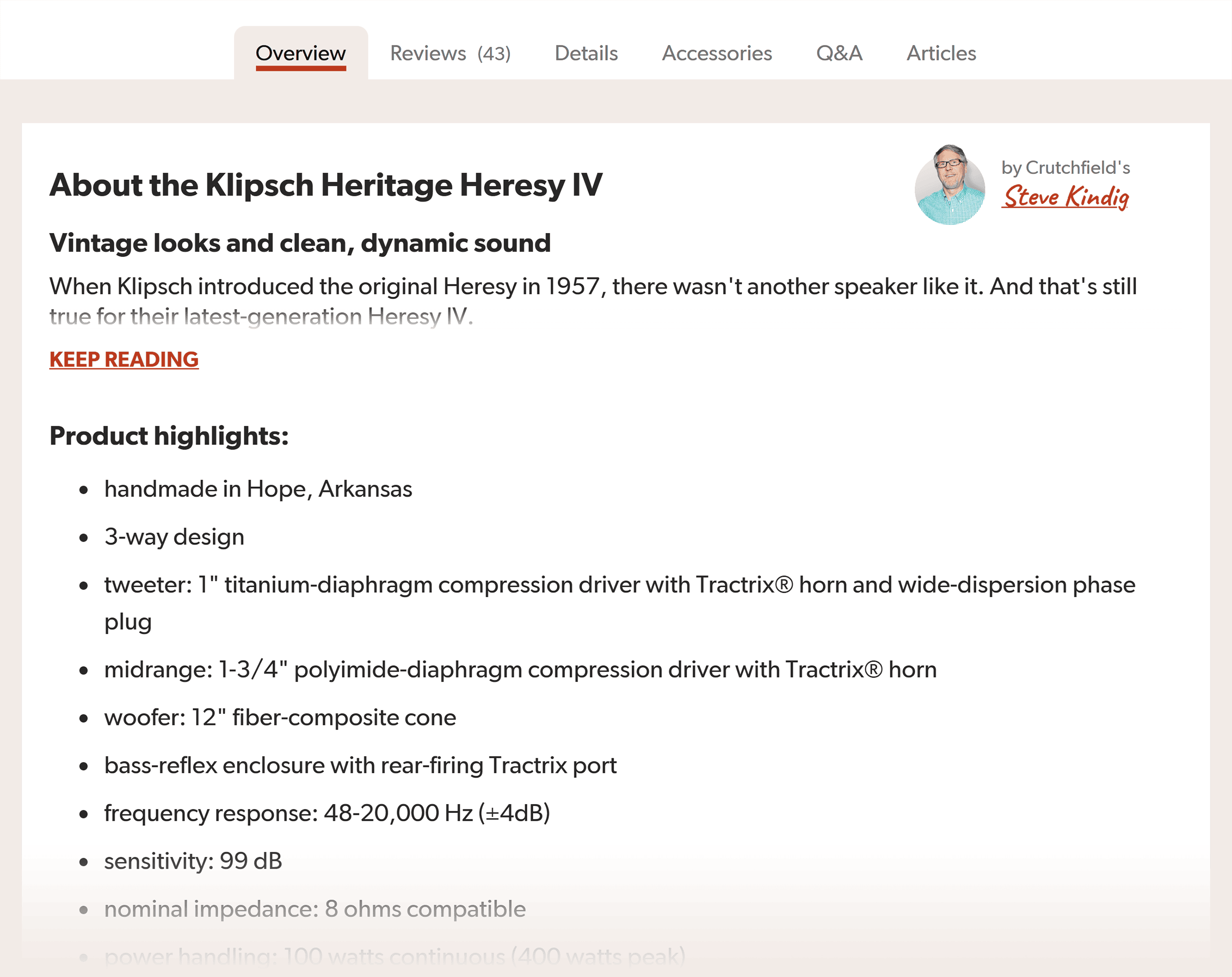
What’s more, the reviews and testimonials are right where you can see them.
These help build credibility as you read more about the product.
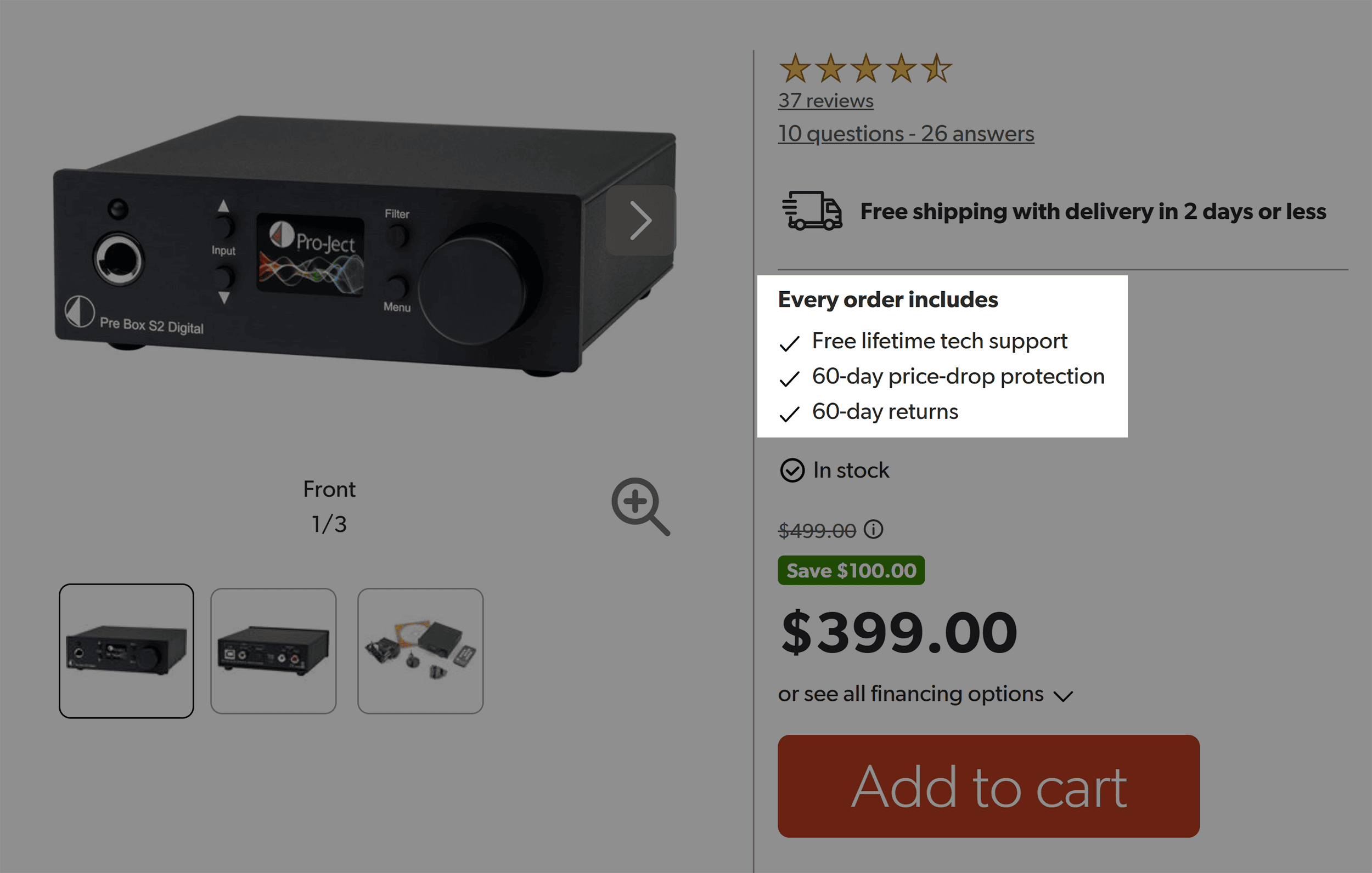
Then, to make it easier for potential customers to click the buy button, Crutchfield uses “anxiety reducers” in strategic locations.
For example, near the “add to cart” button, microcopy highlights benefits such as:
- Free lifetime tech support
- 60-day price-drop protection
- 60-day returns
Smart move. Why?
Asking someone to take action, like adding to cart, can trigger hesitation.
These anxiety reducers help ease buyer concerns and make the next step feel safer.
But what really sets Crutchfield’s website apart is how clear their focus on customer service is.
(After all, that’s their brand differentiator.)
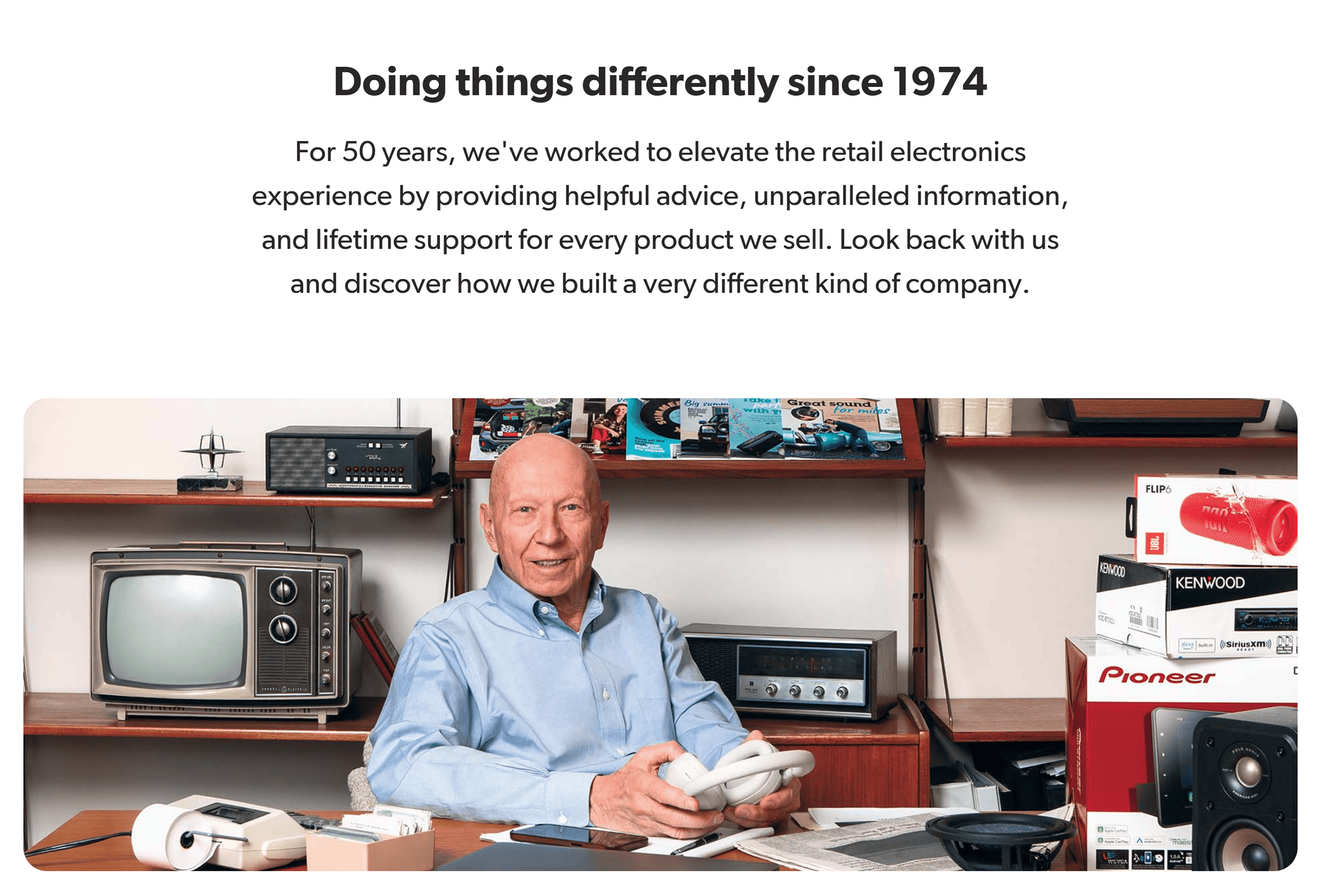
On every page, they make it clear how quickly you can reach them.
First, their phone number is always visible at the top of every page.

And no matter where you are—homepage, category page, or product page—they always feature tech experts.
This reassures shoppers that a real, knowledgeable human is always ready to help.

These elements build trust in their business while making the shopping experience stress-free.
That’s why they top my list of ecommerce sites with conversion-focused designs.
How Crutchfield Looks on Mobile
Crutchfield’s mobile site is just as user-friendly as the desktop version. It ticks all the big mobile SEO boxes.
Pages load fast, and the search and filter options are clear, simple, and easy to tap.
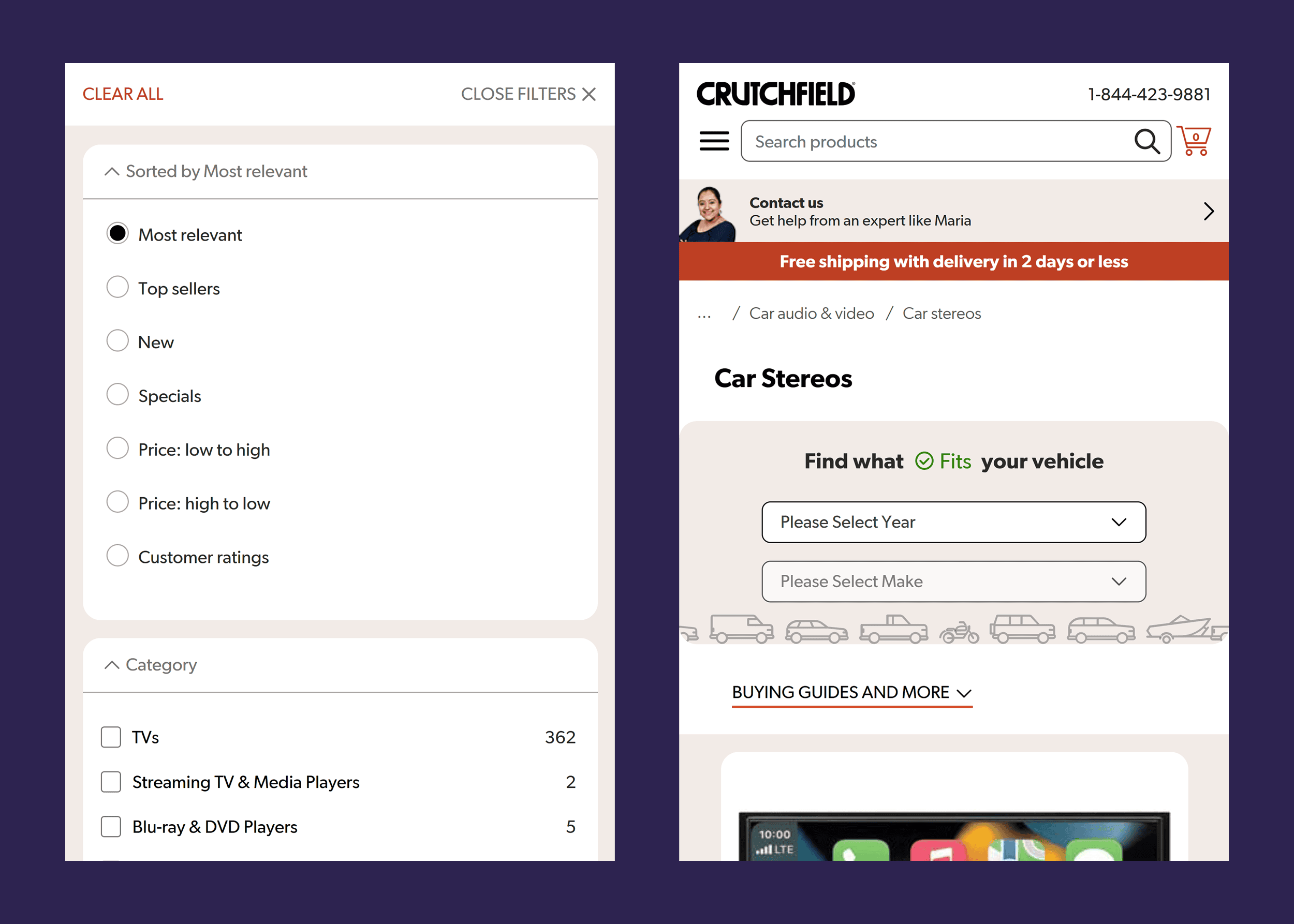
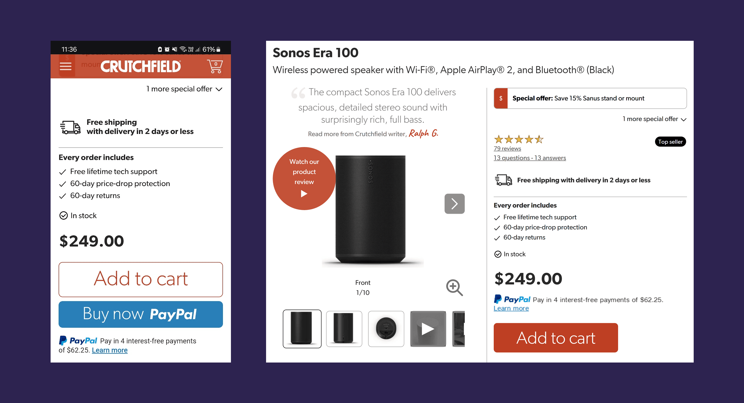
All the trust signals are still there, too.
And here’s a superb touch:
The PayPal “Buy now” button gets prime placement on mobile, unlike the desktop version.
(While we obviously don’t know for sure, the team likely tested this and found it boosted mobile sales.)
Takeaways
- Prioritize user experience: Focus on customer needs to help boost conversions and SEO.
- Make your value proposition obvious: What makes your store and products different? Make sure visitors see that on every page.
- Design product pages for people AND search engines: They should load fast, give clear details, and guide shoppers to buy.
2. Bang & Olufsen (B&O)
Bang & Olufsen is a global leader in luxury audio and visual technology.
They’re known for sleek design features, cutting-edge sound, and refined Scandinavian craftsmanship.
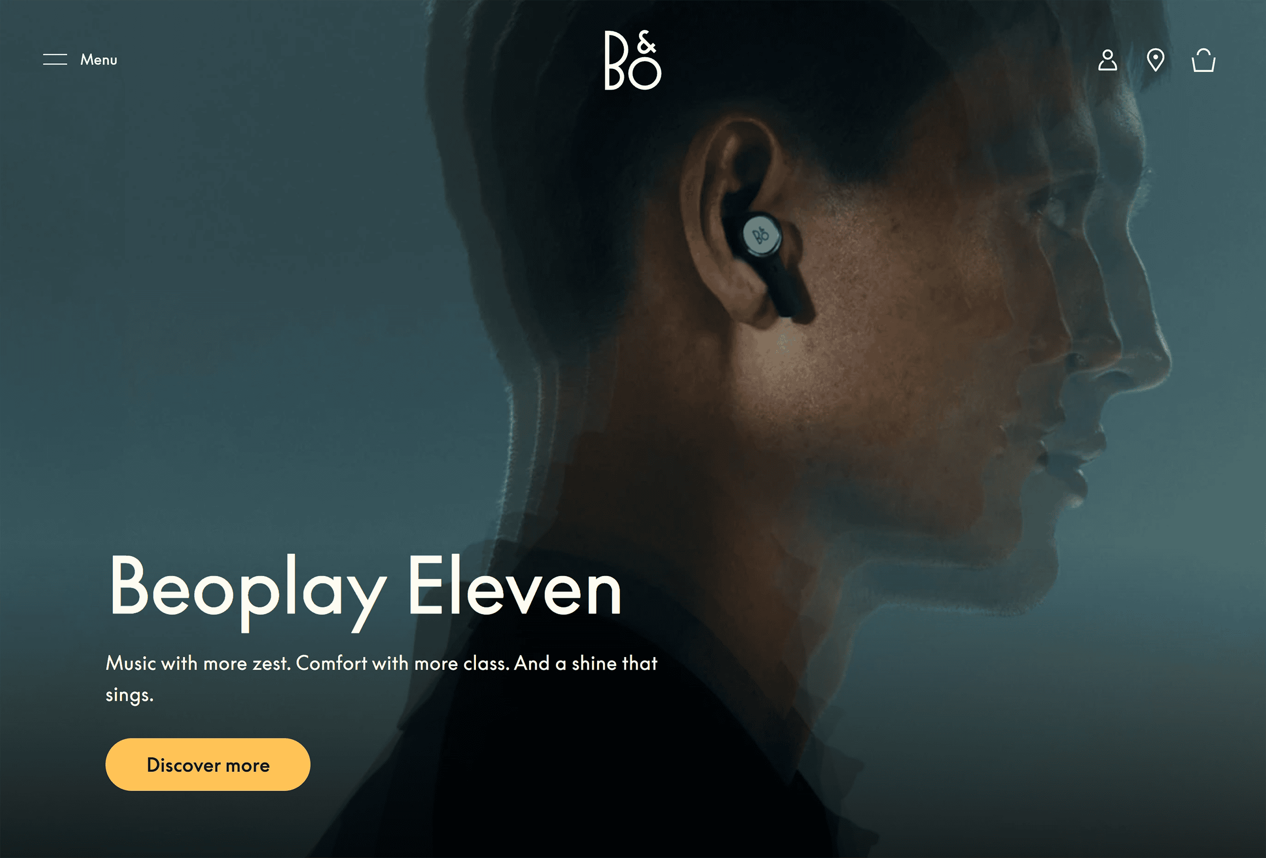
Their website matches their brand, as the minimalist design oozes elegance.
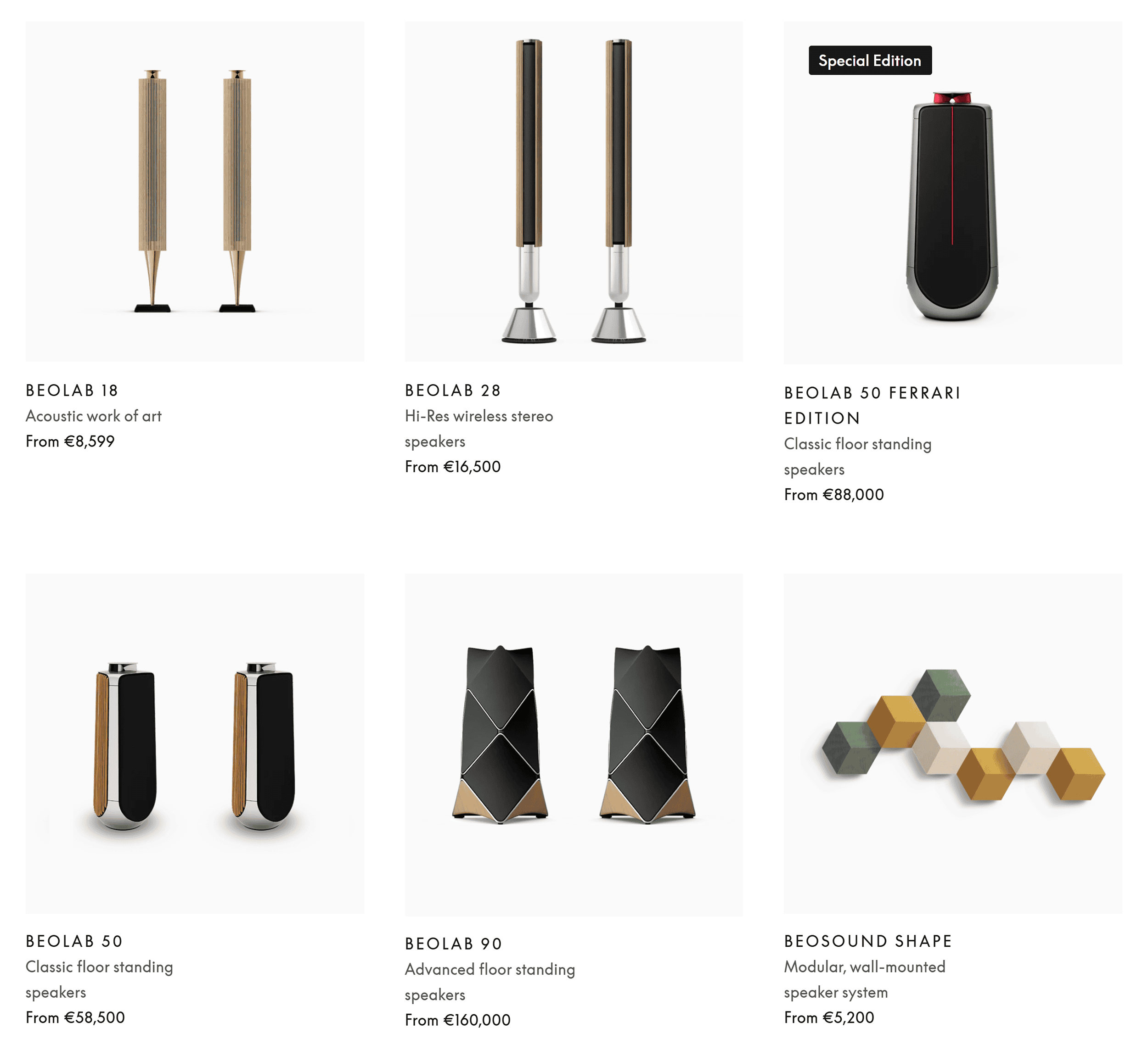
Plus, the generous white space makes each product look like a museum piece.
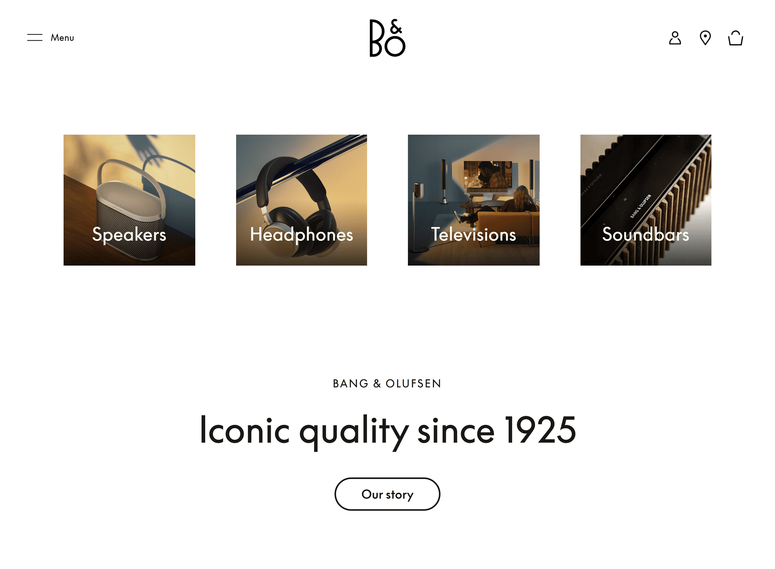
The clean layout and modern font (Beosupremen) complete the Scandinavian aesthetic.
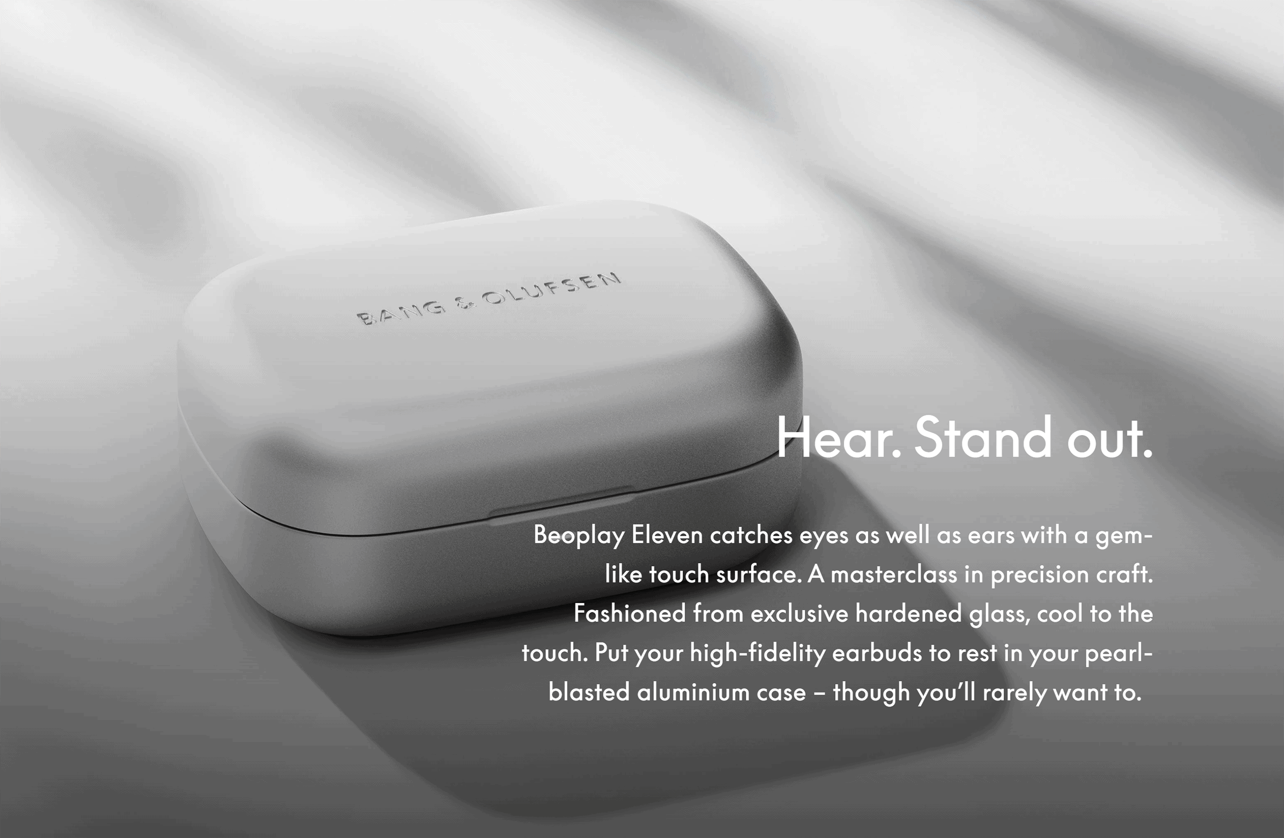
Browsing the site feels less like online shopping and more like exploring an art exhibit.
Now, check out the product pages.
It feels like something out of a premium lifestyle magazine.
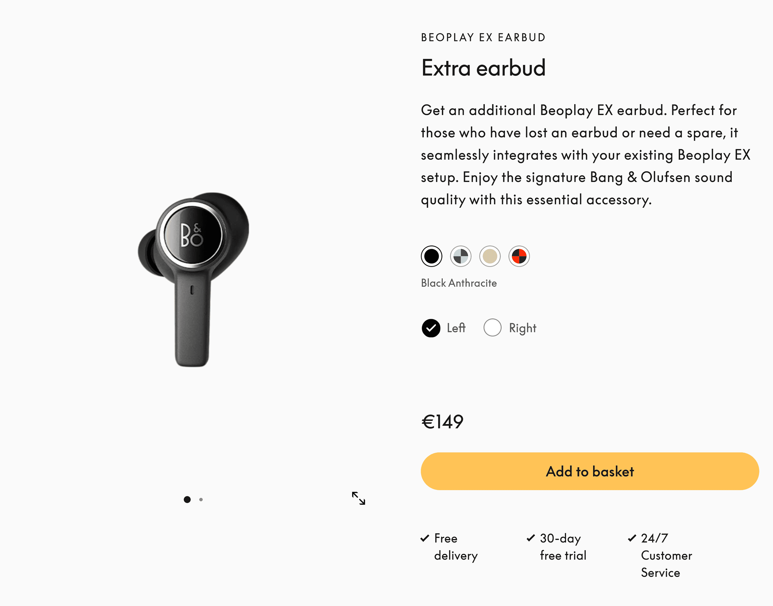
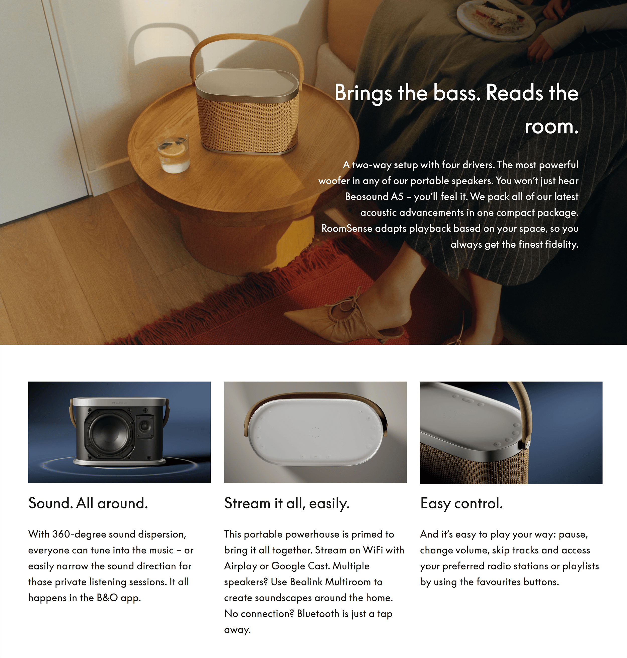
High-resolution images capture your attention immediately.
Plus, the detailed, well-crafted descriptions speak to reason AND emotion.
The best part?
B&O have managed to do all this while optimizing for SEO.
For example, their product pages use keywords in the H1 tag instead of just the product name.
(In this case, “portable speaker.”)
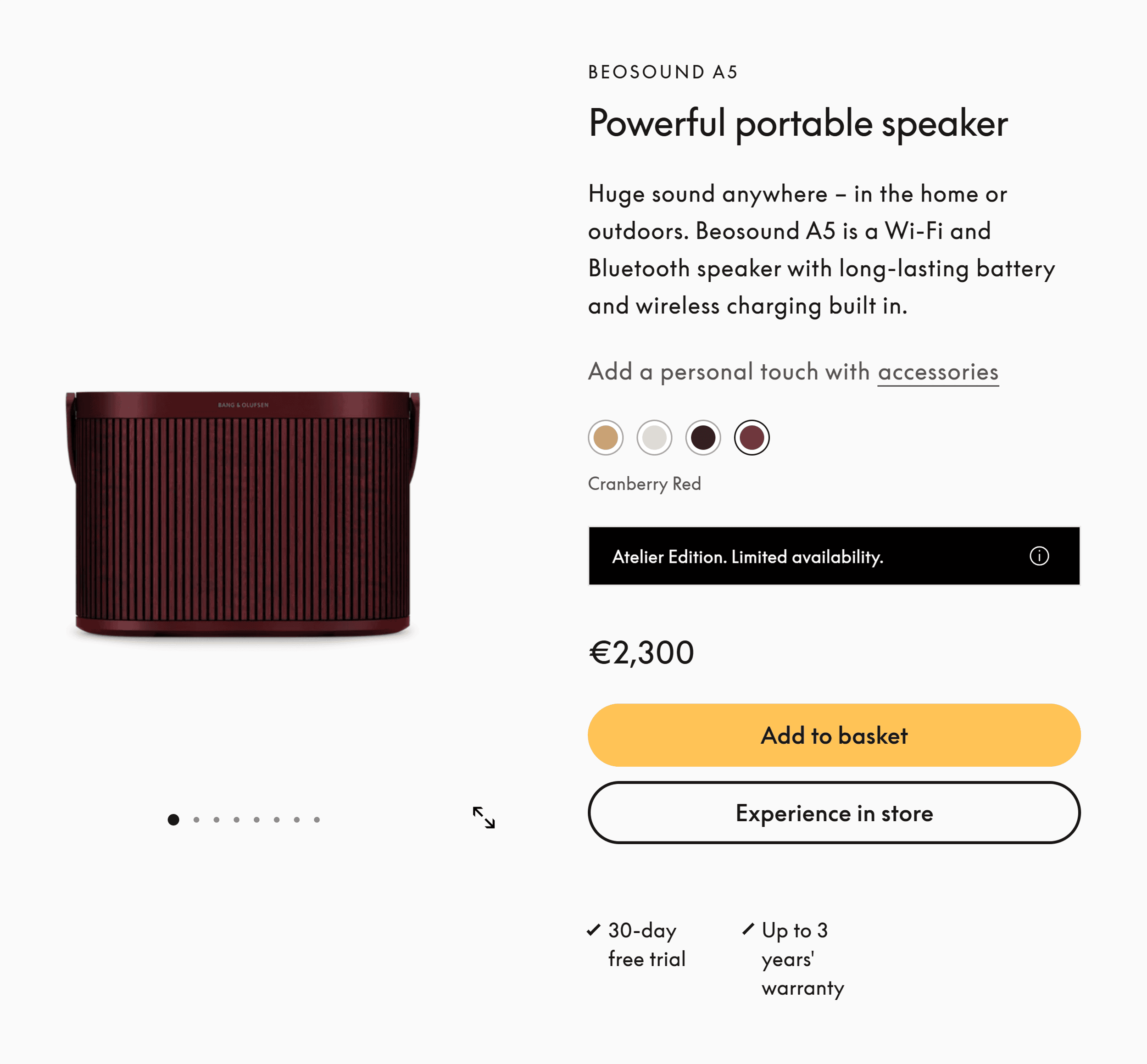
They also use the keyword naturally throughout the page a few times.
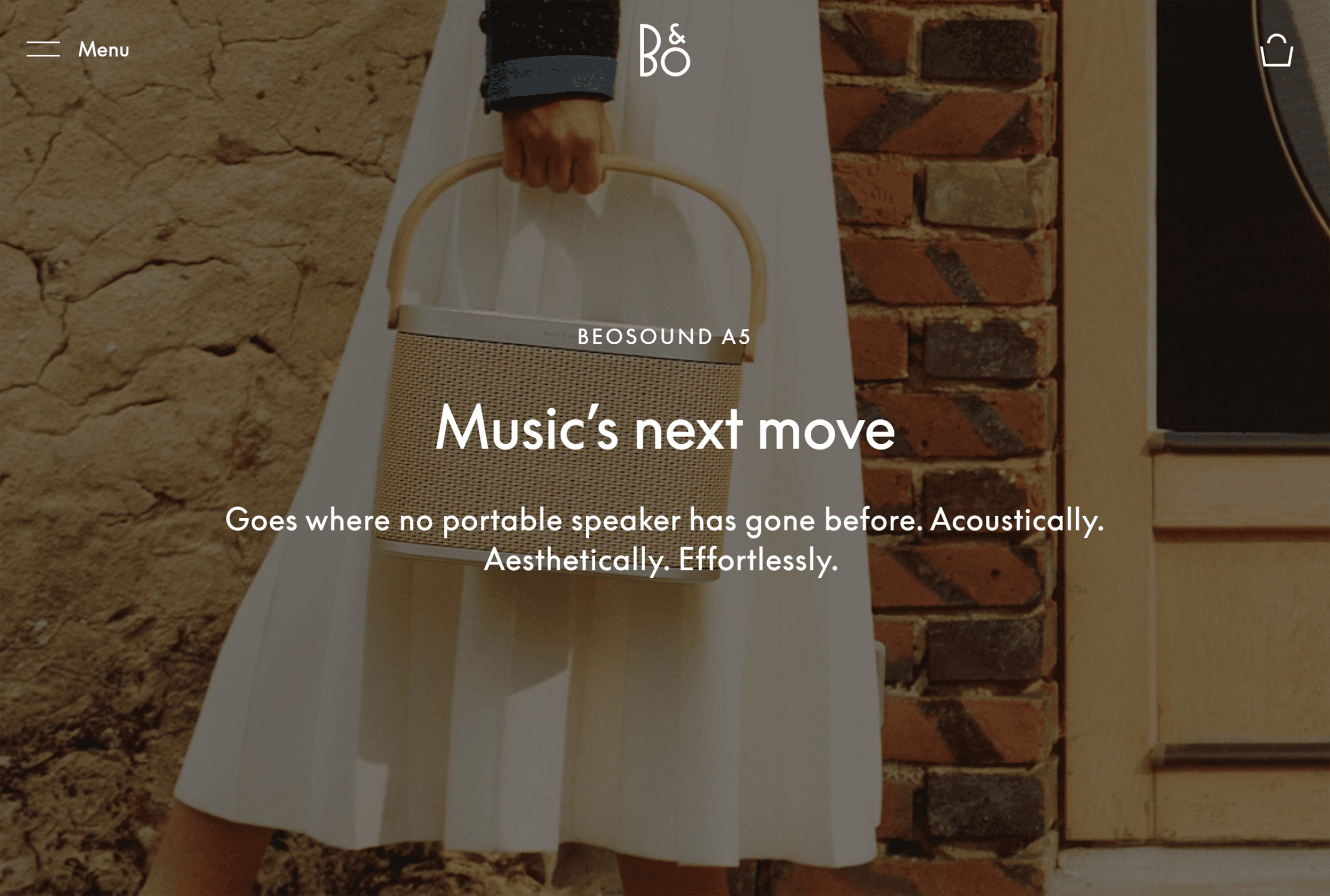
And there’s more:
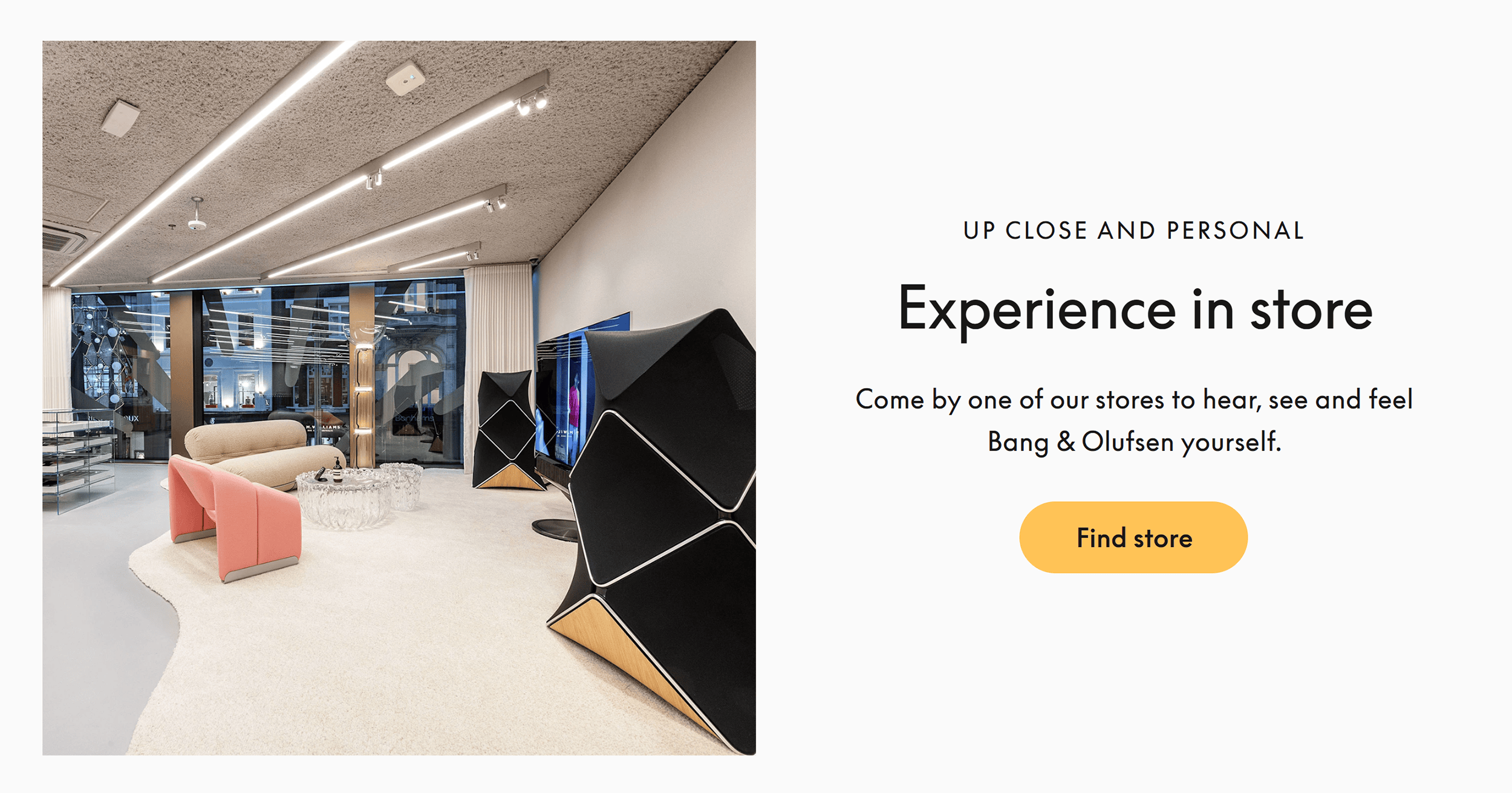
Bang & Olufsen’s website does a great job of linking online browsing with in-store visits.
Their homepage displays a call to action encouraging shoppers to “Experience in store.”
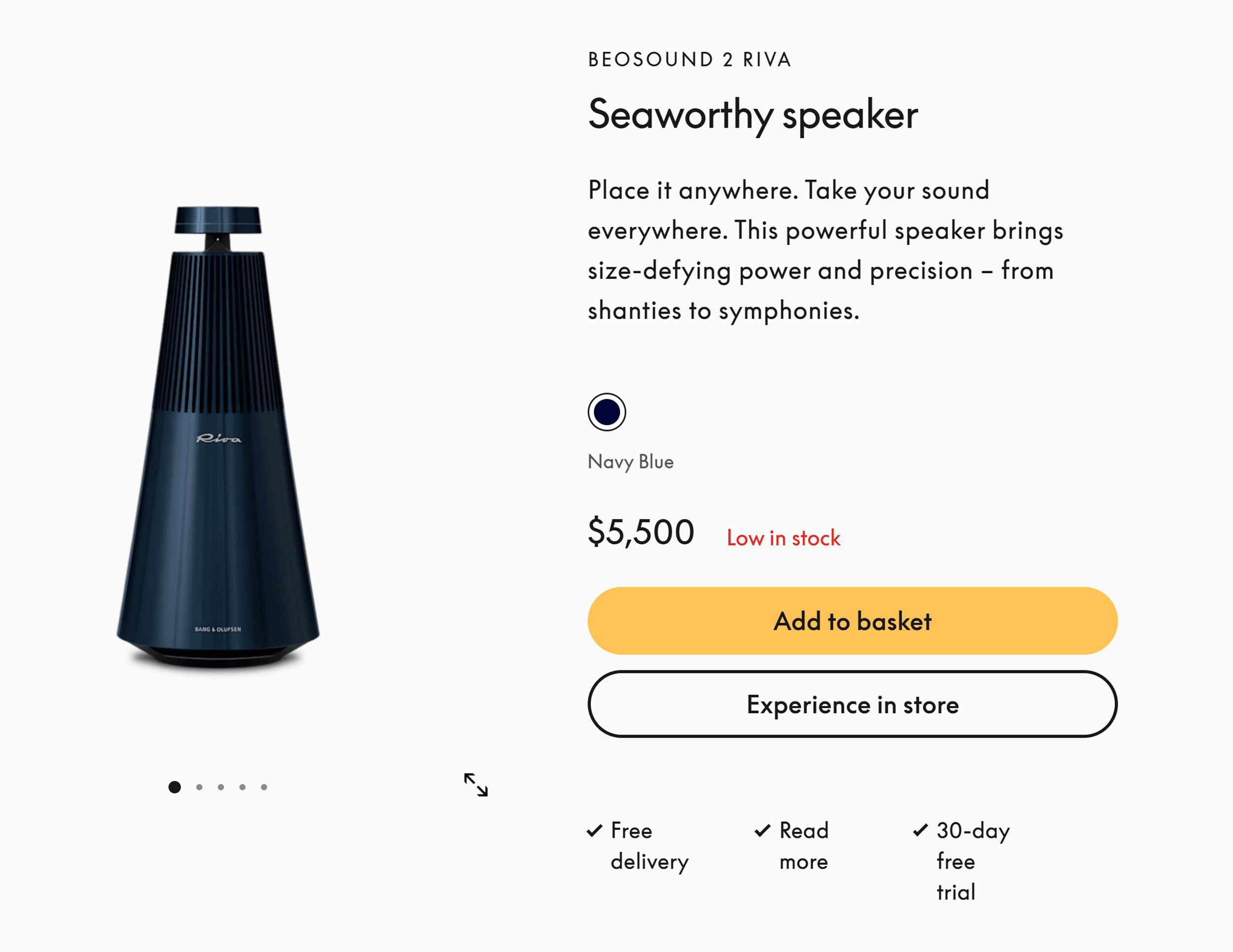
The same CTA copy also appears on product pages reinforcing B&O’s physical presence.
And here’s why that matters:
It shows they’re more than an online retailer.
This adds credibility and sophistication to the brand. It also helps boost buyers’ confidence in the brand’s legitimacy.
How Bang & Olufsen Looks on Mobile
Bang & Olufsen’s mobile site keeps the same luxury vibe.
The minimalist design stays the same, with clean layouts and space for products to stand out.
The high-quality images load quickly and look stunning.
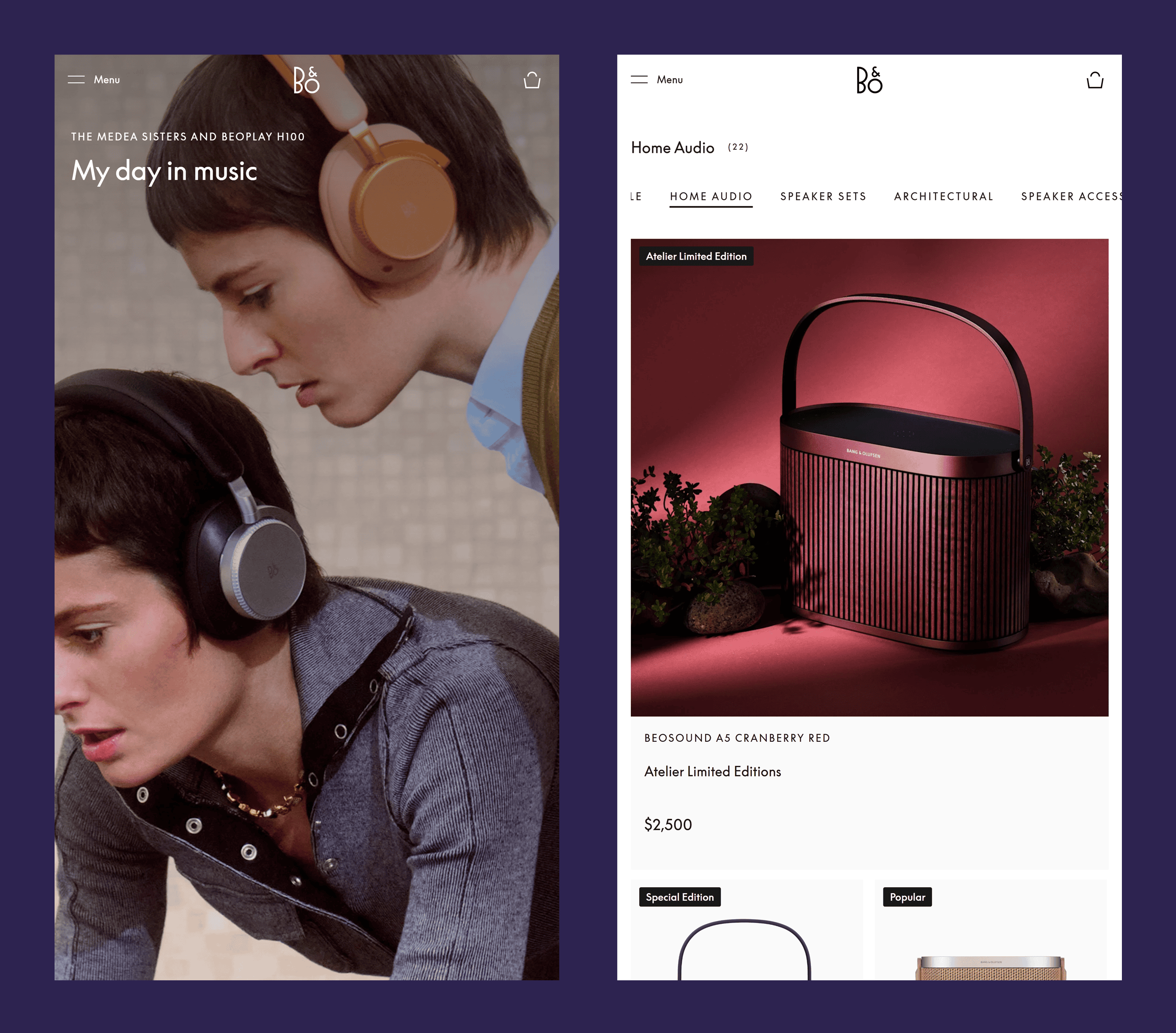
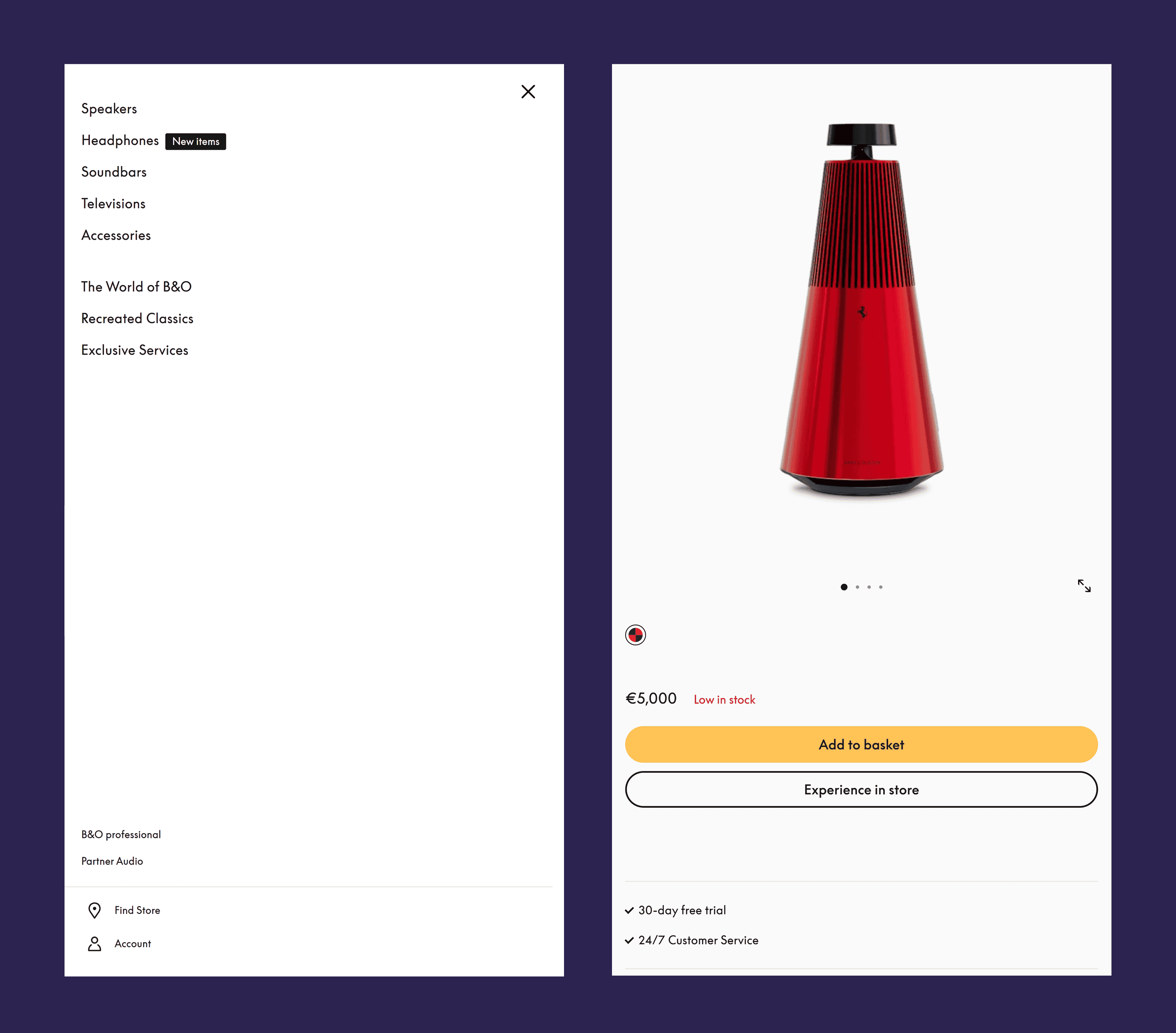
Navigation is just as smooth.
The large, clear buttons are easy to tap, and everything responds quickly to your touch.
All this comes together to create the premium, elegant feel you’d expect from B&O.
Takeaways
- Speak luxury through subtlety: Skip the loud banners and hard-sell tactics. They create a salesy feel that cheapens a premium brand.
- Balance image quality with page speed: Showcase your products with high-quality images. Also compress them so they load fast and stop visitors from bouncing.
- Create a seamless shopping experience: Link your website to your offline stores. This makes everything feel more cohesive.
3. Misen
Misen sells high-quality cookware for home chefs and hobby cooks.
They transform everyday kitchen tools into aspirational must-haves.
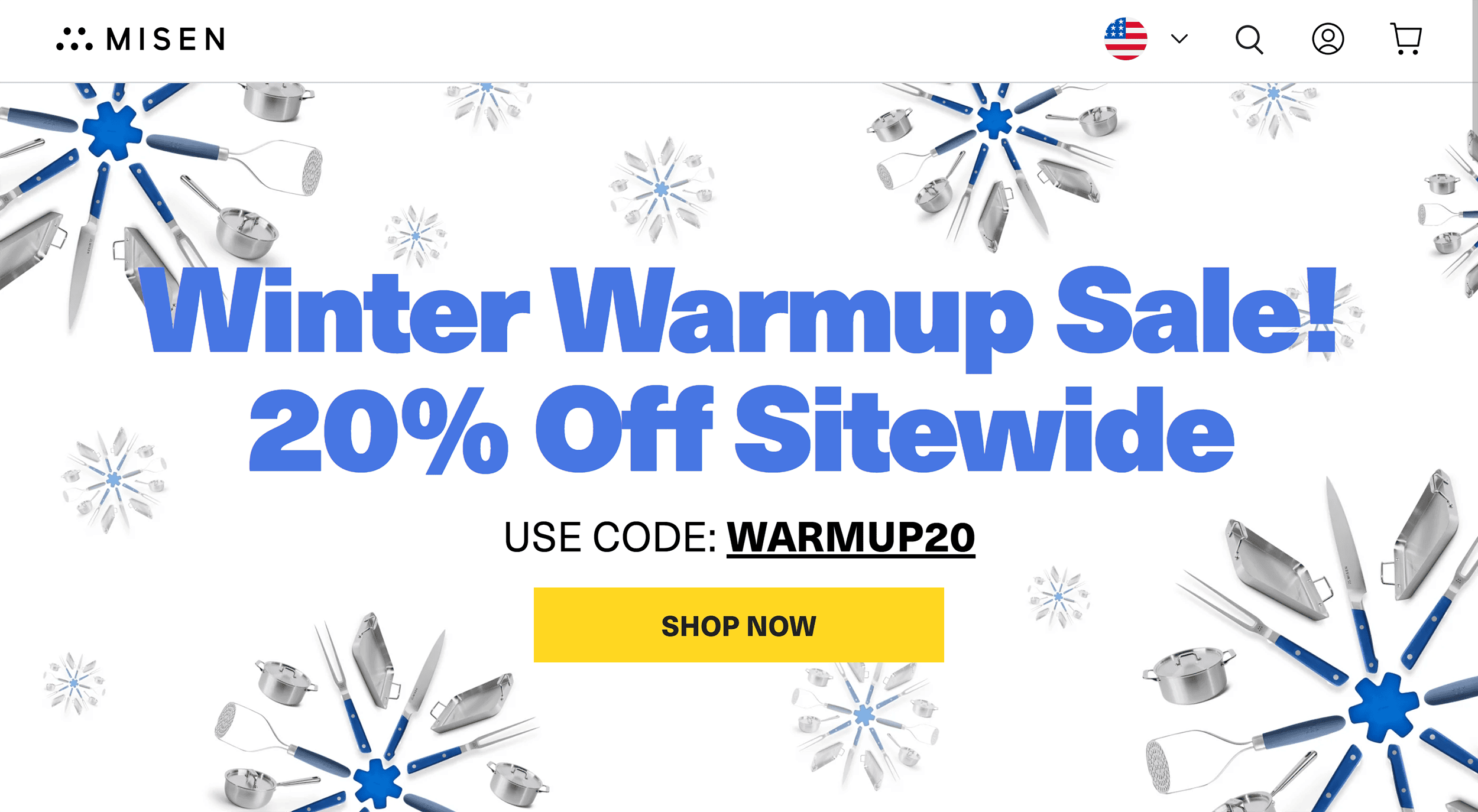
Their website fully reflects this goal.
Bold typography and bright colors grab your attention.
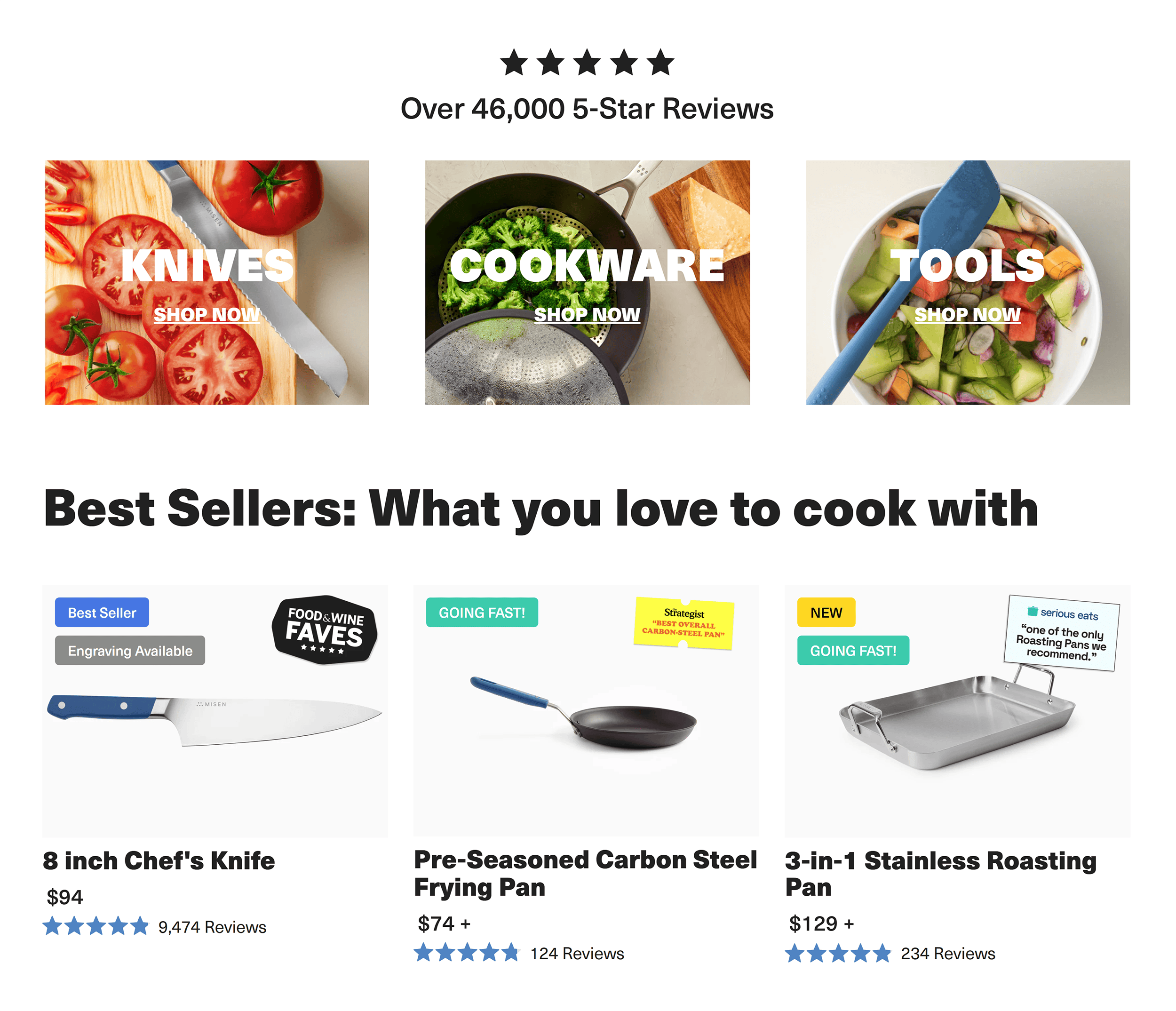
And the compelling copy inspires you to level up your cooking skills.
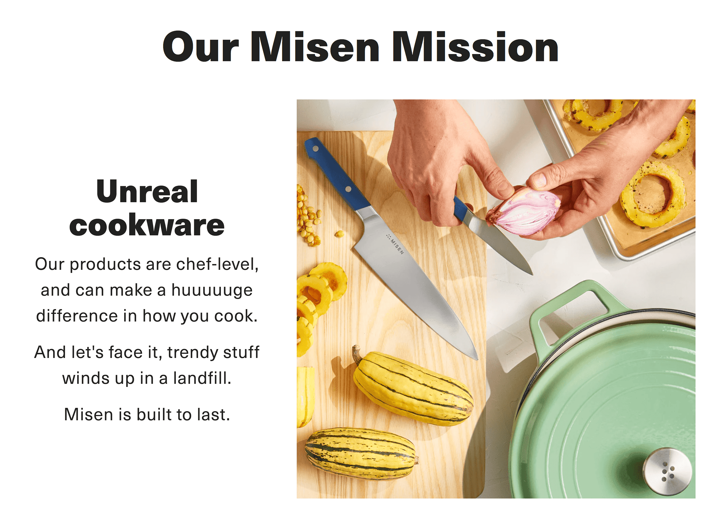
What sets Misen’s website apart?
It speaks to four distinct decision-making styles.
Just look at their product pages to see this at work.
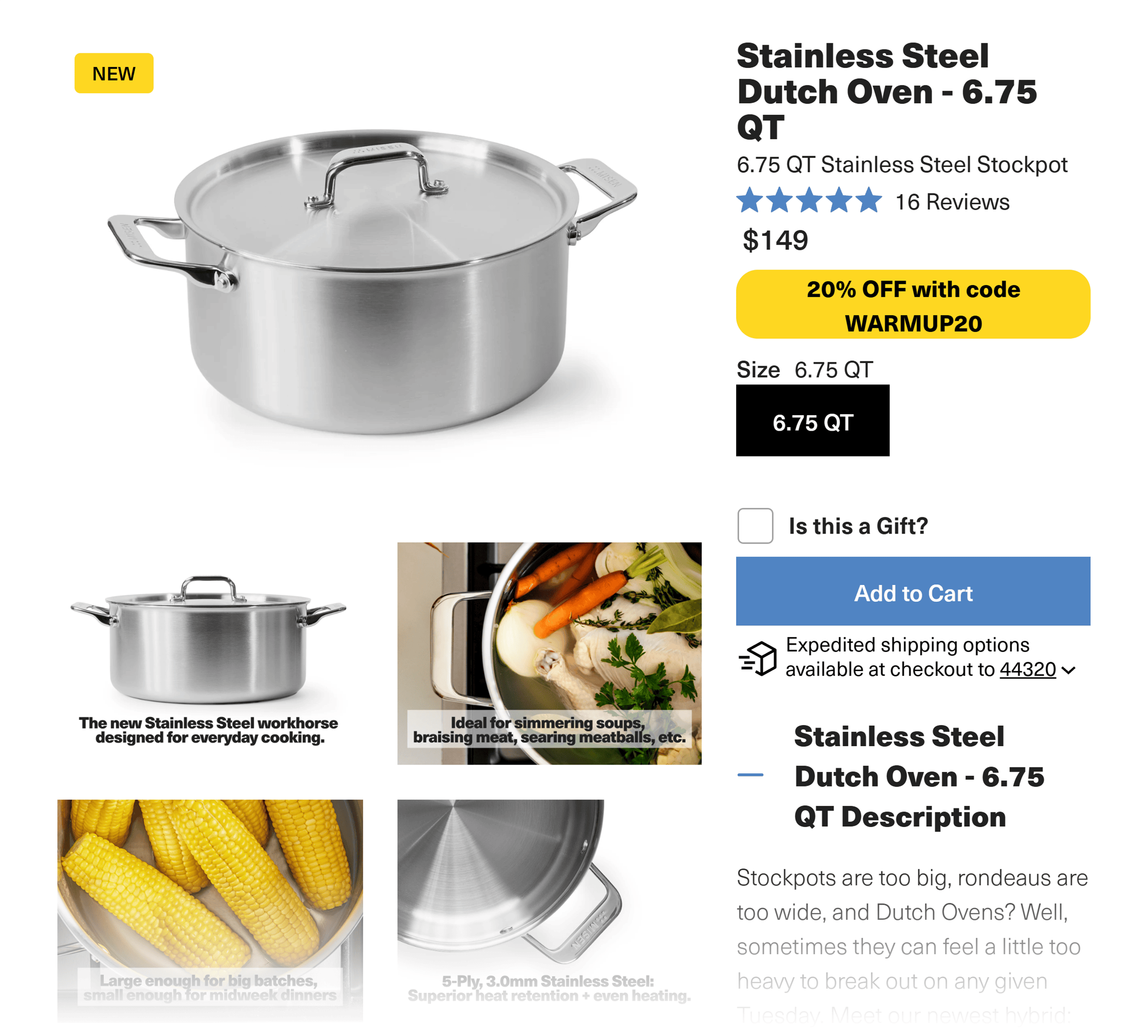
First, Misen wins over methodical buyers with:
- Detailed specs
- Material breakdowns
- Clear explanations
This gives these logic-driven shoppers the data to make a confident purchase.
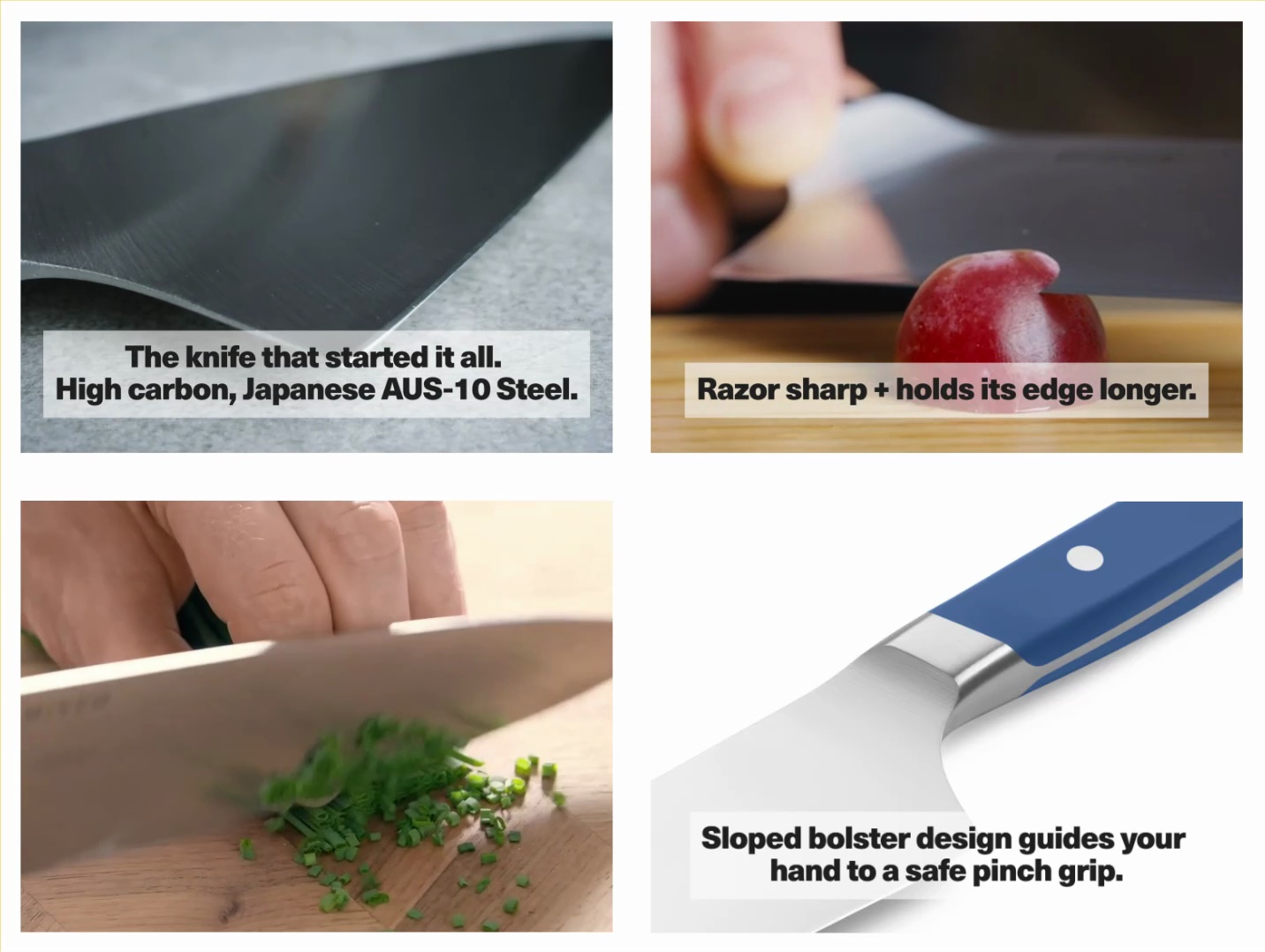
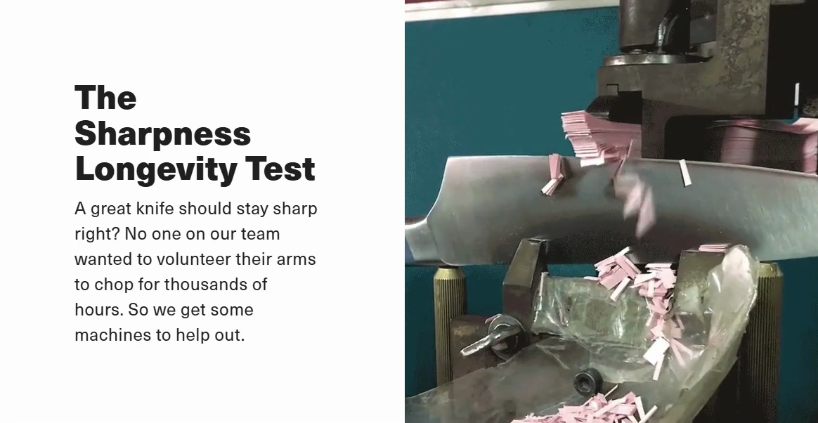
For emotion-driven buyers, Misen uses vivid images and GIFs, like the knife slicing through a grape.
These visual elements spark desire and help you imagine using the product yourself.
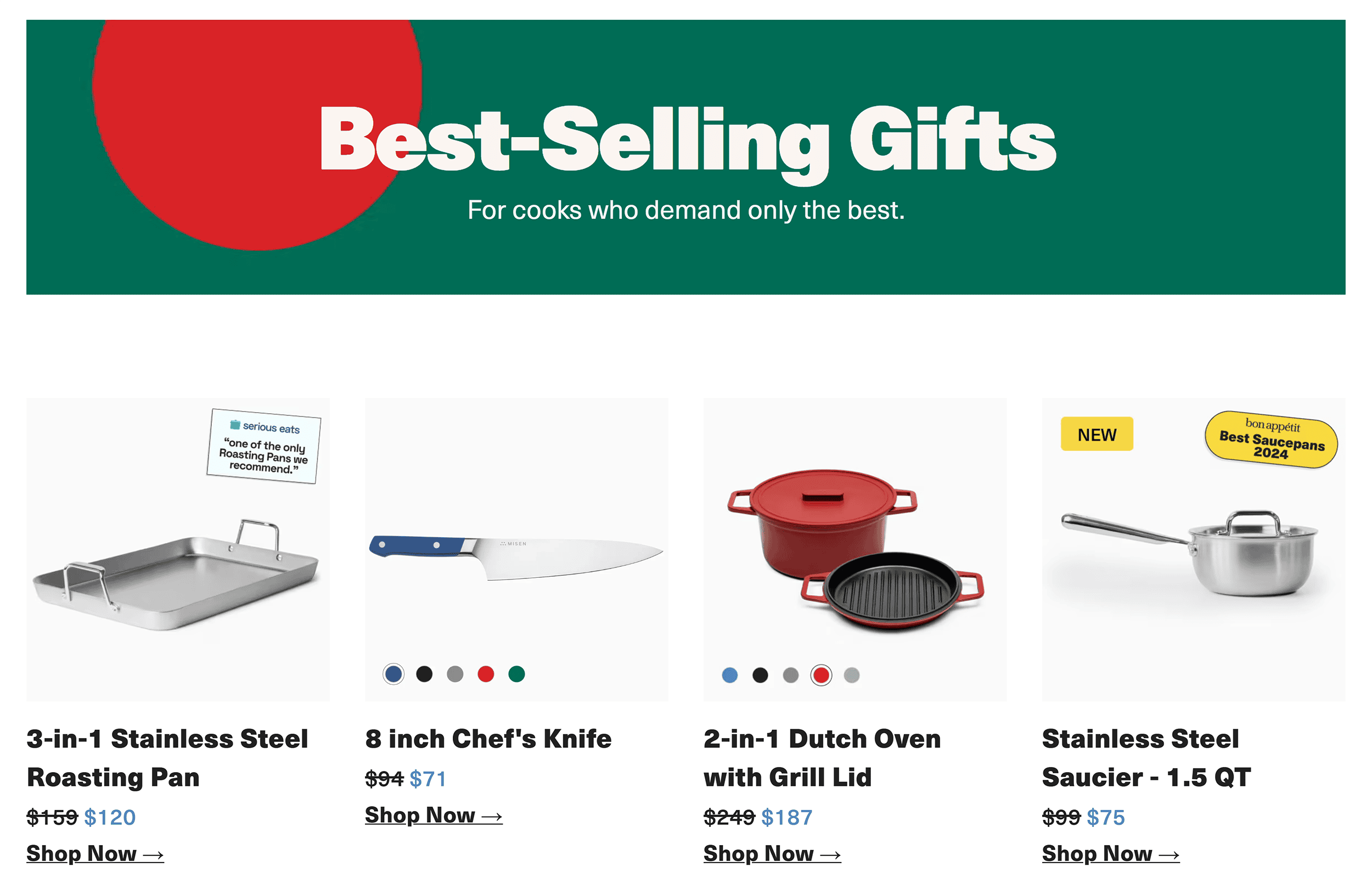
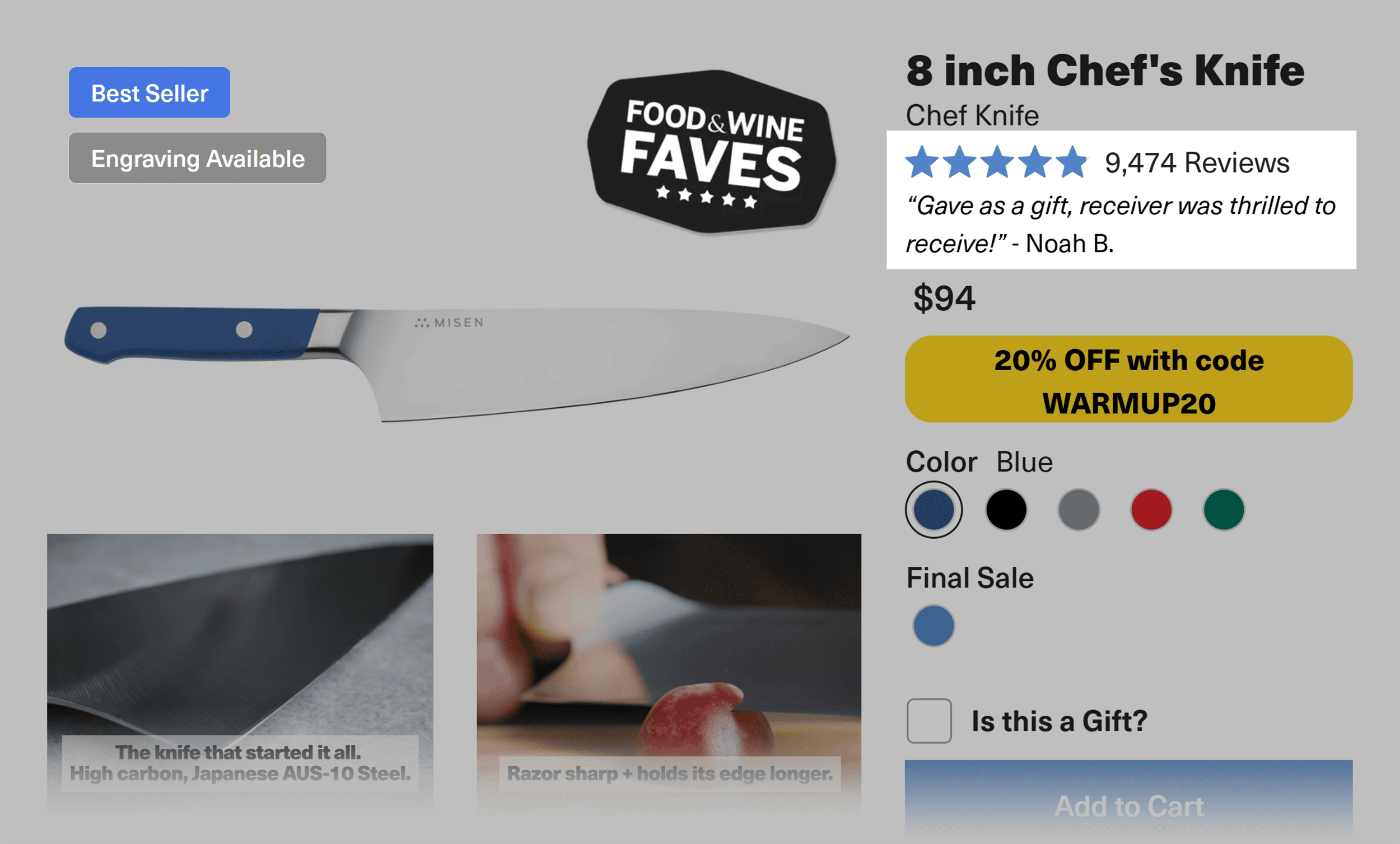
To attract competitive buyers, Misen uses bestseller badges and review counts.
These elements trigger FOMO and appeal to the desire to choose the best product.
Finally, for practical buyers, Misen features close-up shots of knives in action.
You’ll see hands gripping tools, before-and-after cooking shots, and precise cuts.
This gives practical buyers proof that the product delivers on its promises.
So go visit Misen’s product pages.
Study them. Copy what works. And your conversions will thank you.
How Misen Looks on Mobile
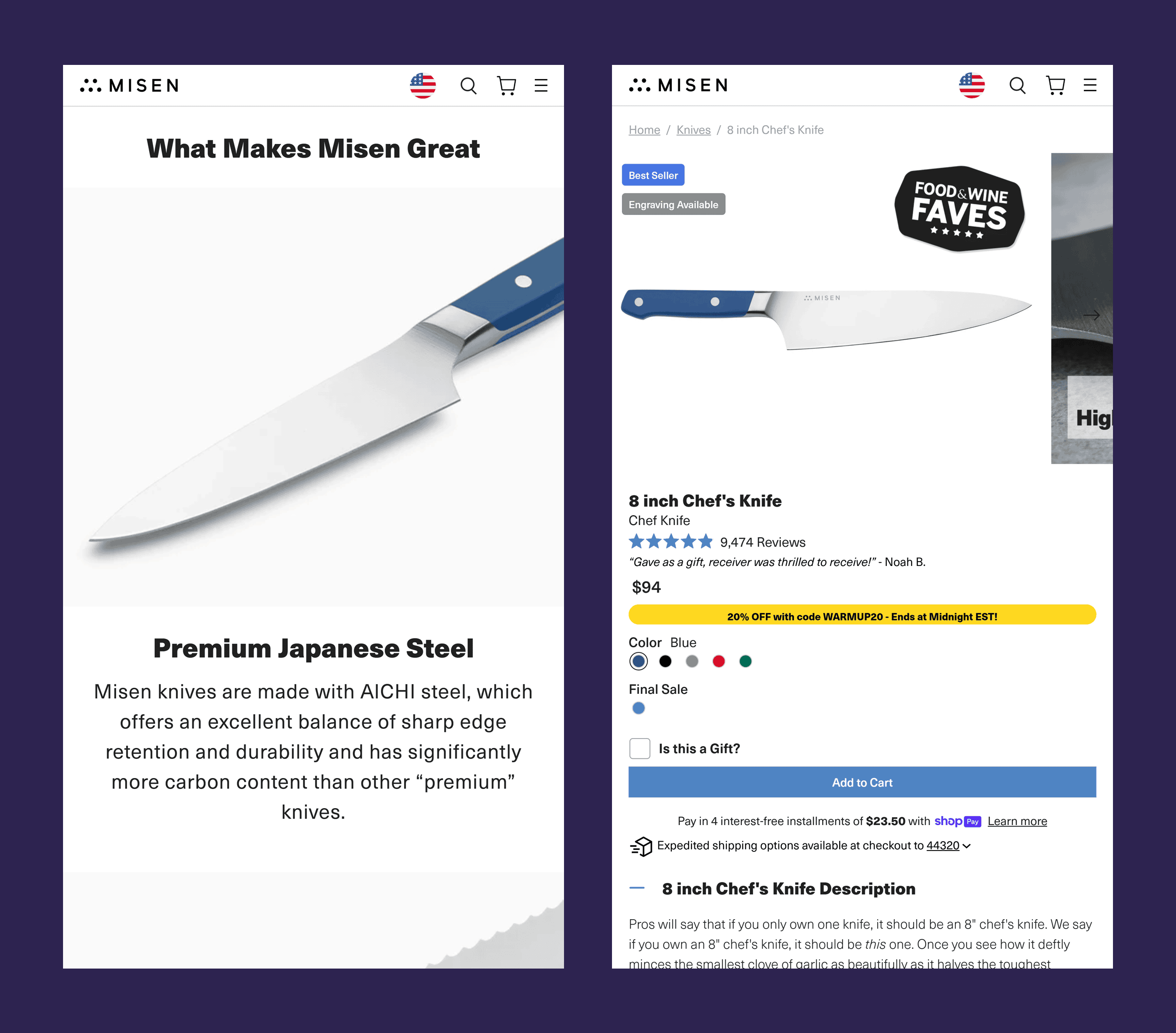
Misen’s mobile site proves that rich content and video can work on smaller screens.
They also embrace long copy, pairing text and visuals with precision.
Images appear right where they’re needed, making browsing smooth and intuitive.
But that’s not all.
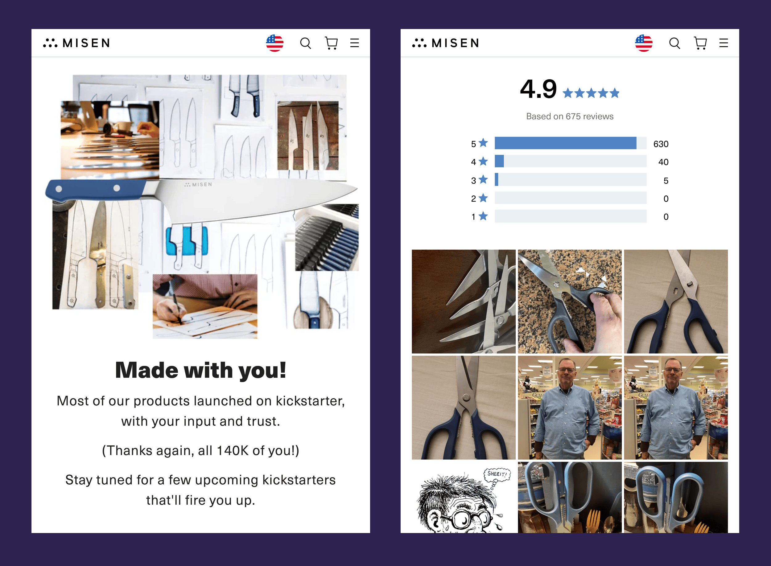
Social proof, like user-generated content (UGC), appears at just the right moments to nudge shoppers to buy.
Misen’s mobile pages make it clear:
Premium design and performance can work perfectly even on smaller screens.
Takeaways
- Design for different buyer mindsets: Show your product working in multiple ways to appeal to different buyer types.
- Make images tell stories: Skip stock images and basic product photos. Show your products in action to evoke curiosity and desire.
- Keep mobile fast but premium: Compress images to load high-res product shots and videos quickly. This keeps the premium feel while boosting performance.
Large Ecommerce Website Examples
Large ecommerce sites face a big challenge:
Managing thousands of products while staying fast and user-friendly.
The best sites drive conversions by focusing on key elements like:
- Fast load times
- Simple navigation
- Streamlined checkout processes
These elements aren’t optional. They directly impact conversions, user experience, and customer satisfaction.
4. Sephora
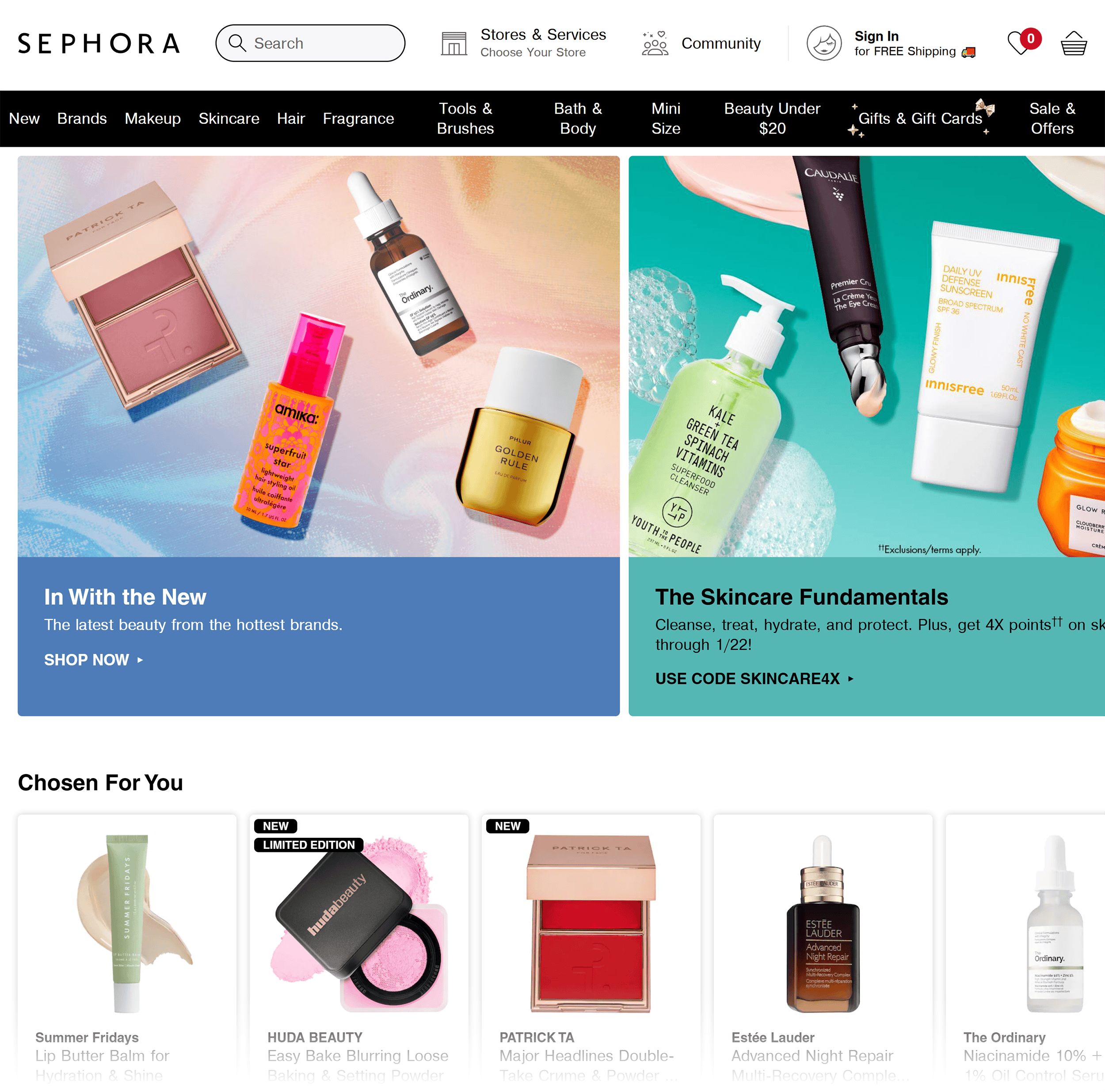
Sephora is a global beauty retailer with a wide selection of products.
The website feels like browsing a sleek, organized beauty aisle (without the crowds).
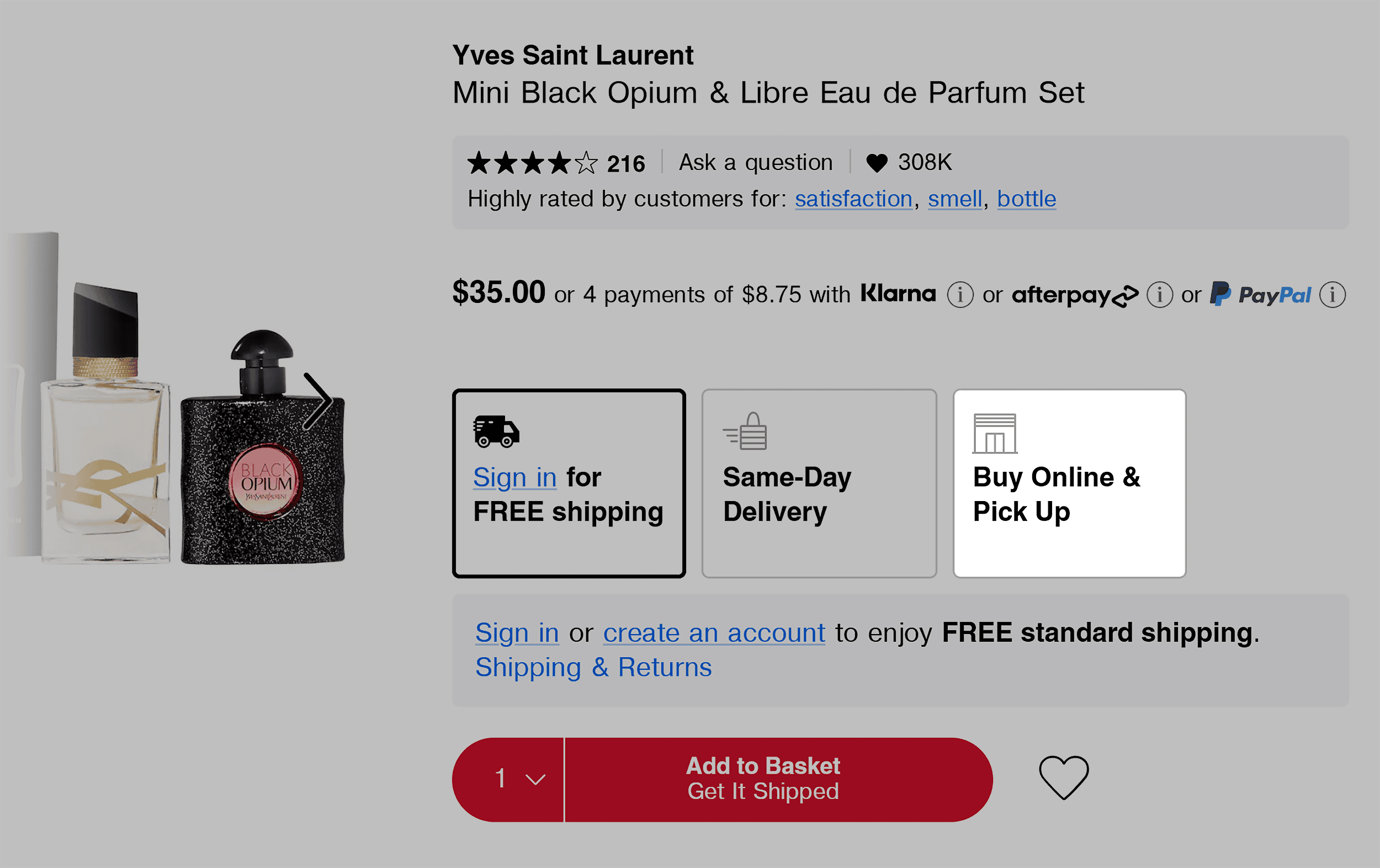
One of Sephora’s smartest conversion plays is “Buy Online, Pick Up In-Store (BOPIS).”
It’s a way to reduce cart abandonment, and Sephora makes it impossible to miss.
But that’s just the start of their user-friendly design.
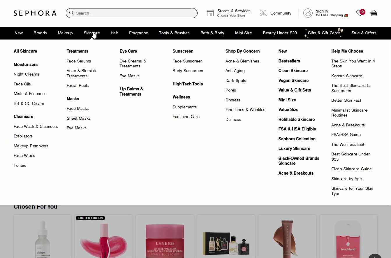
Their intuitive navigation menu makes browsing simple.
The menu dropdown appears instantly when you hover, and categories are easy to find.
Bold fonts highlight main categories, while subcategories use lighter fonts.
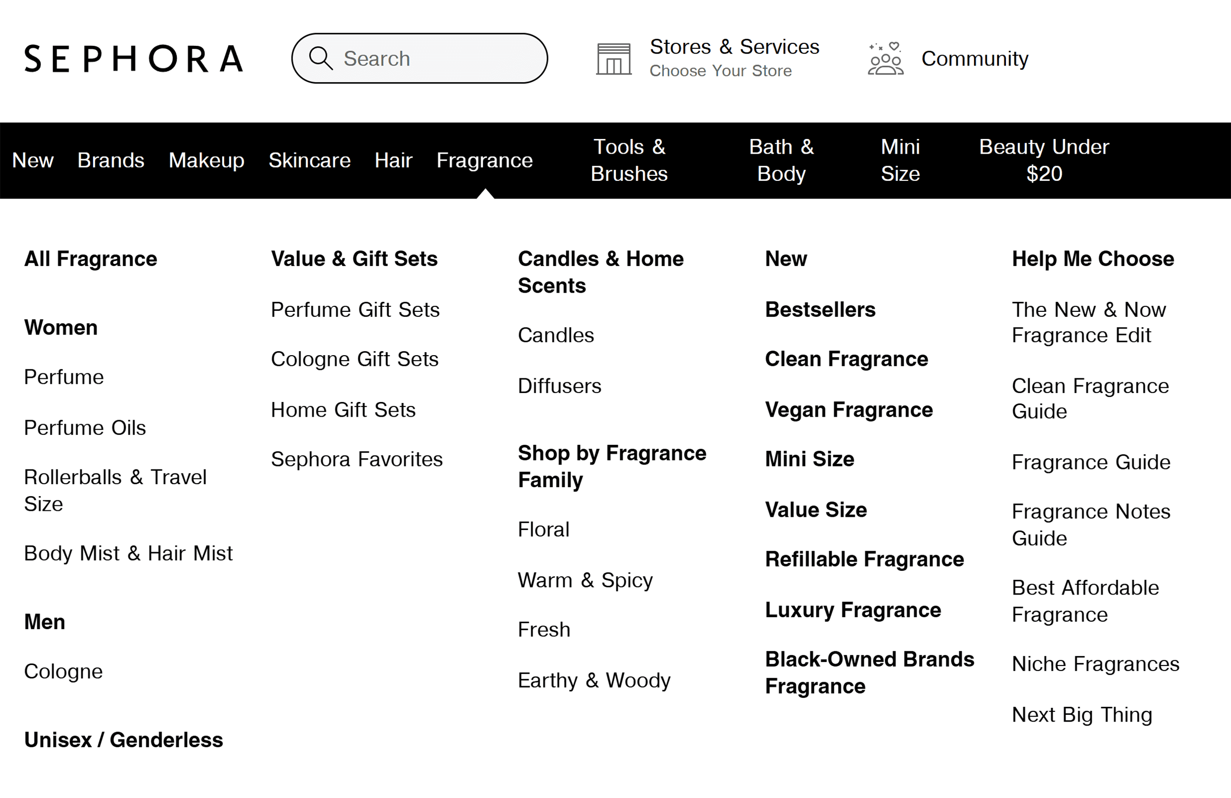
This makes scanning super easy, so you can easily find what you’re looking for in the mega menu.
The category pages keep this same attention to detail.
Popular filters like “Vegan” and “Clean” sit right at the top, making it easy to sort by preference.
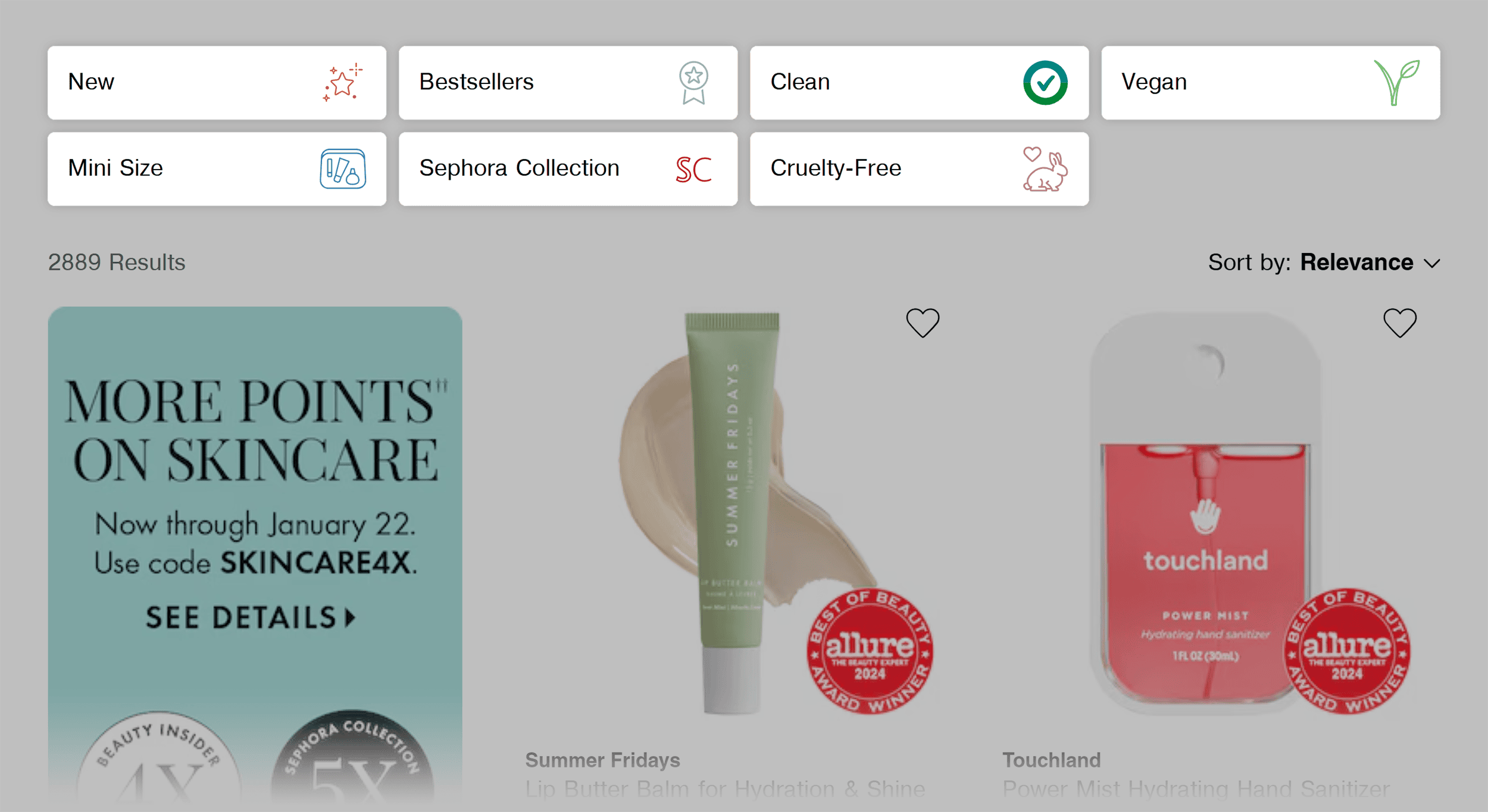
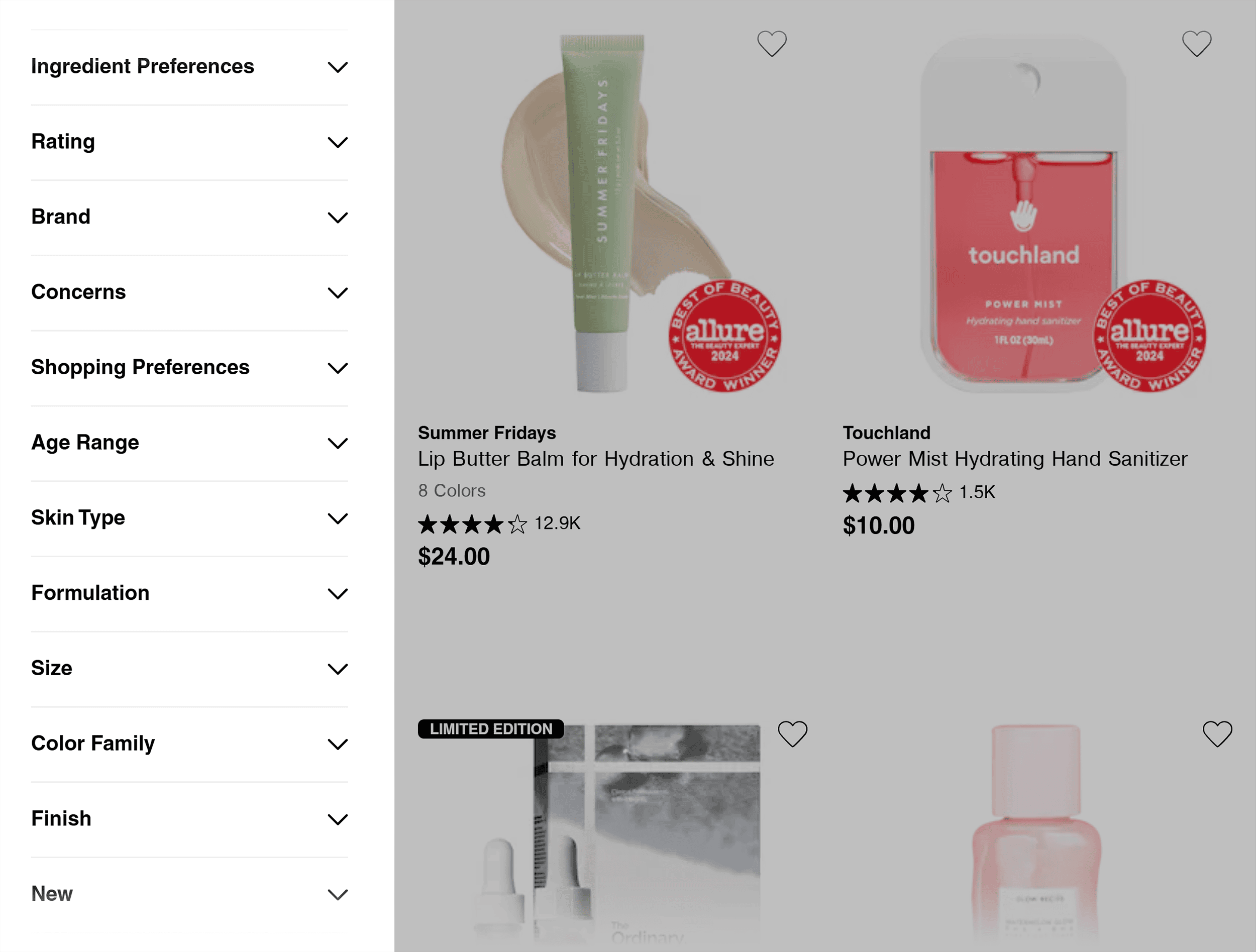
The site also uses faceted navigation. This lets shoppers filter results based on specific criteria, like price or brand.
It’s especially helpful for large ecommerce sites with extensive product catalogs.
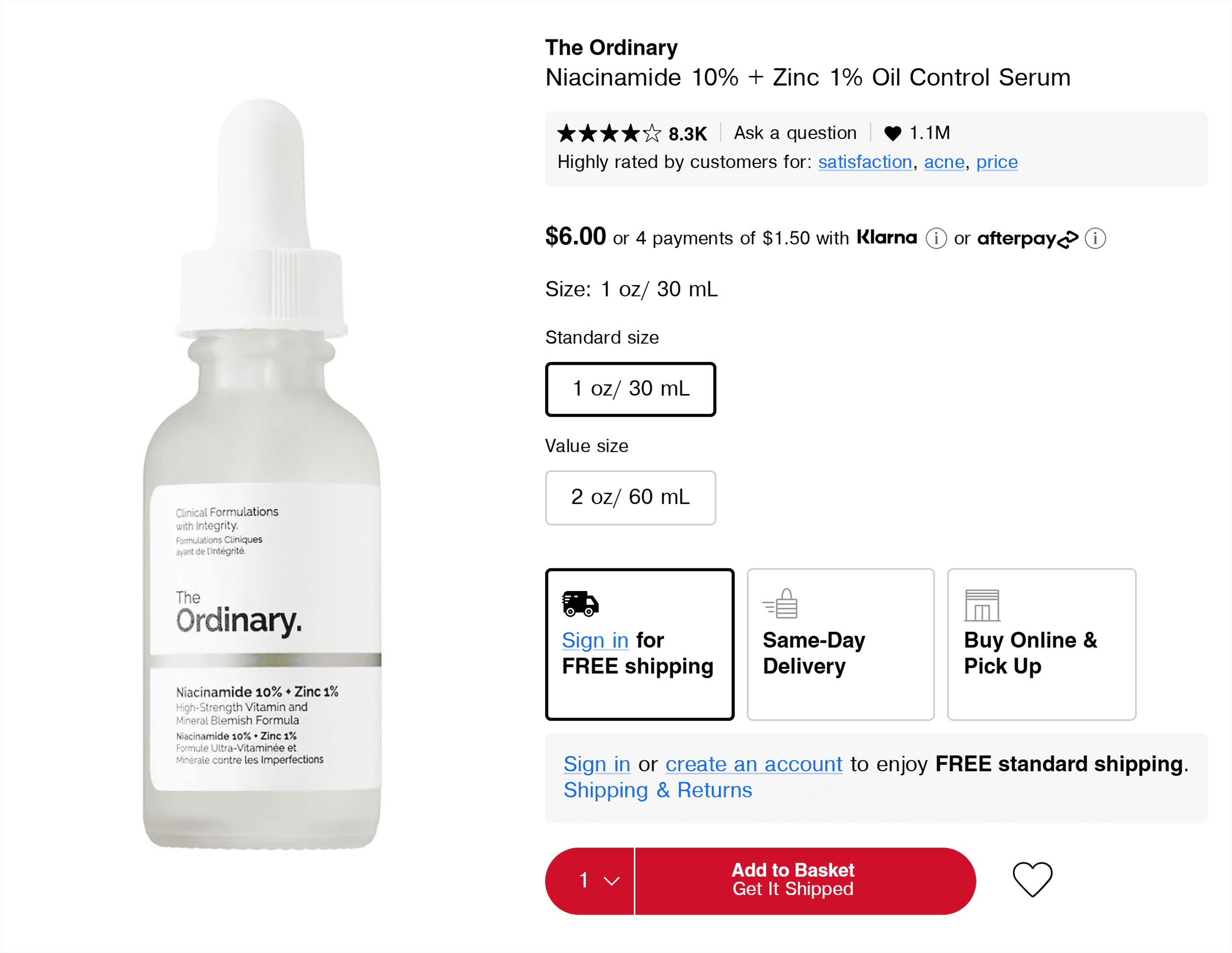
Now, let’s look at Sephora’s product pages.
Key product details like price, availability, and shipping info are clearly displayed.
This gives potential customers the details they need to make a confident purchase decision.
The product photos do some heavy lifting, too.
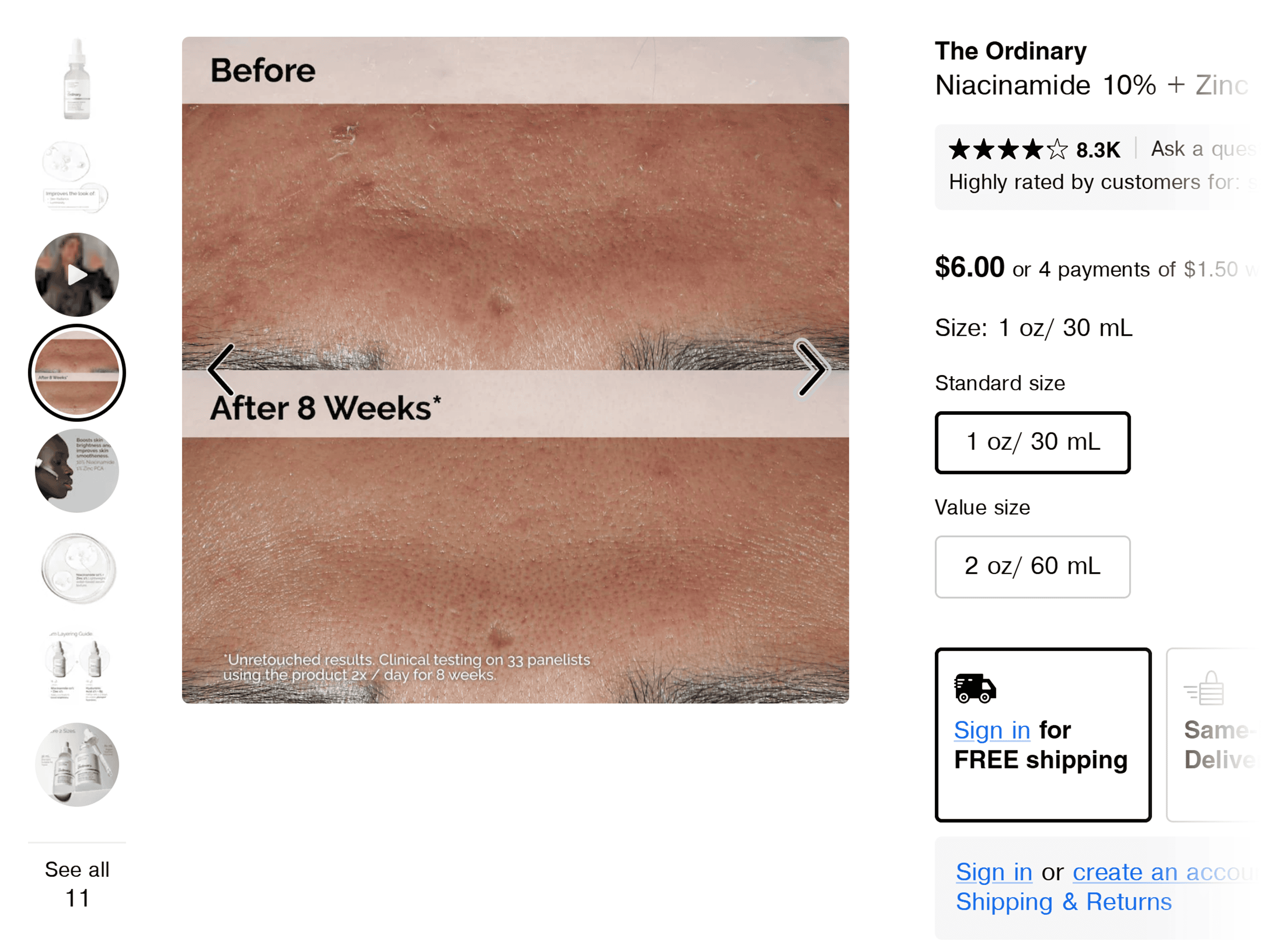
First, Sephora uses unedited images to show real results.
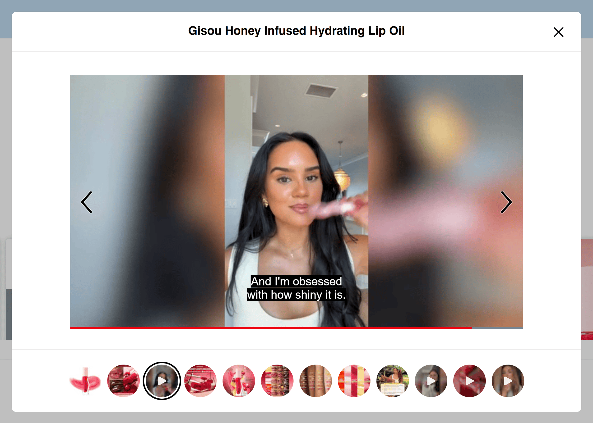
It also includes influencer videos that show real people using the product.
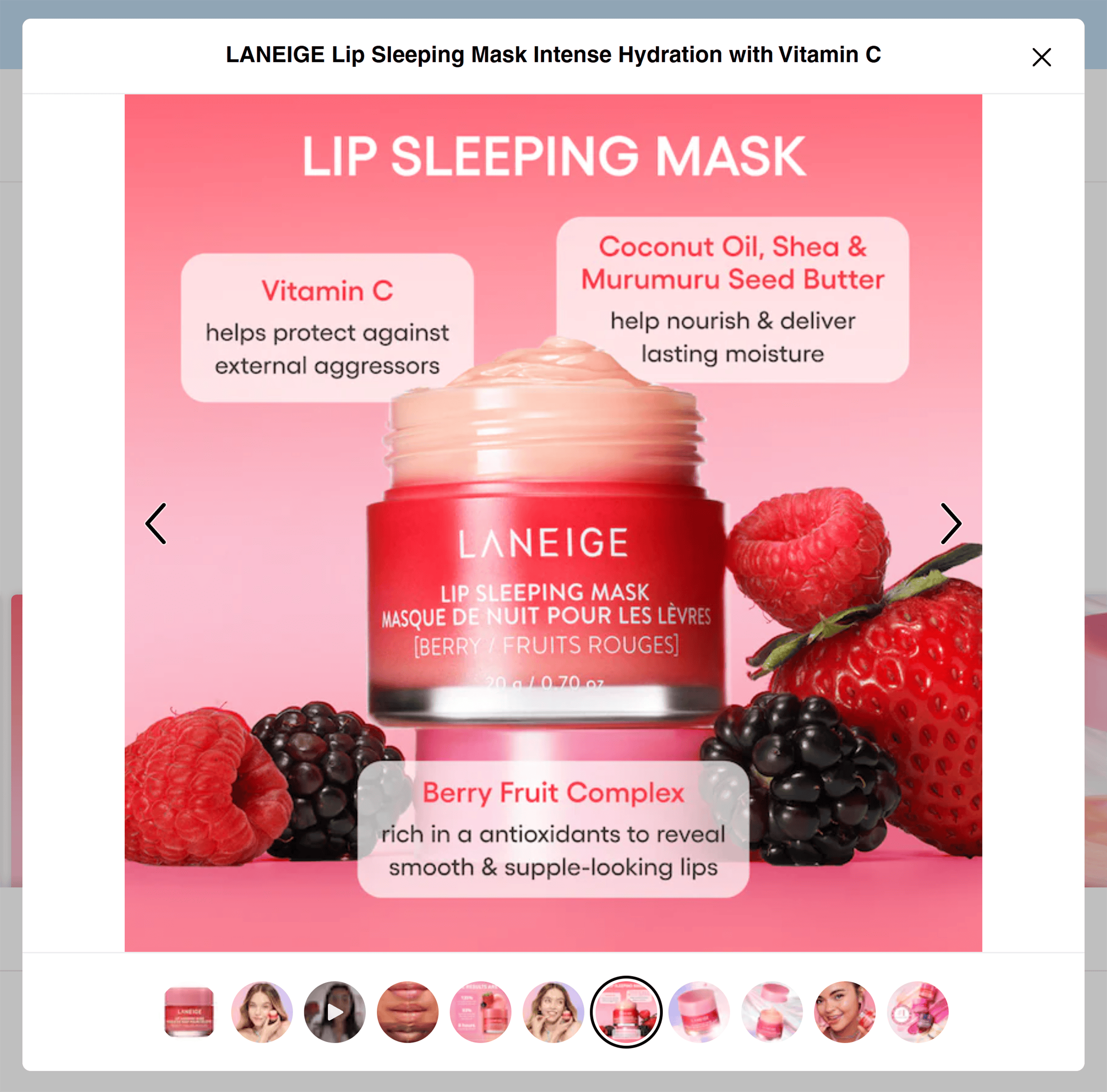
Then, there are photos with ingredient callouts that highlight key benefits.
As you can see, everything about Sephora’s product pages encourages action:
- Clear product details help visitors understand the value
- Social proof like unedited photos and videos builds trust in the products
These elements work together to make it easy for visitors to take the next step and buy.
How Sephora Looks on Mobile
The mobile experience on Sephora is just as user-friendly.
But you’ll notice one big difference from many ecommerce site designs:
The hamburger menu is missing.
Instead, Sephora uses a scrollable text-based menu at the top.
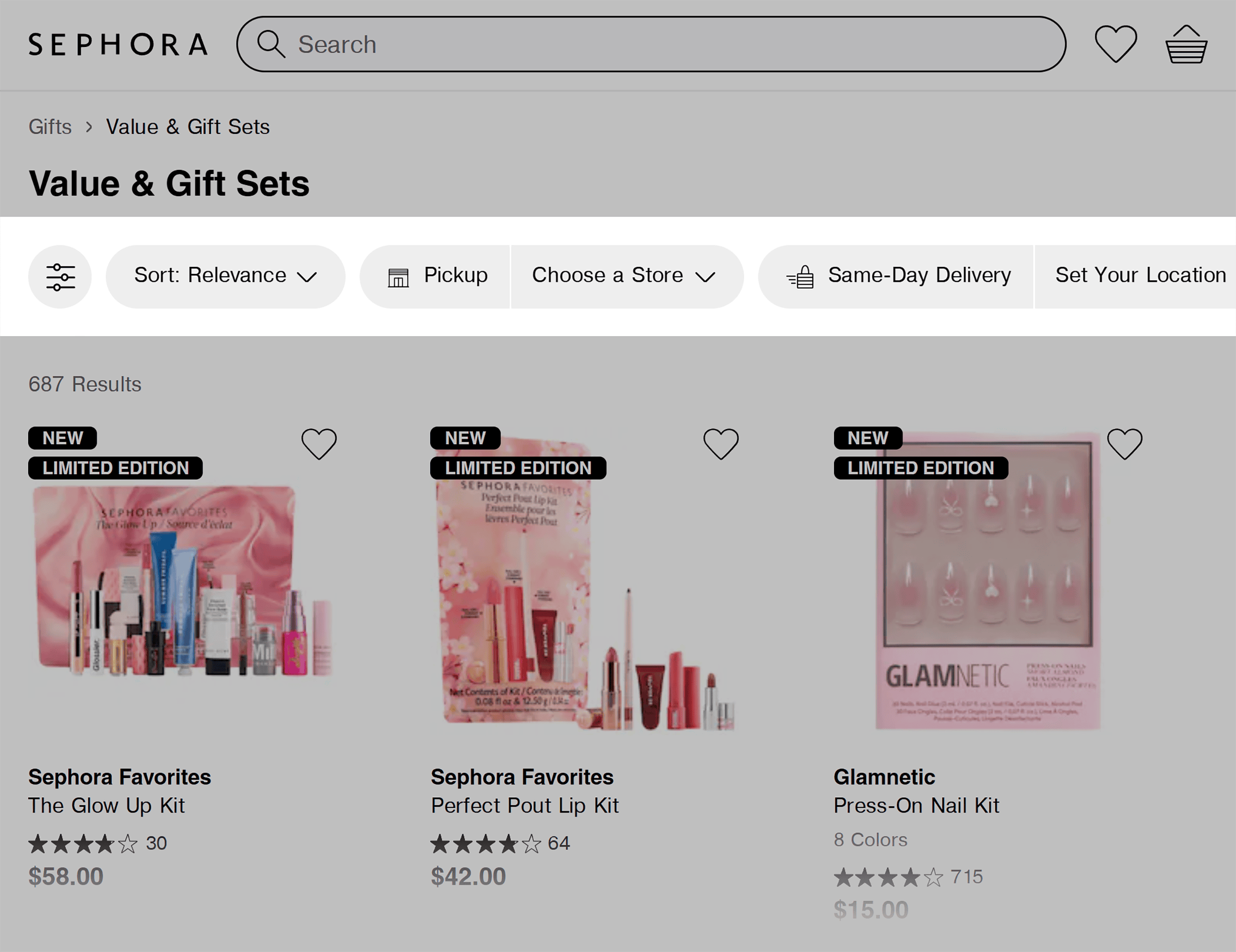
And a bottom navigation bar that pops up when tapped.
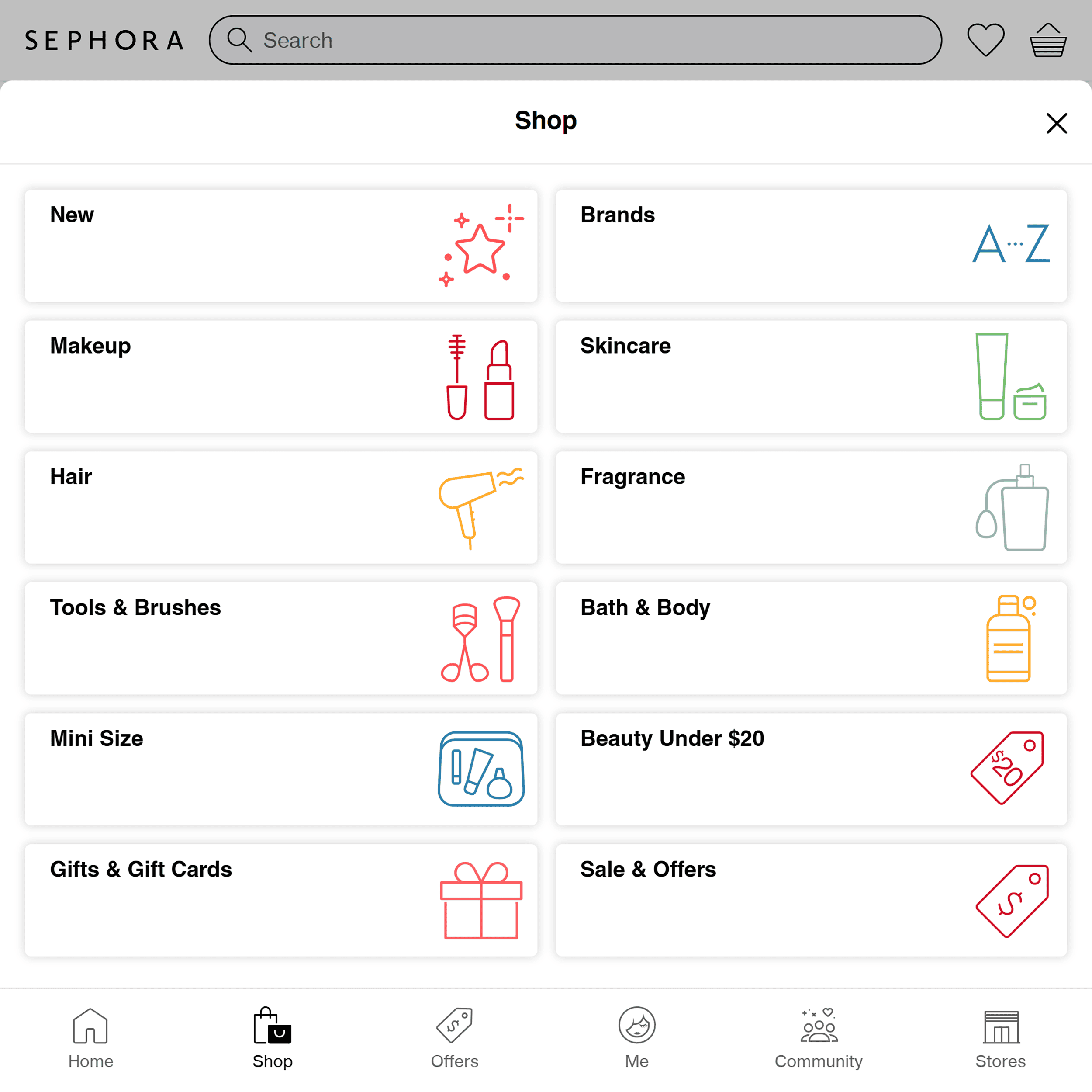
This design isn’t typical, but it reflects Sephora’s customer-first approach.
How so?
Their customer research has shown that the hamburger menu was causing friction. So they removed it.
This move paid off.
According to Andrew Birgiolas, UX Lead at Sephora:
Takeaways
- Bridge online business and in-store shopping: If you offer in-store pickup, make it impossible to miss. Don’t bury it in the checkout process.
- Simplify navigation: Use scrollable menus with clear, readable labels that guide customers naturally.
- Make data-driven decisions: Ask your customers what they like and don’t like about your site and make changes based on these insights. And use tools like heatmaps to find out what elements of your site are acting as stumbling blocks.
5. RevZilla
RevZilla is a shop for motorcycle enthusiasts.
They offer a range of products from riding gear to bike parts.
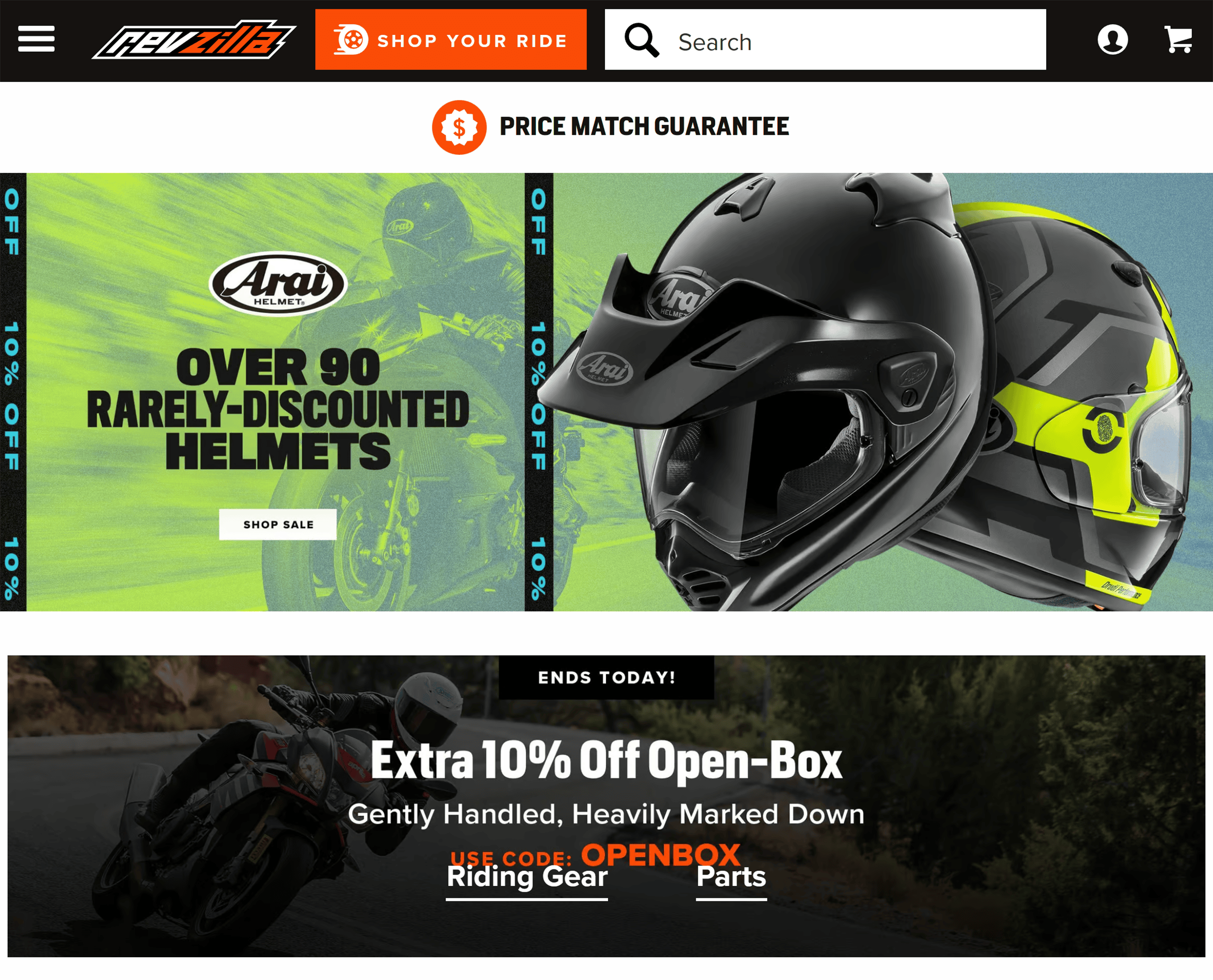
A big part of their conversion strategy?
Building a community.
Their “Riders Preferred Membership (RPM)” offers members exclusive perks and benefits.
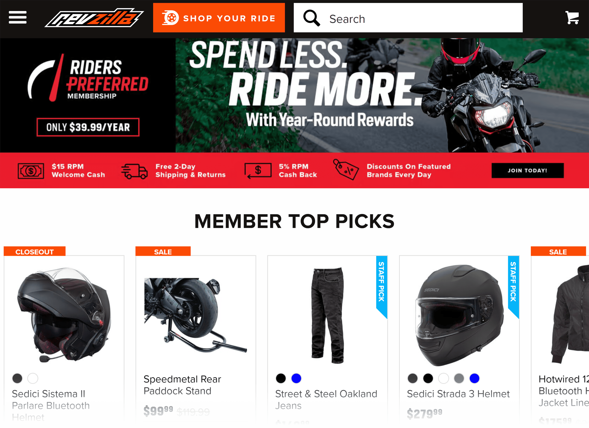
The moment you land on the site, it’s clear that members get special treatment.
This taps into a powerful psychological driver: the need to belong.
But RevZilla’s strategy goes beyond community.
The site is also filled with customer-centric features that speed up the buying process.
Just look at the header.
You’ll find a search bar and the “SHOP YOUR RIDE” button.

The search bar supports average users just browsing the site. These are the shoppers casually exploring options or researching gear.
But “SHOP YOUR RIDE?”
It’s for riders who know what they’re looking for and want to find products fast.
Just enter your bike’s make, model, and year…
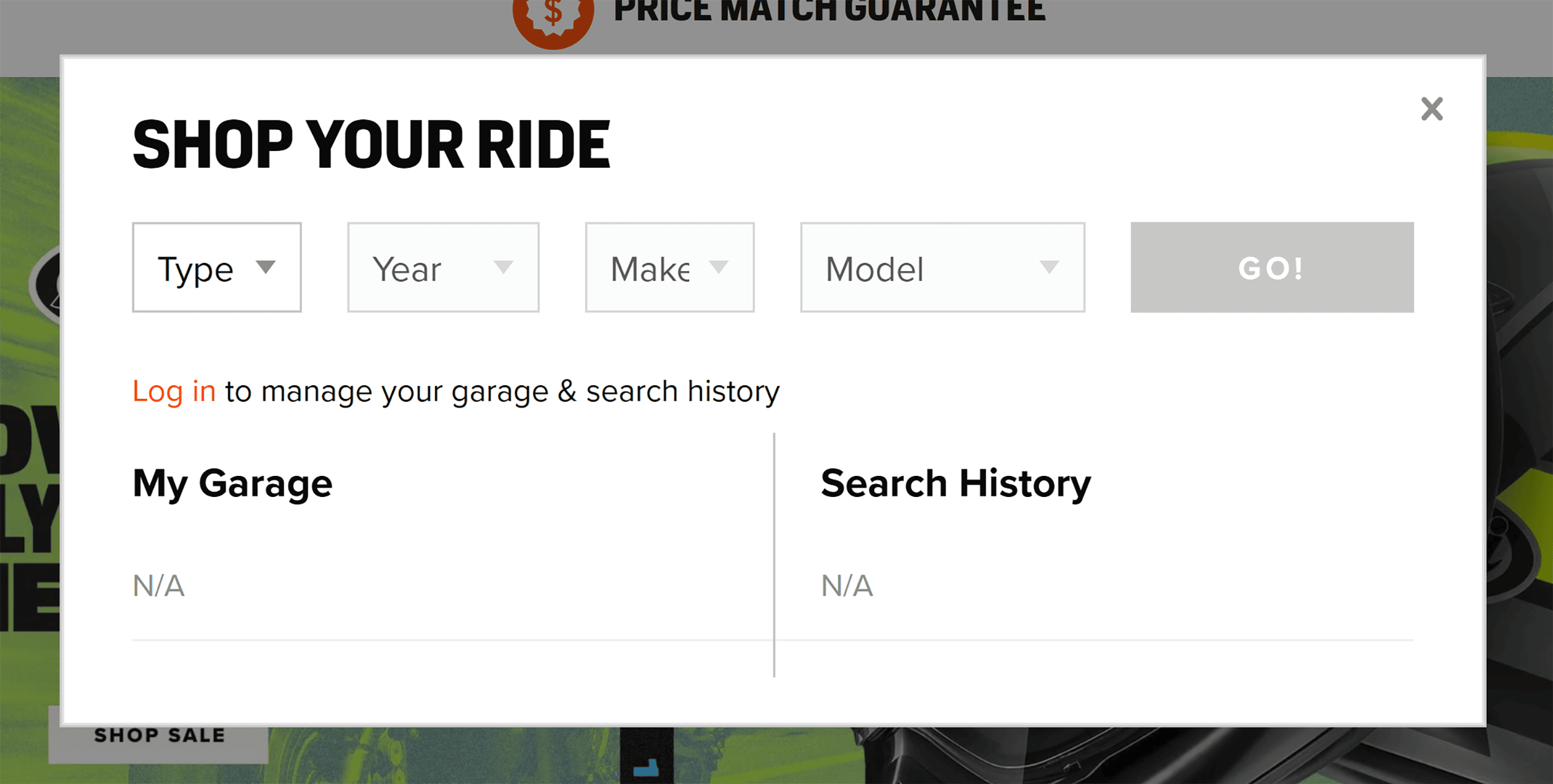
…and the search results instantly filter into products that fit your ride.
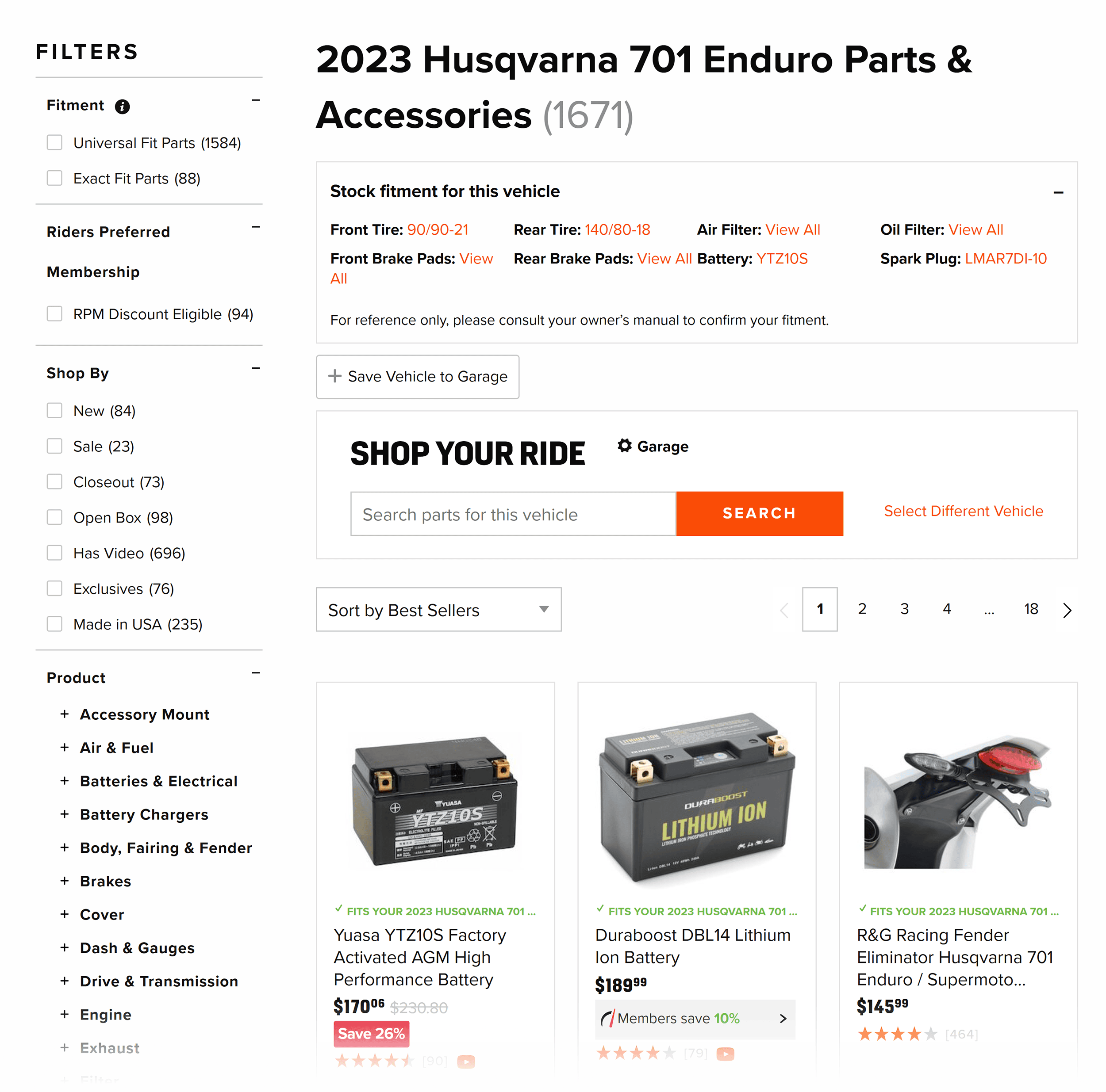
How about that for search personalization?
RevZilla also uses dynamic personalization.
It detects the customer’s location and updates shipping details automatically.
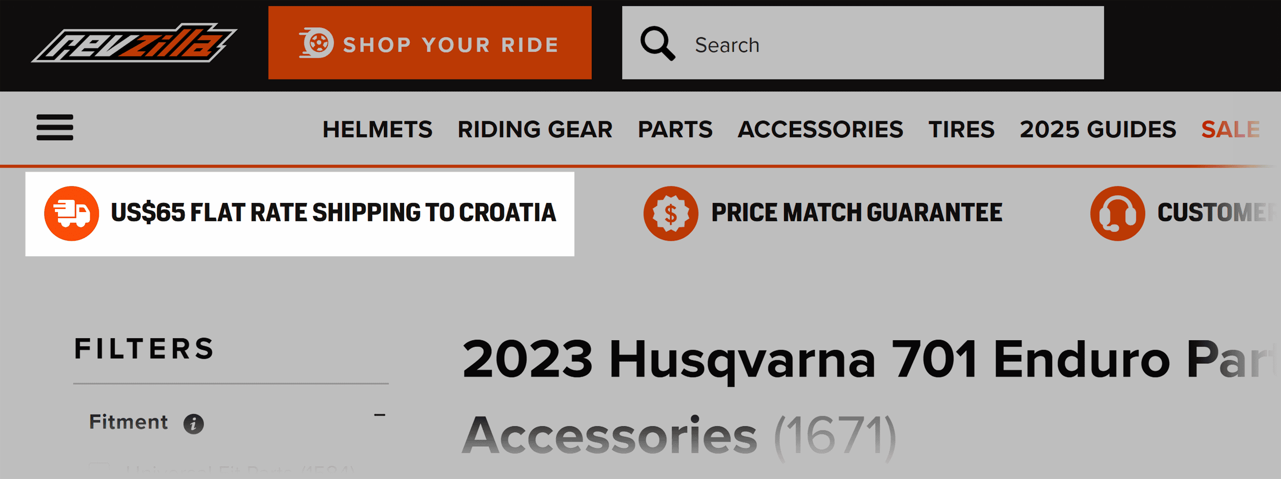
It’s a small touch, but it makes customers feel seen.
And the customer-focused design elements don’t stop there.
Check out their “Find Your Perfect Helmet” tool:
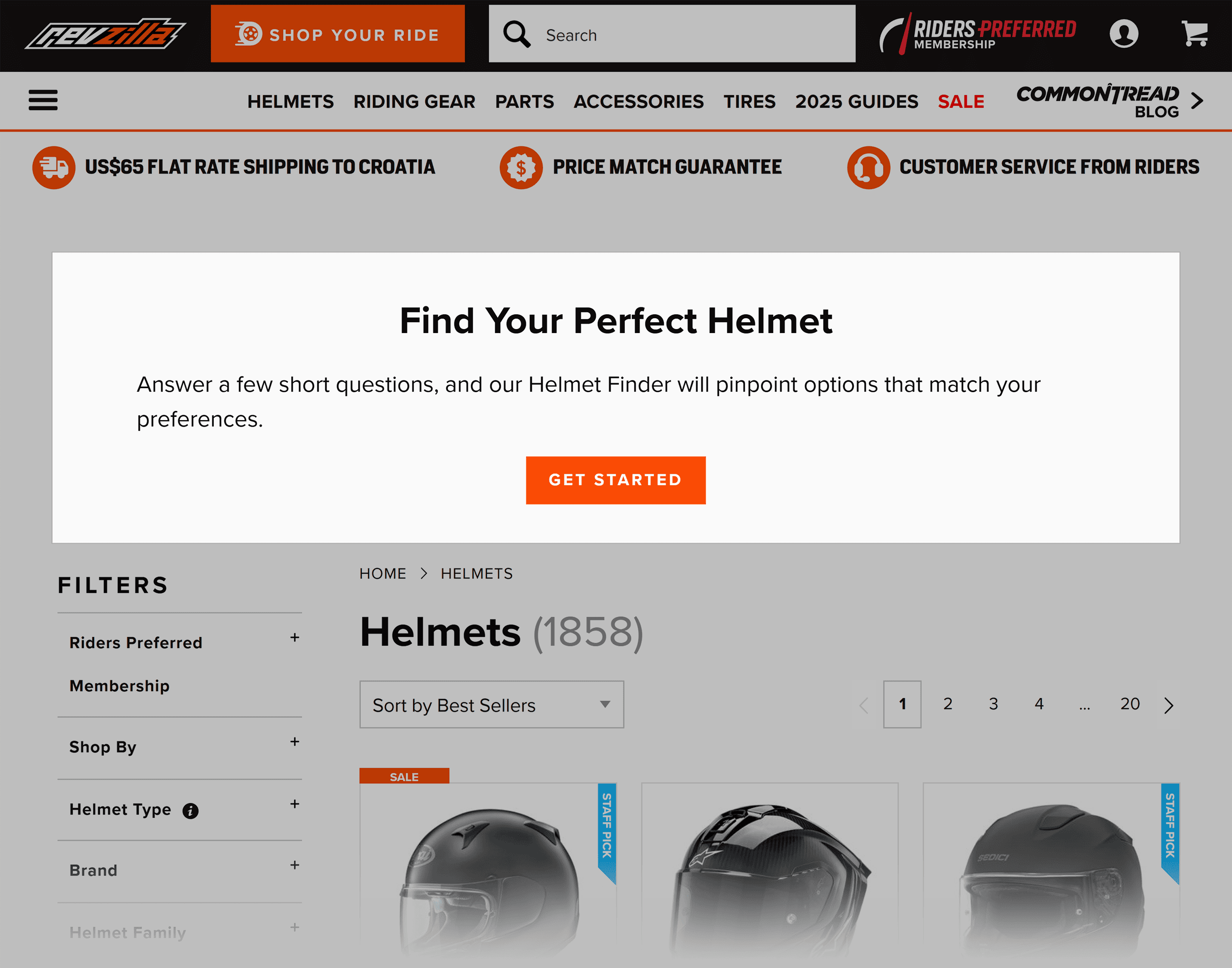
It’s an interactive product quiz that asks simple questions to match users with the right helmet.
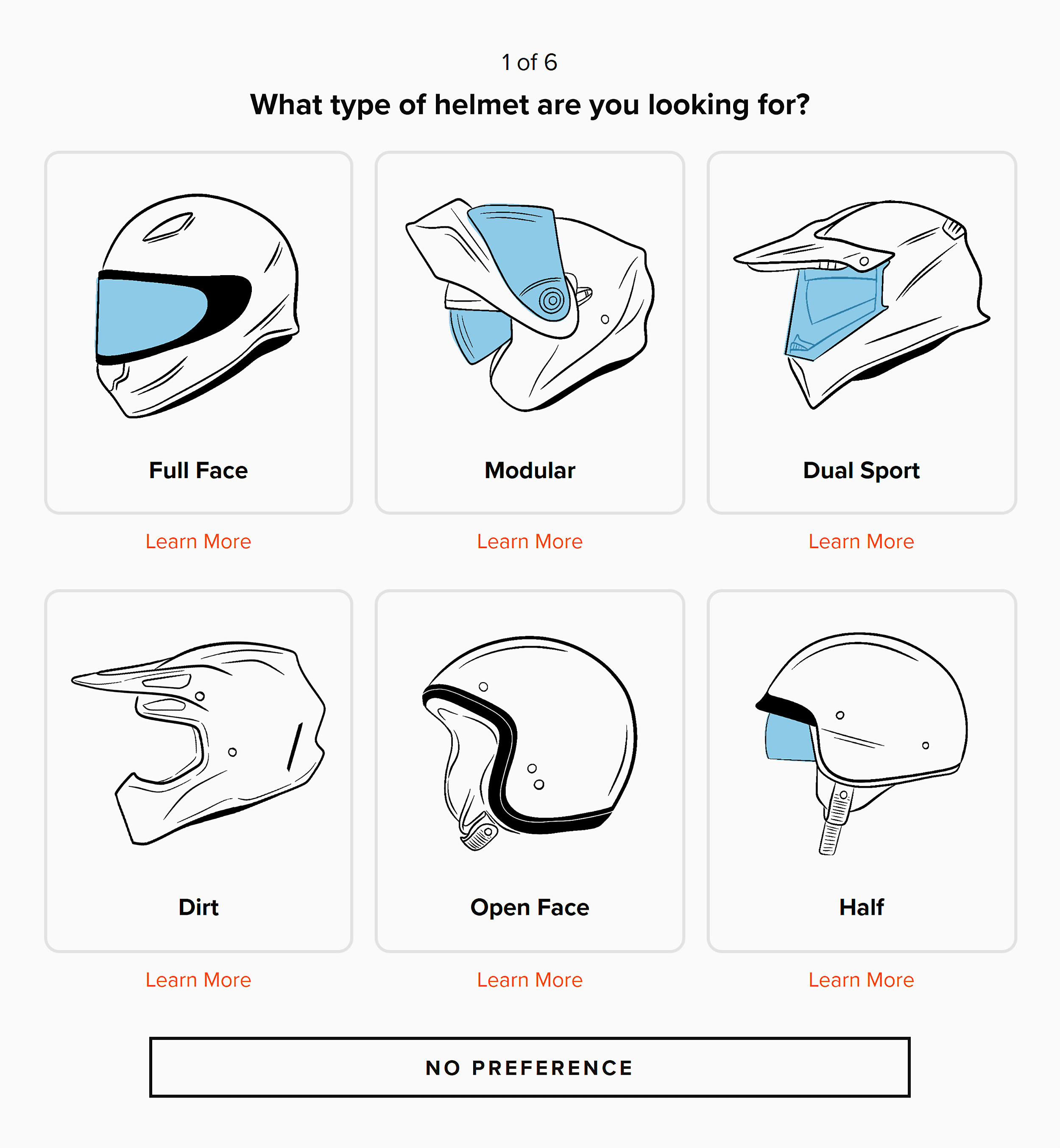
This interactive element boosts engagement.
It also reduces decision fatigue, making it easier for customers to buy.
This is exactly the kind of thoughtful design that makes shoppers feel like the entire site was built just for them.
How RevZilla Looks on Mobile
RevZilla’s mobile site is perfectly adapted for mobile users.
The sticky header keeps essential navigation tools within reach at all times.
This includes the search bar and the “SHOP YOUR RIDE” feature.
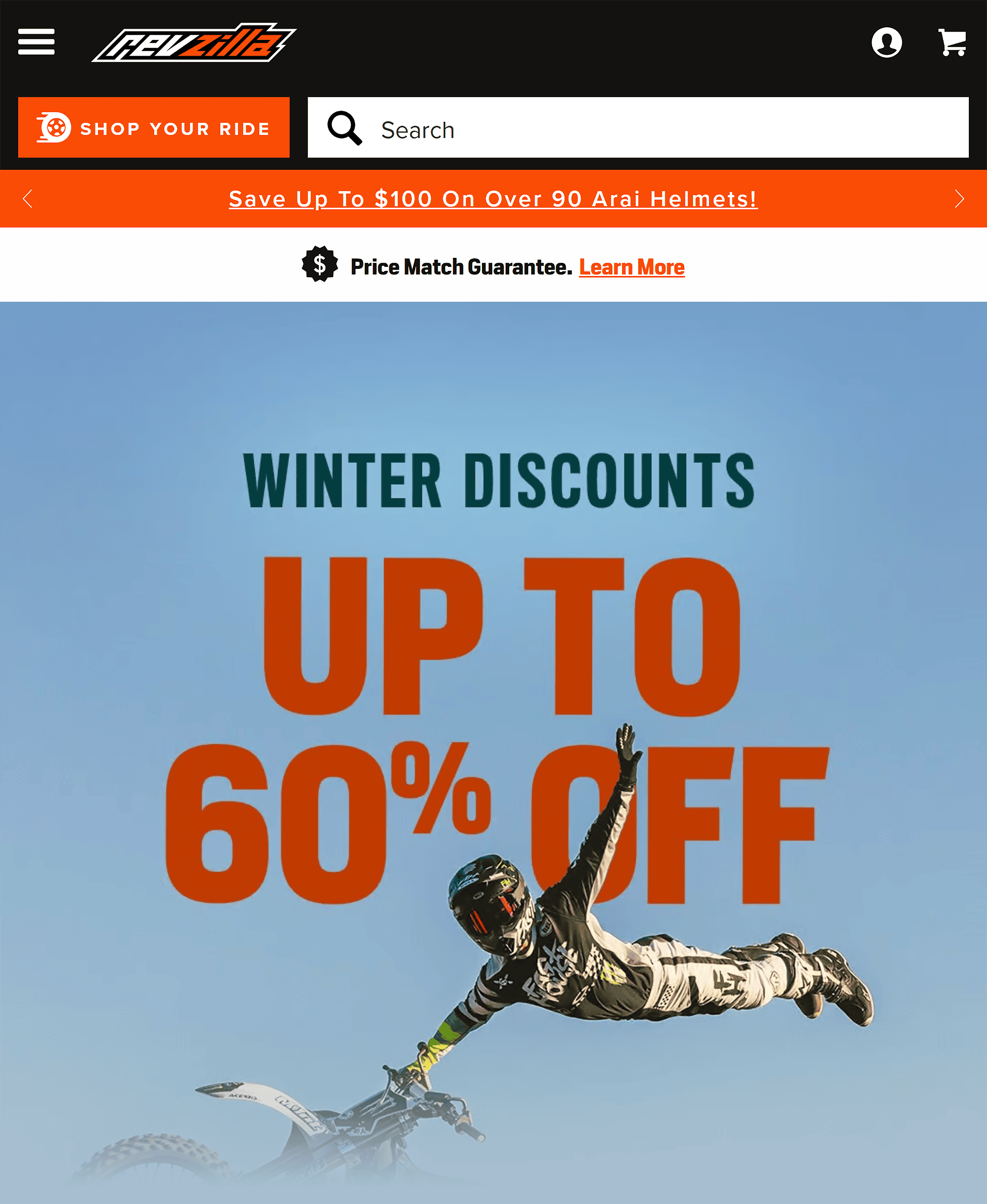
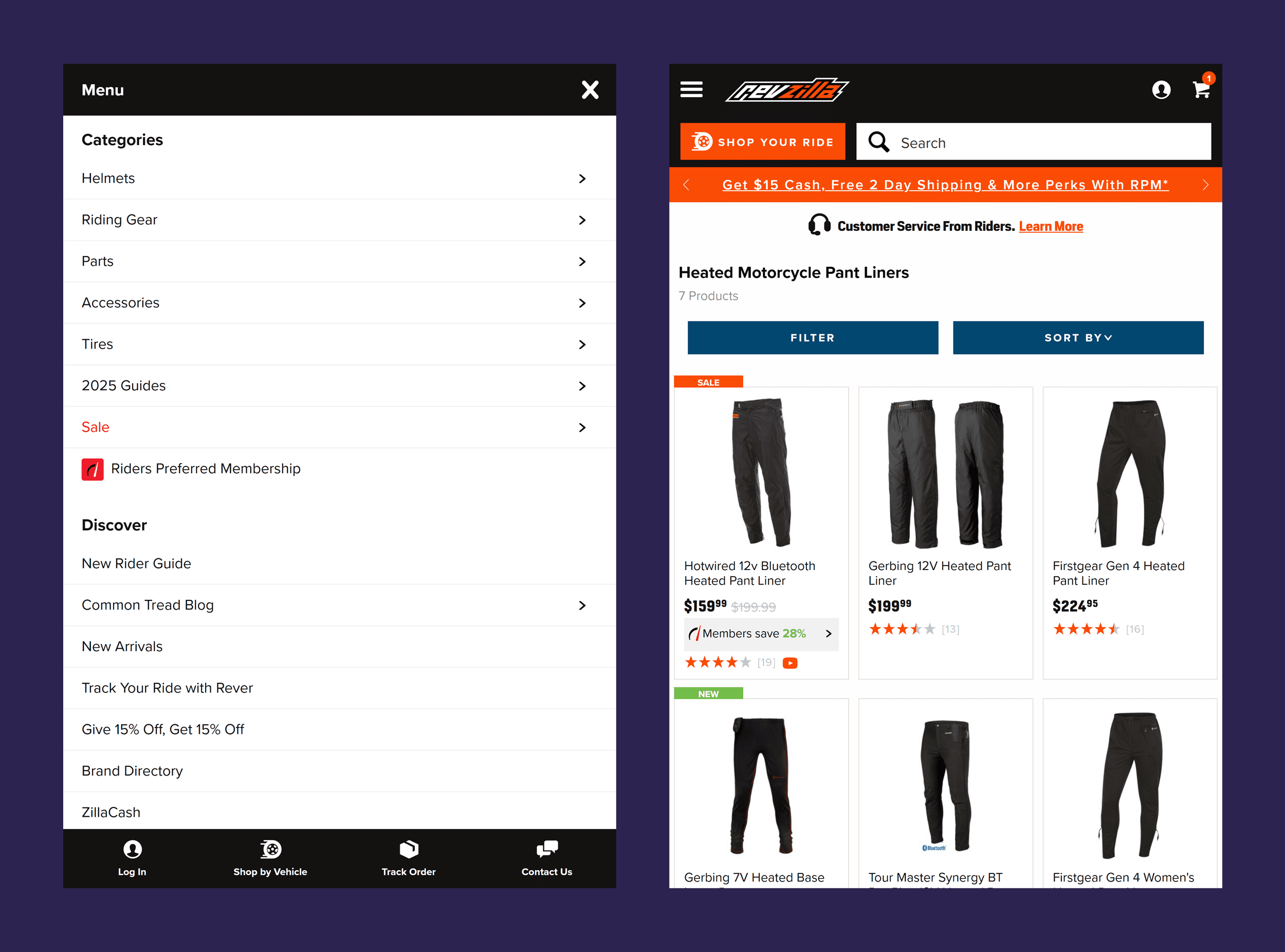
Navigation on mobile is also smooth and responsive.
Filters, buttons, and dropdowns are perfectly sized for touch, and navigation paths are simple and clear.
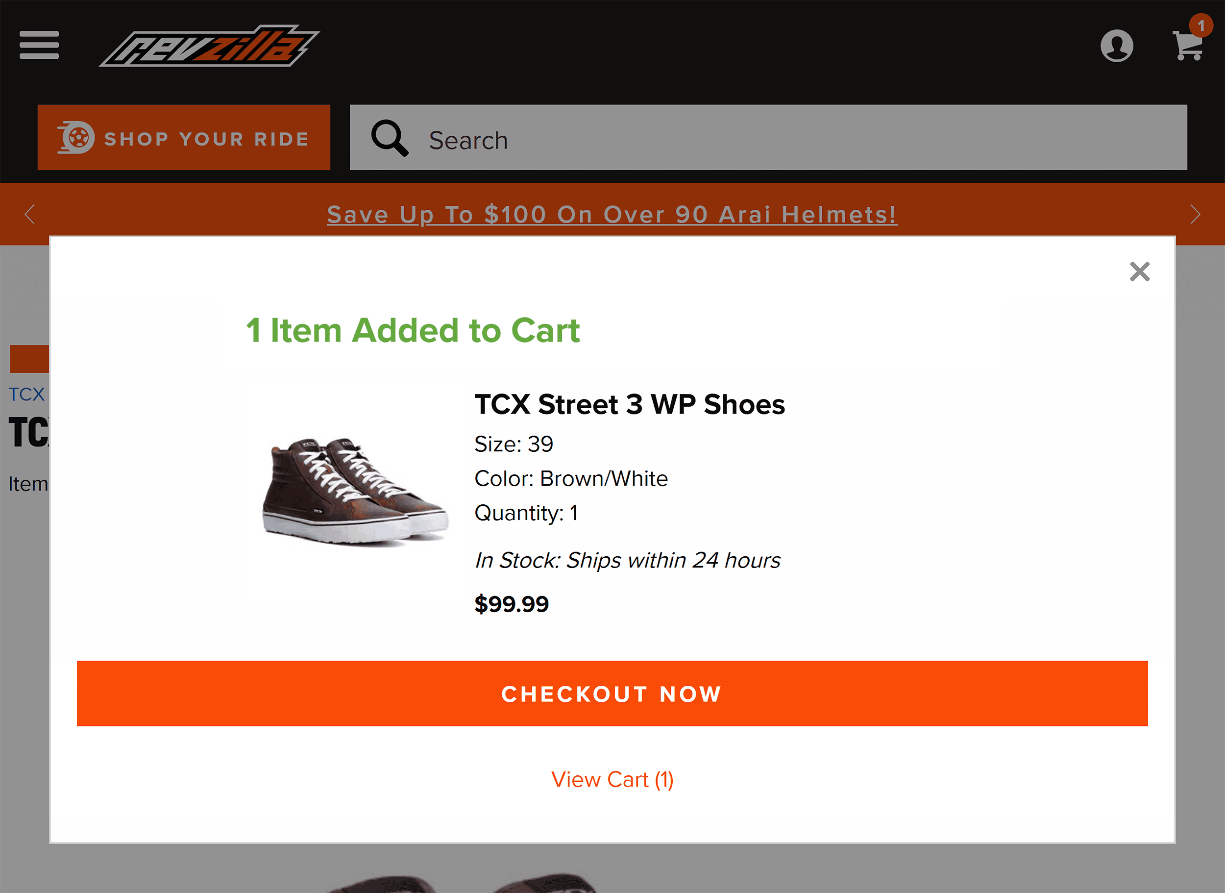
The checkout process is just as thoughtful. It’s designed for speed and simplicity.
There are also progress indicators that show you where you are in the process. And form fields are kept to a minimum.
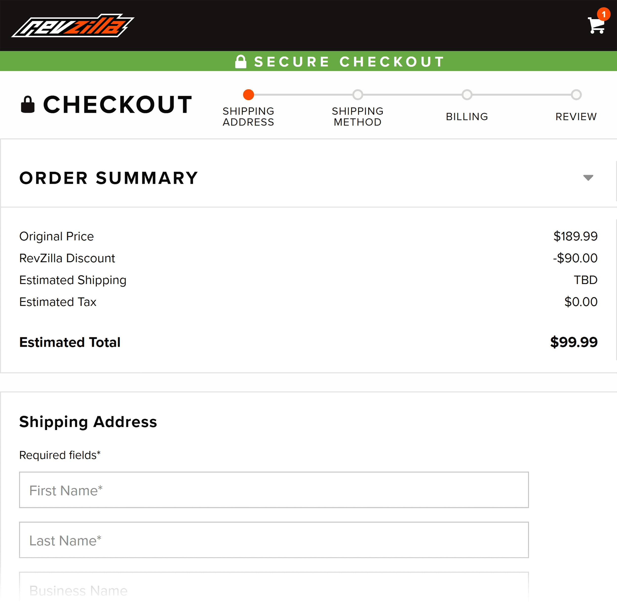
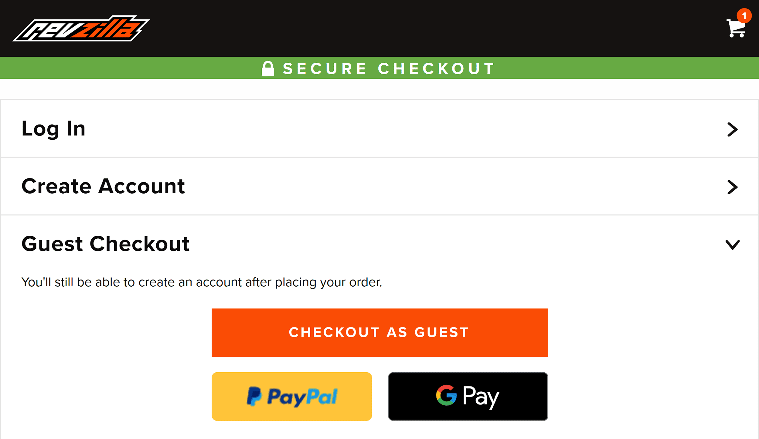
Plus, RevZilla offers guest checkout, which is a way to reduce cart abandonment.
Takeaways
- Build a community, not just a customer base: When customers feel seen, heard, and valued, they’re more likely to stick around and spend more.
- Personalize the shopping experience: The more personalized the experience, the more engaged users become—and engaged users convert. Could your ecommerce website emulate the “Shop Your Ride” feature?
- Optimize the checkout process: Guest checkout, clear next steps, and fewer form fields remove friction. This makes it easier for users to complete their purchases.
Luxury Ecommerce Websites
Luxury ecommerce sites need to radiate sophistication and exclusivity on screen.
Not an easy task.
So, how do they create that kind of experience?
With:
- High-quality visuals that capture the product’s exclusivity
- Minimalist layouts that create a refined and polished aesthetic
- Curated design elements that reflect the brand’s elegance
But here’s the real challenge:
How do they exude elegance without slowing the site down?
And if that’s not tricky enough, they also have to nudge customers toward a purchase.
In a subtle way, of course.
6. Tiffany & Co.
World-renowned luxury jewelry store, Tiffany & Co. transforms online shopping into a refined experience.
The site carries the same aura of exclusivity as stepping into one of their flagship stores.
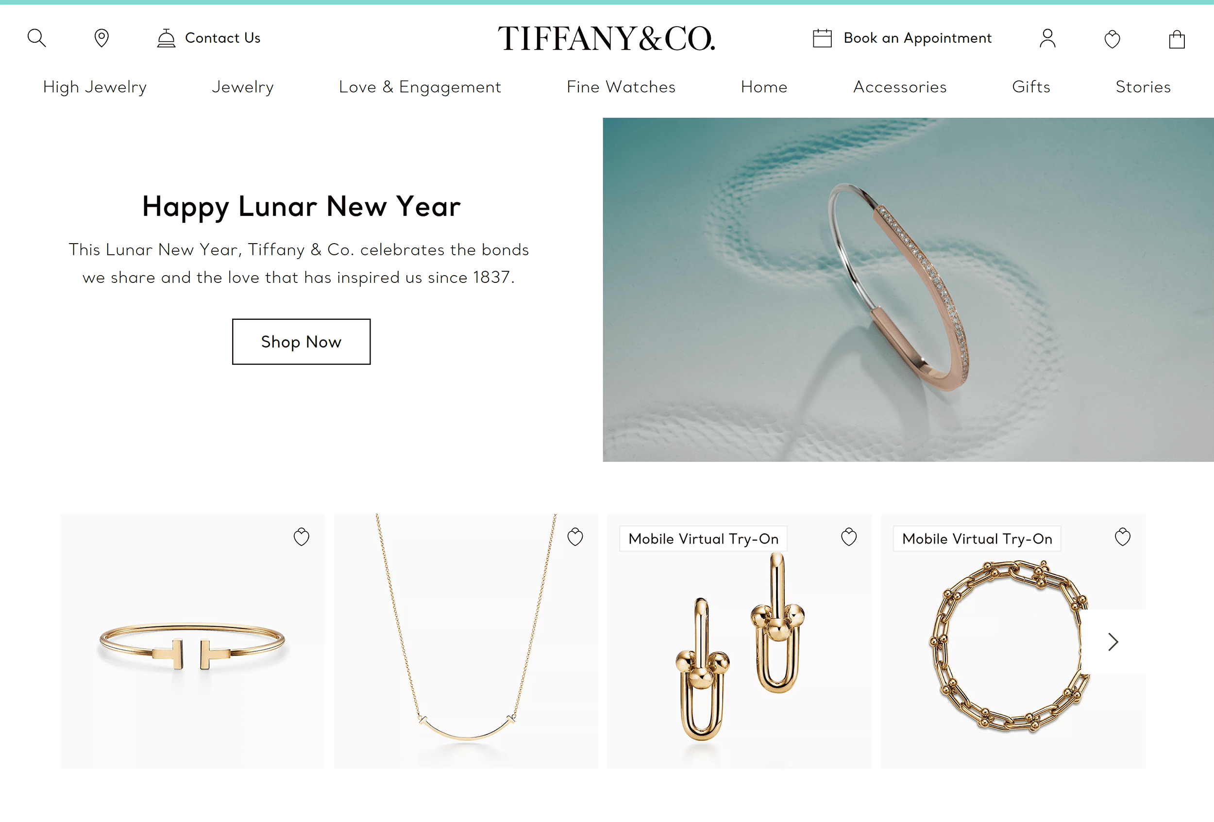
The moment you land on the site, you’re unmistakably in Tiffany’s world.
The iconic Tiffany blue frames every page. And you can feel the elegance in every detail.
The typography is subtle and unobtrusive.
(Just like a butler. Always present but never in the way.)
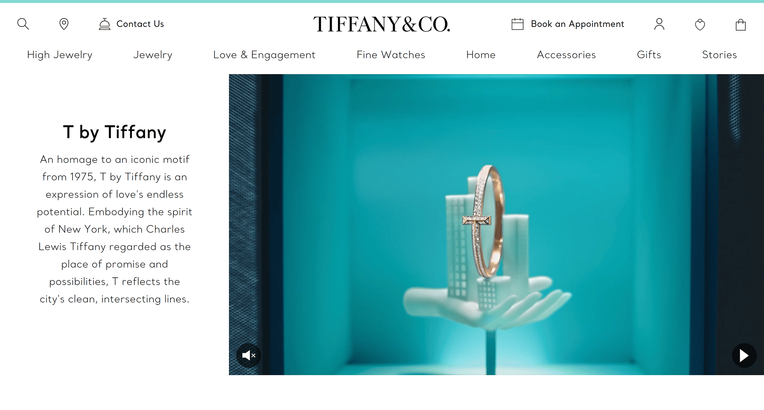
Then, there are the visuals.
High-resolution images take center stage, showcasing the craftsmanship of each product.
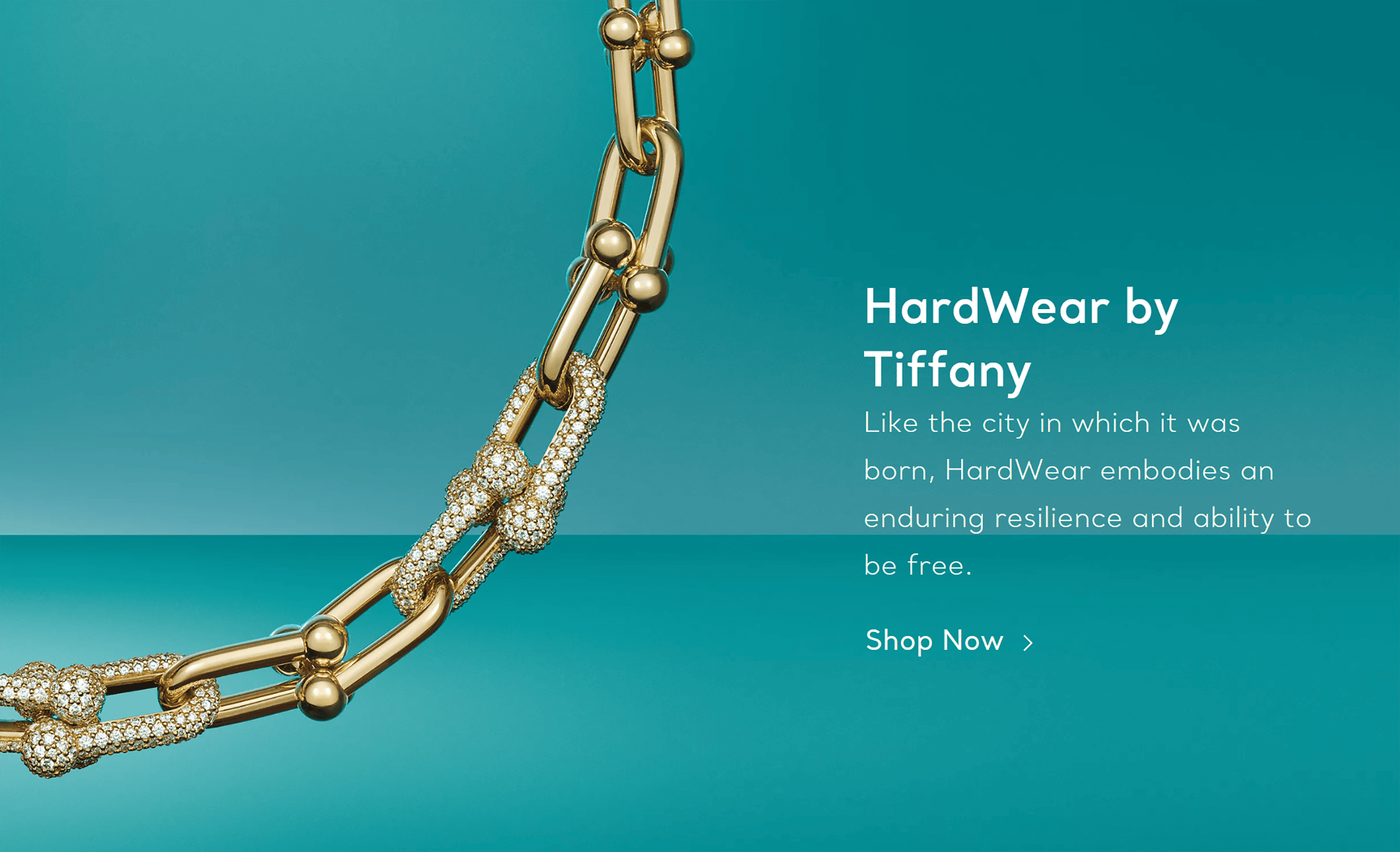
Even the mega menu exudes refinement.
Generous white space, carefully chosen fonts, and a clean layout come together to create a truly luxurious feel.
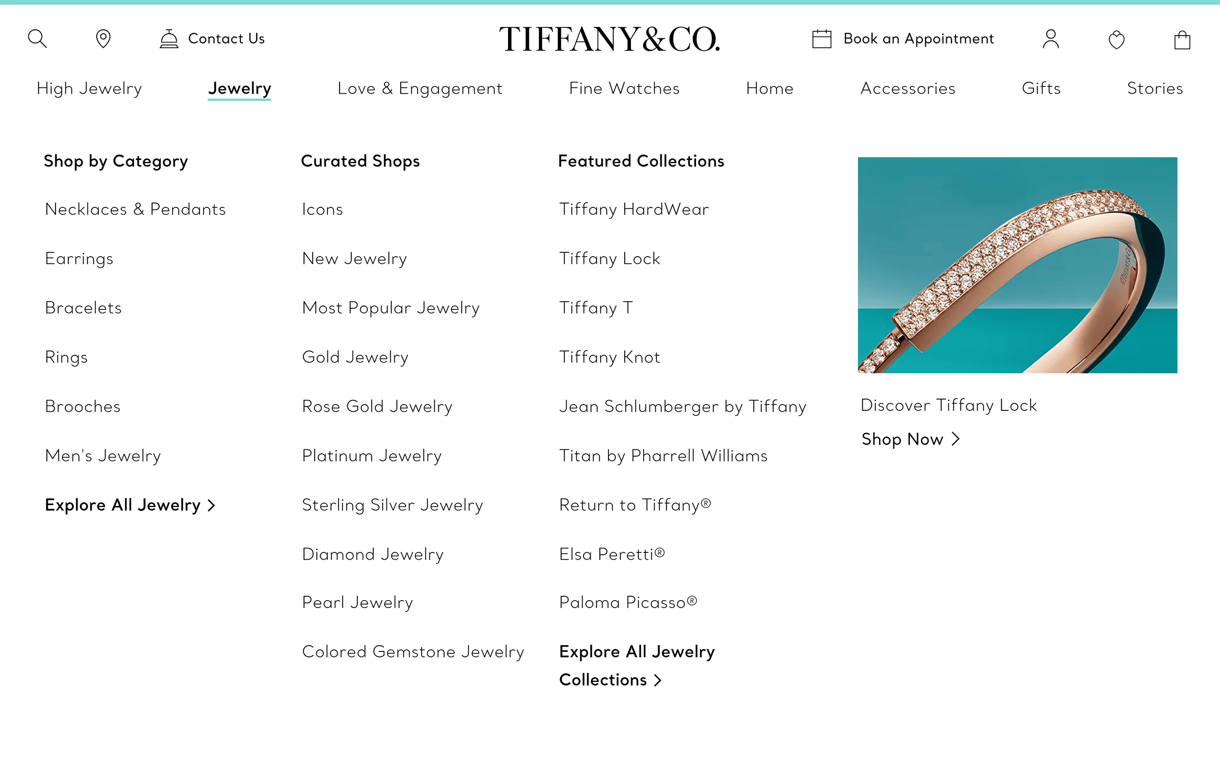
And here’s something that goes against typical ecommerce best practices:
You won’t find star ratings, review snippets, or social proof bars anywhere on the site.
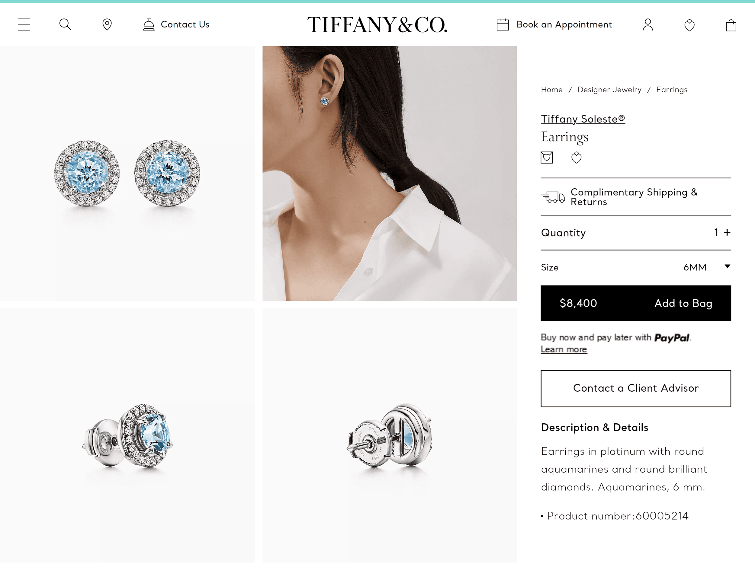
What’s more, the luxury feel goes beyond design choices.
Tiffany & Co. doesn’t rush you into a purchase.
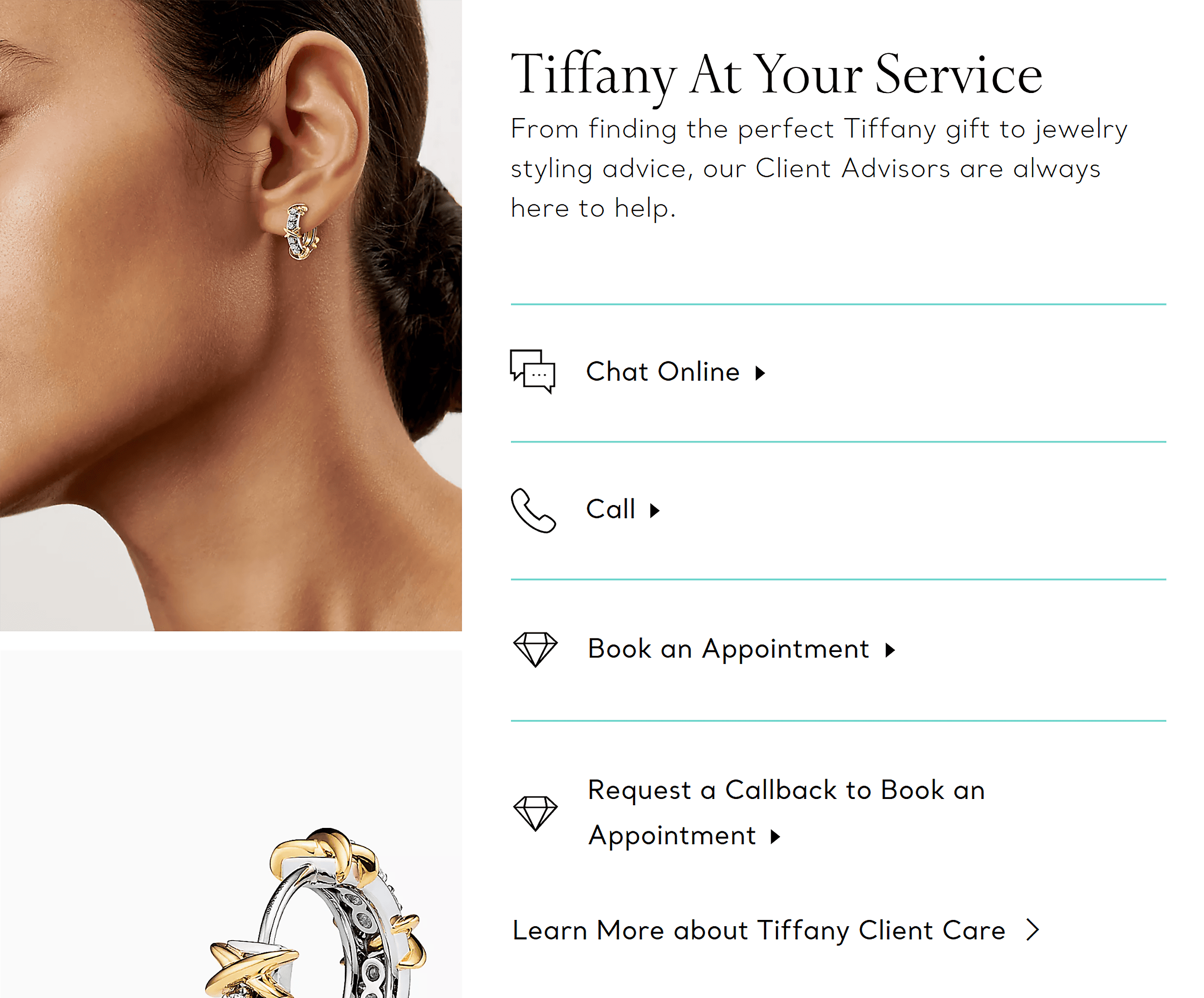
Instead, they make it clear that a slower, more personal shopping experience is an option if you want it.
For example, they offer virtual consultations with jewelry specialists.
This helps customers make better decisions through one-on-one advice.
Then, for diamond purchases, experts are readily available for personalized guidance.
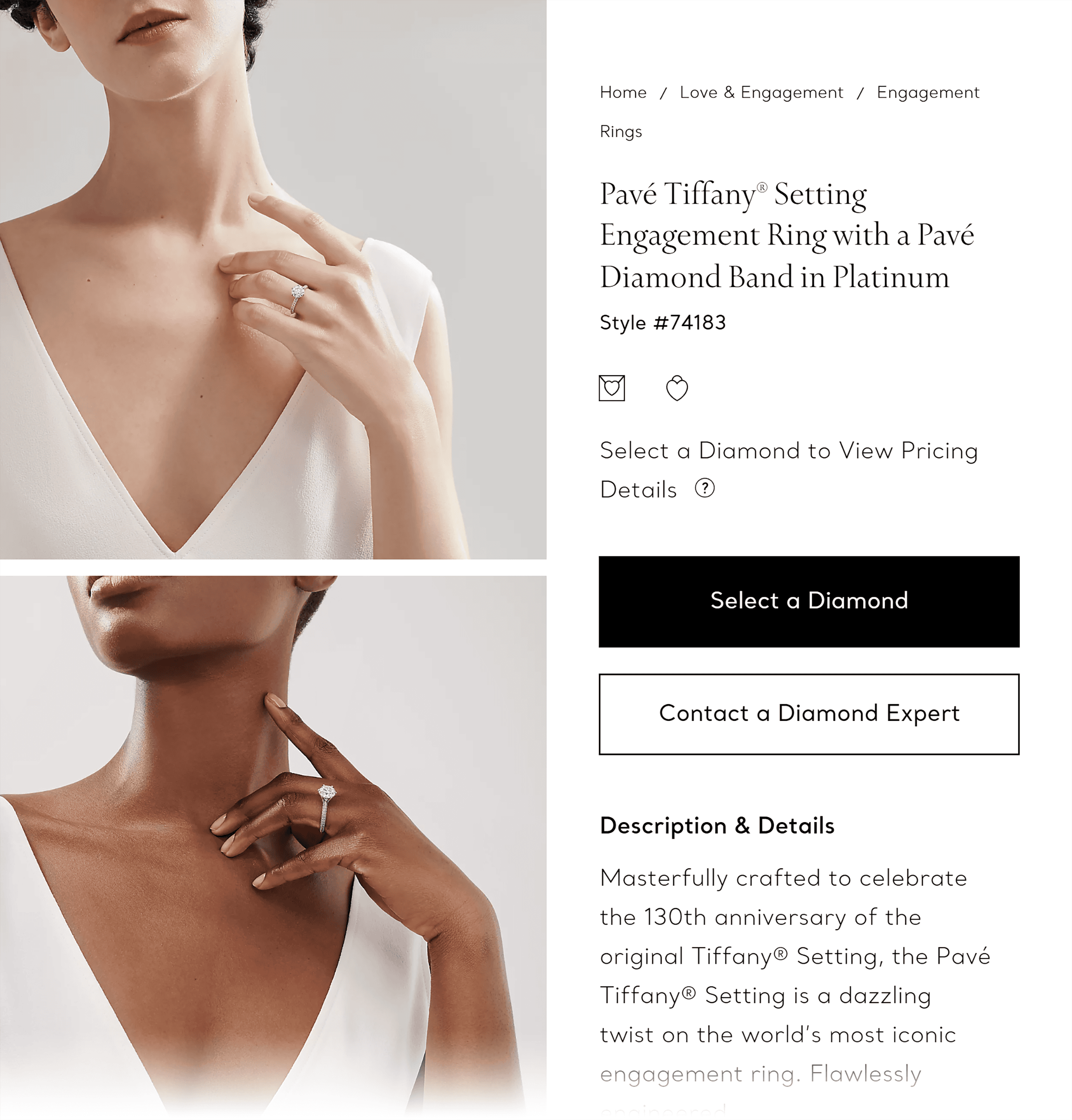
And for customers who want to see and feel the pieces in person, they can easily book in-store appointments.
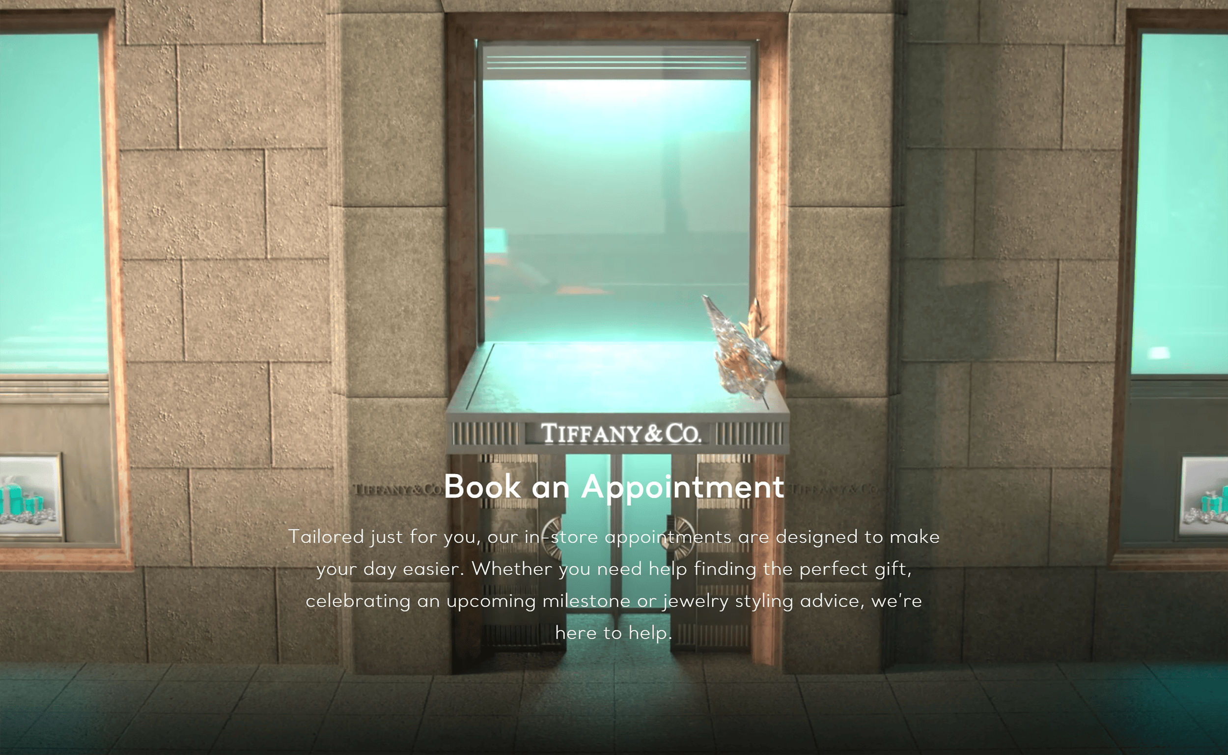
Yes, these paths to purchase may take longer.
But they make the target audience feel seen and valued.
After all, when you’re spending thousands on jewelry, the experience matters as much as the product.
How Tiffany & Co. Looks on Mobile
The mobile experience keeps Tiffany & Co’s signature elegance intact.
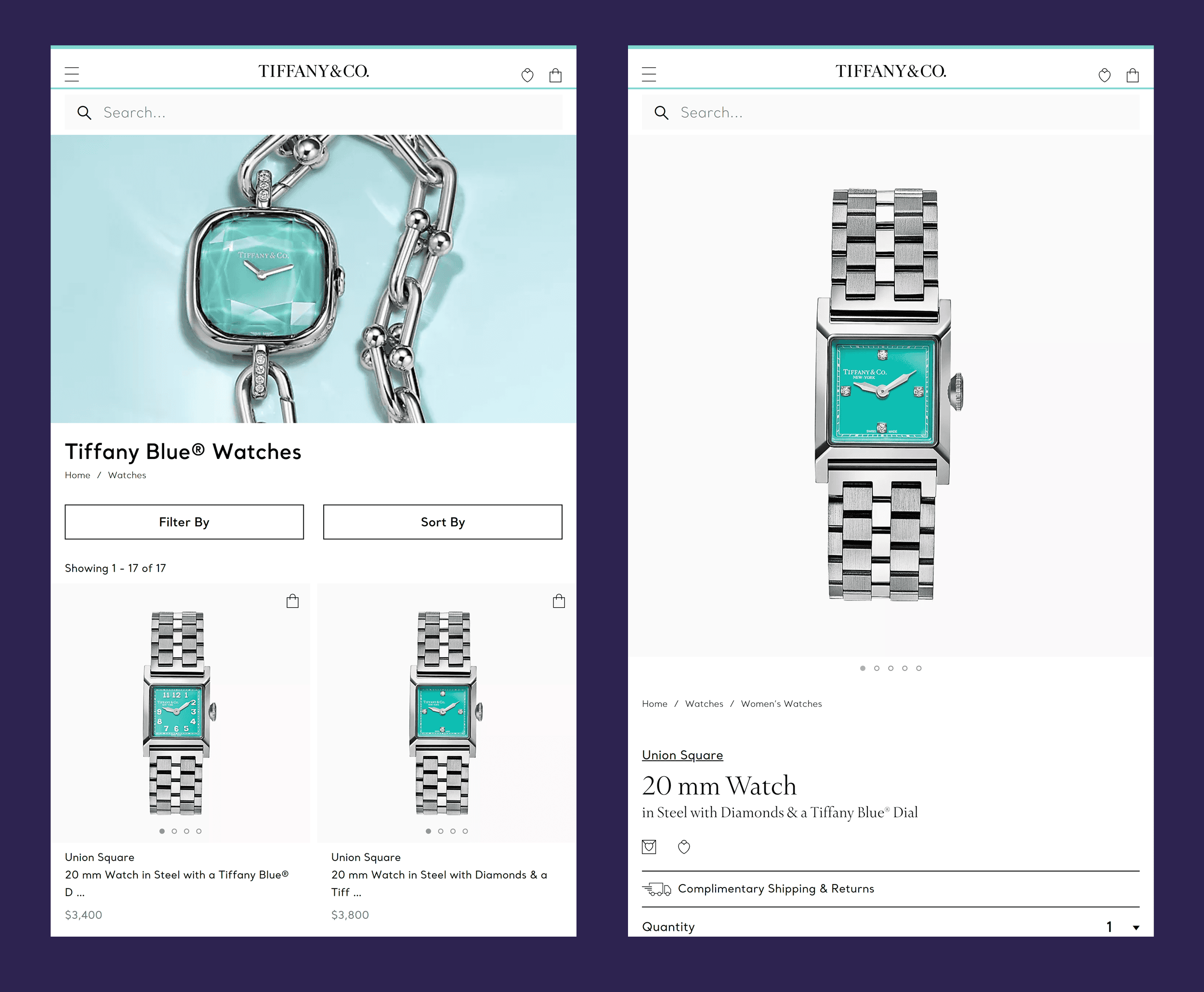
A standout feature is the “Mobile Virtual Try-On” tool.
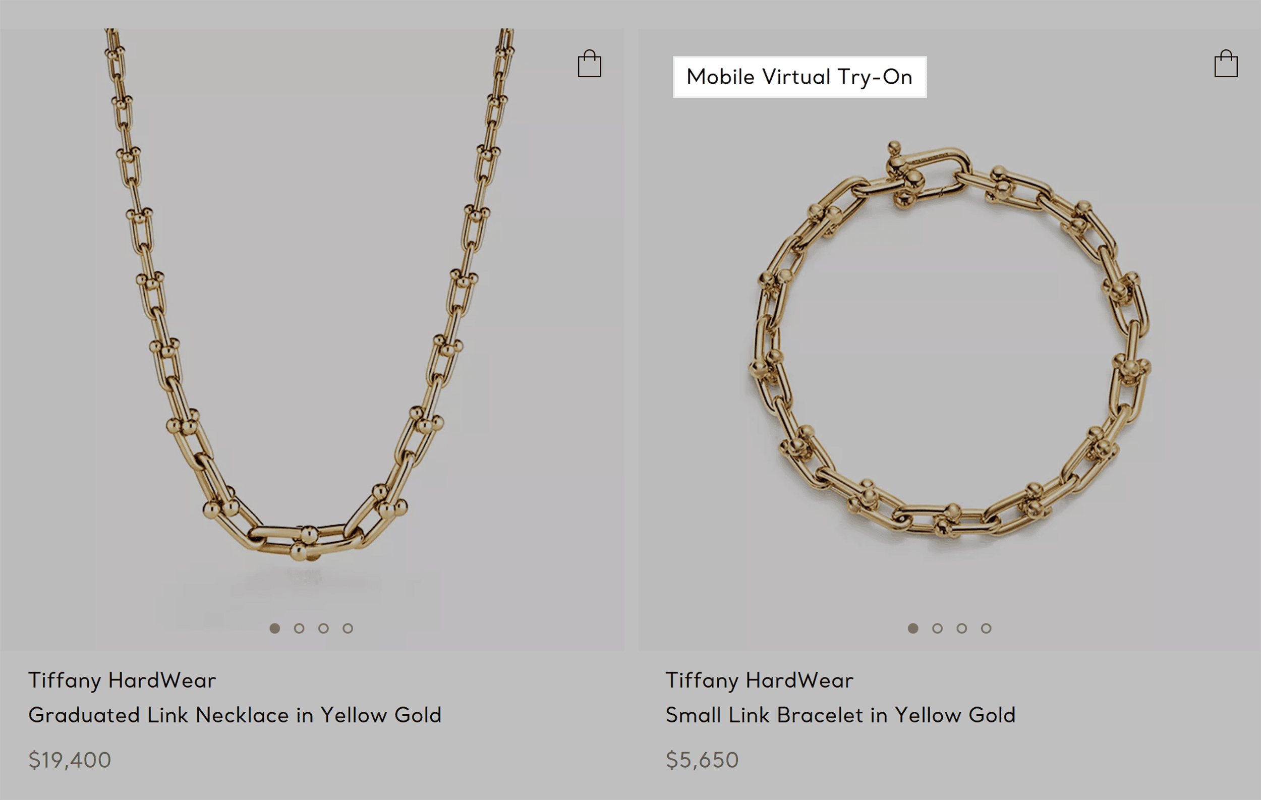
It uses augmented reality (AR) to let customers see how jewelry looks on them using their phone’s camera.
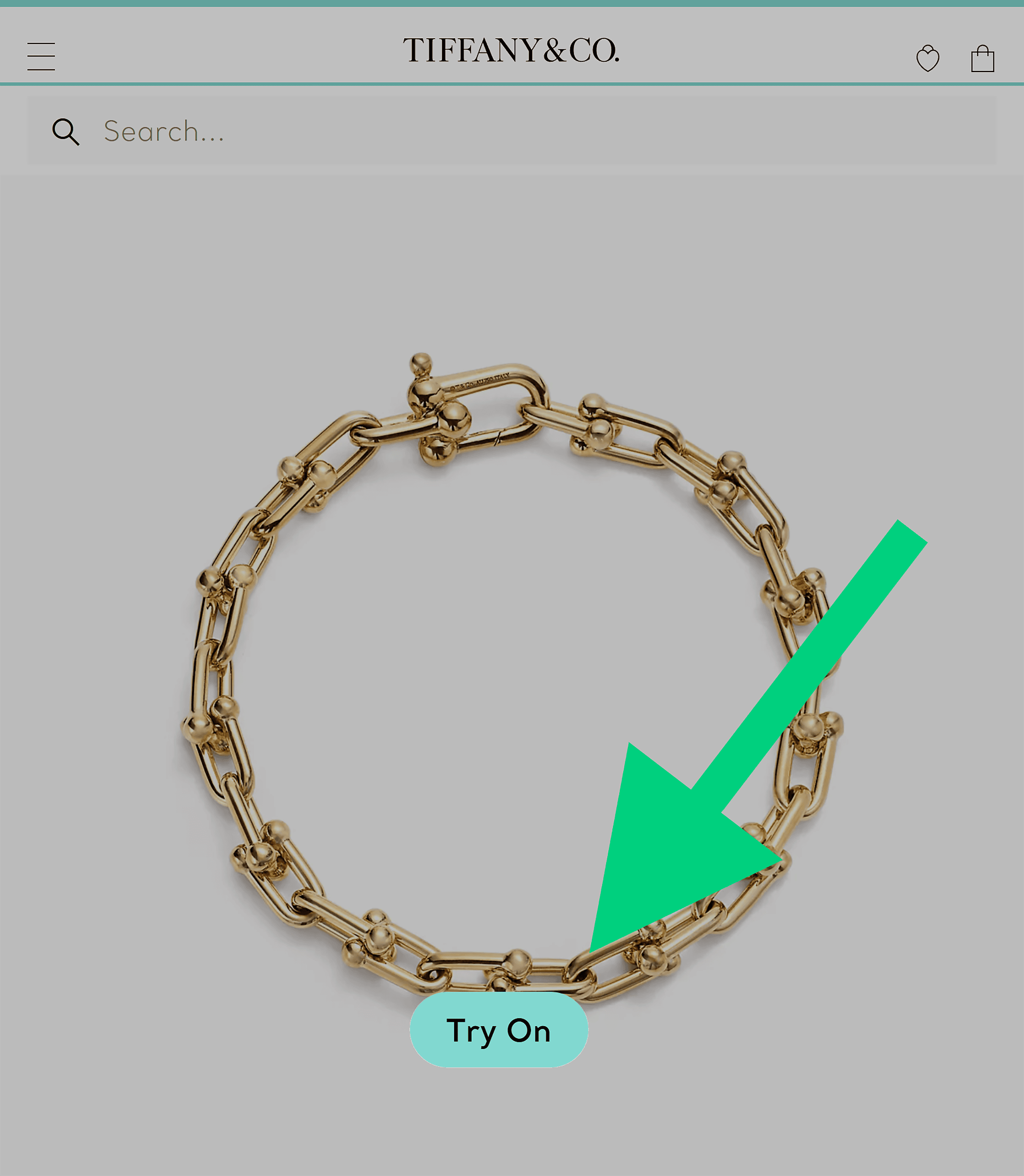
This feature reduces purchase anxiety and gives customers the confidence to move forward.
Takeaways
- Make your site look the part: Prioritize minimalist design, lots of white space, and uncluttered layouts.
- Skip the hard sell: People don’t generally buy luxury items on impulse. Embrace a slow, thoughtful approach and do away with urgency tactics.
- Break best practices if they don’t fit your brand: Skip review stars and ratings if they feel off-brand. But make sure you replace them with stronger conversion triggers like brand authority. Or, say, Anya Taylor-Joy’s face on your homepage.
7. Louis Vuitton
Louis Vuitton is one of the most iconic and recognized names in fashion.
Its website carries the same confidence and authority that only a legacy brand can.
The colors are rich and striking.
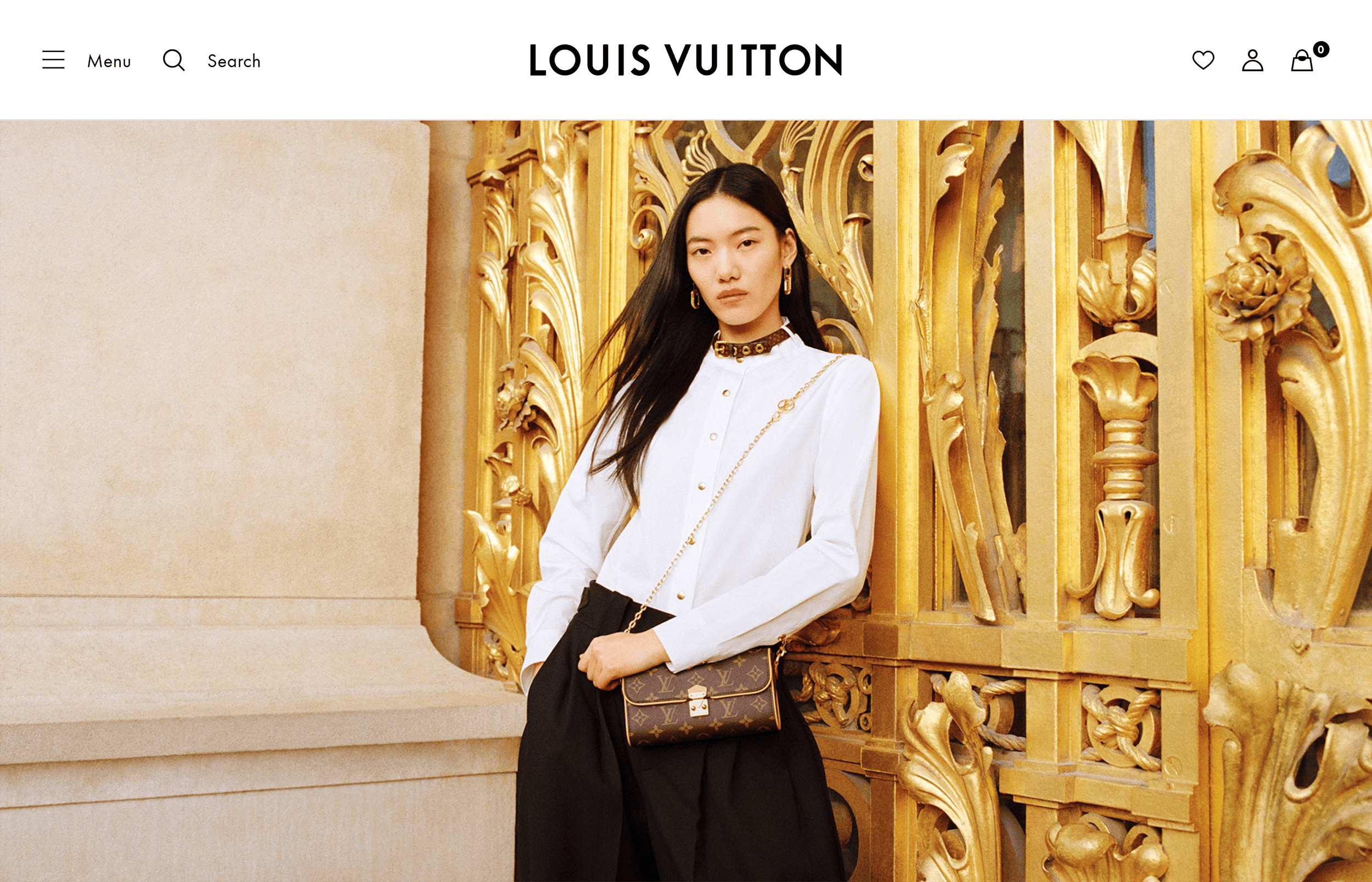
And the oversized product images command attention.
Then, there’s the iconic LV monogram which signals status and quality.
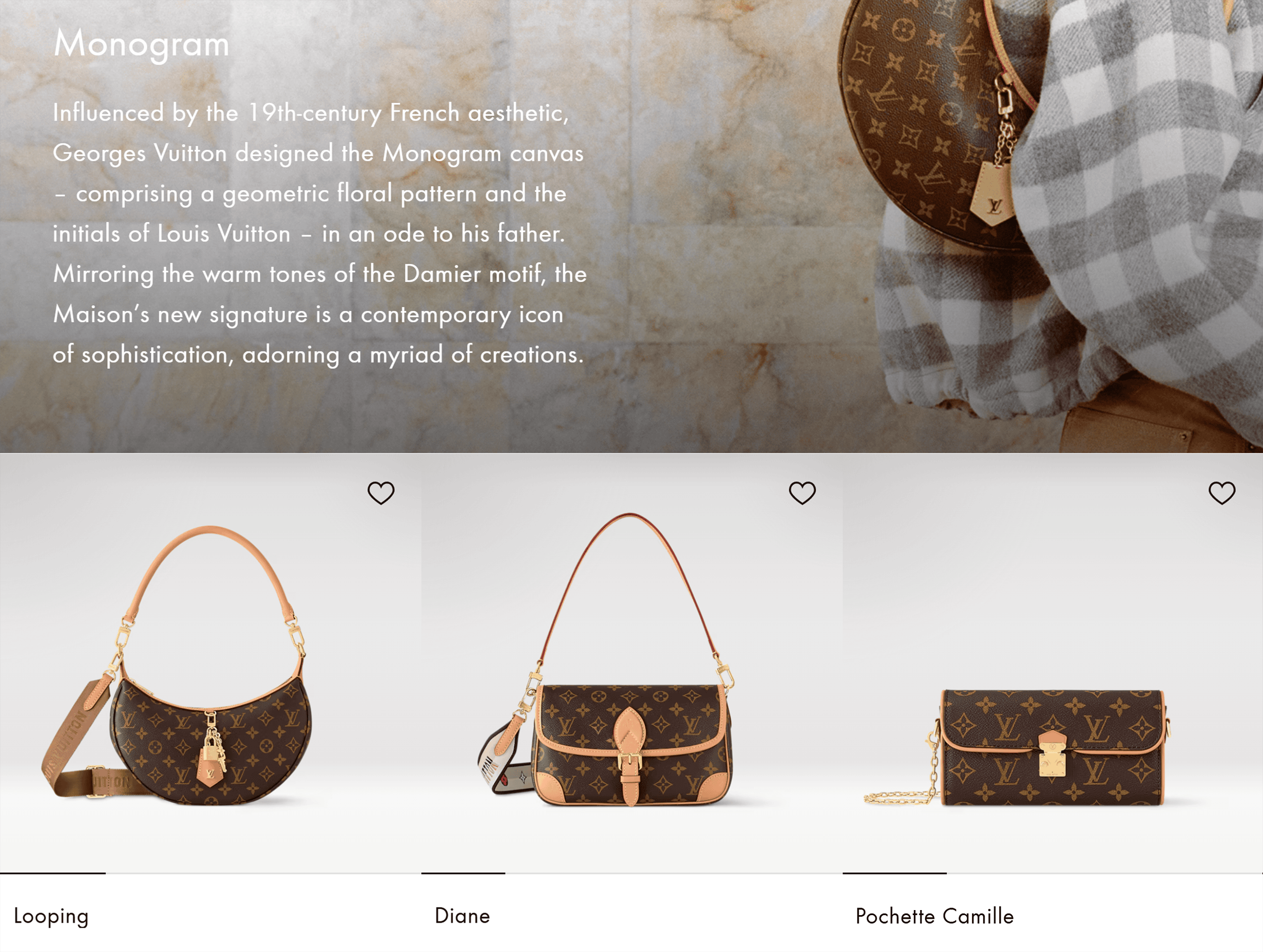
Head to one of their product page, and you’ll see something unique.
The first image is often a lifestyle shot.
It’s like seeing the product on the runway which helps reinforce the brand’s aspirational nature.
Next, check out the unique navigation menu.
Click the hamburger icon, and a list of product categories slides in.
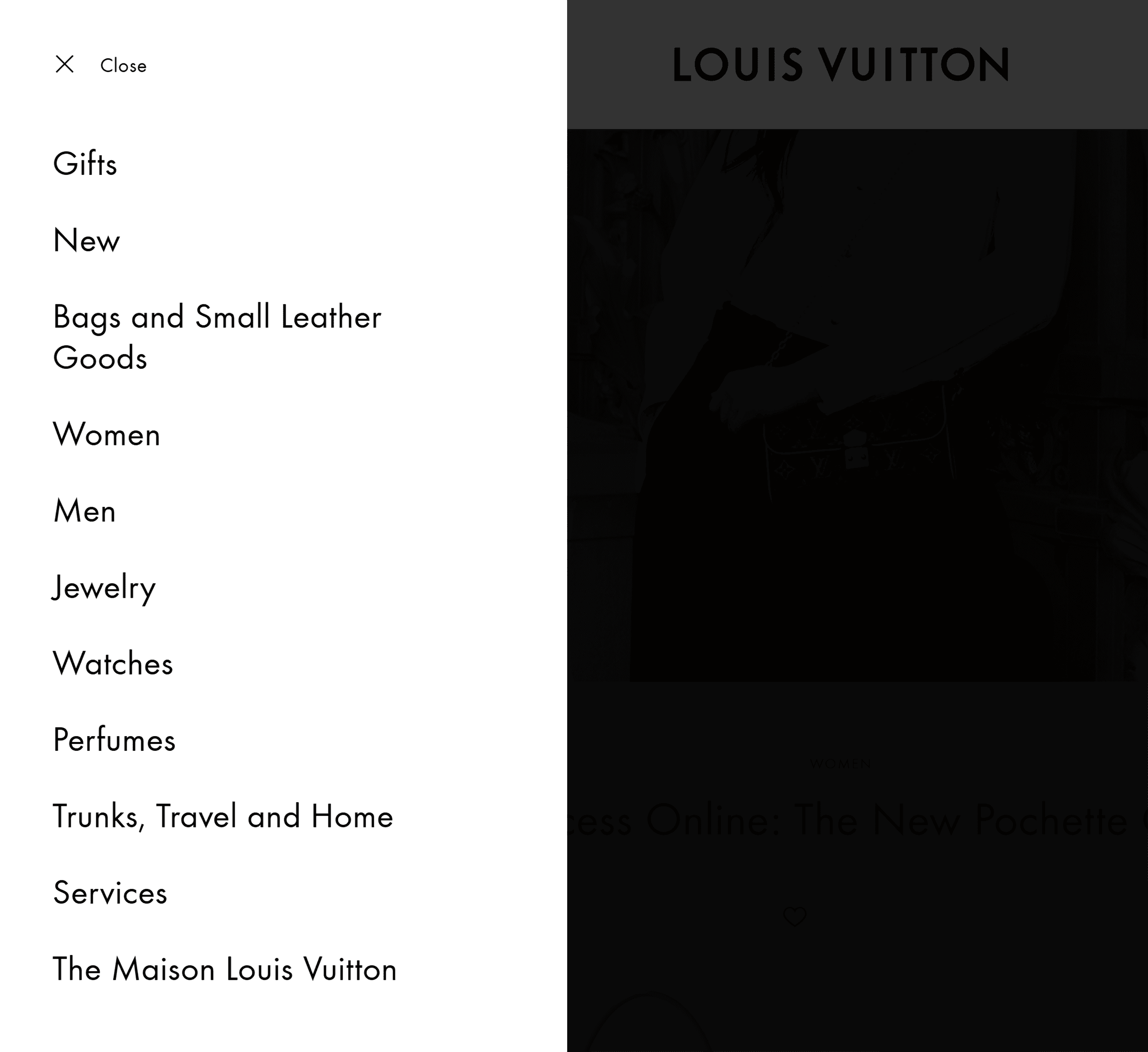
Click one of the product categories and a subcategory appears.
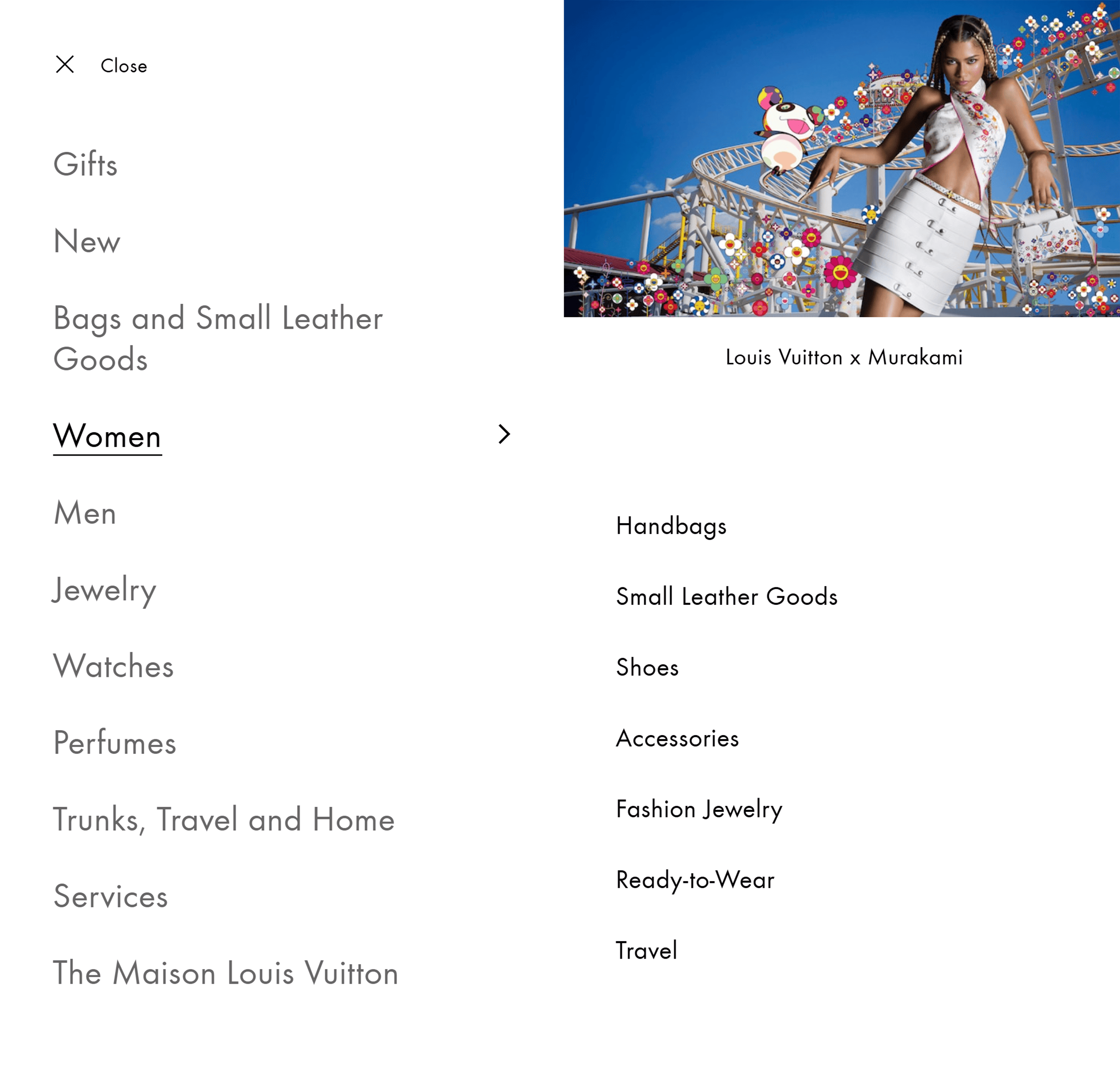
Choose one and click. And yet, another subcategory slides in.
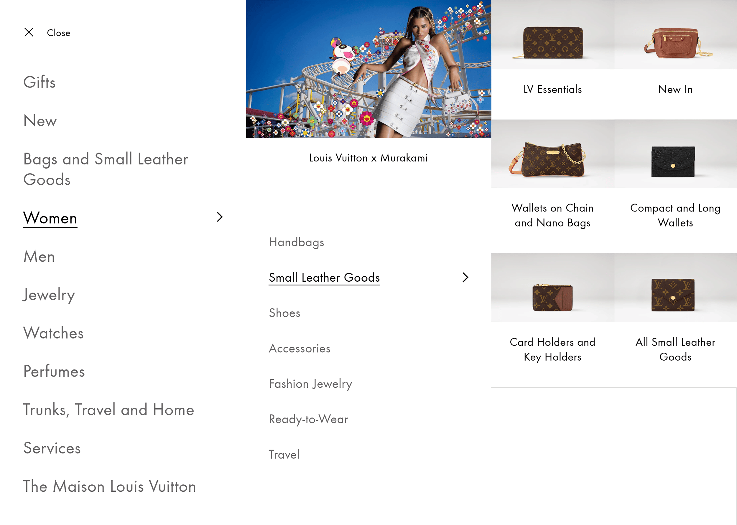
It’s an approach that’s visually clean and easy to follow, thanks to the ample white space.
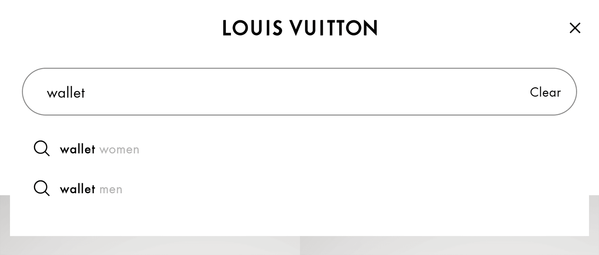
And if you use the search function, a full-screen window will appear with images of trending products and bestsellers.

As you type, search is predictive, and results populate instantly.
No need to hit enter. Everything happens in real time.
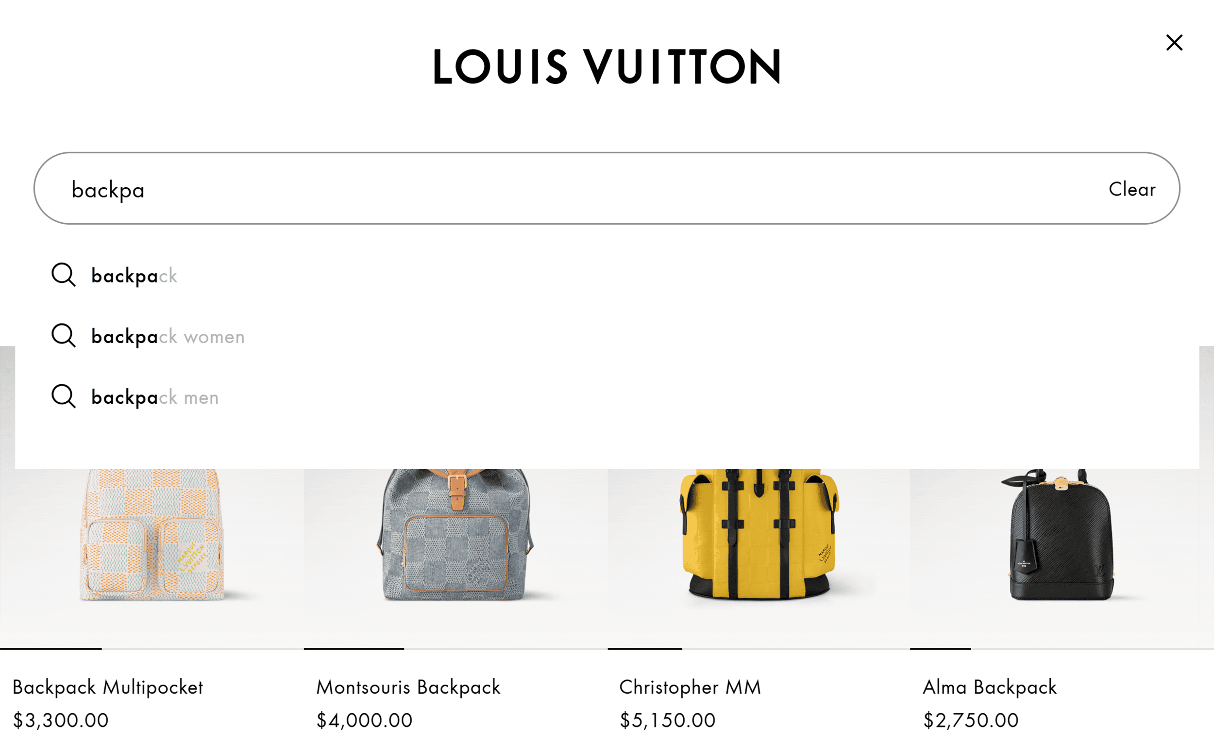
All these design elements make the site feel like LV truly understands its customers.
And that’s exactly how you want your customers to feel—luxury site or not.
How Louis Vuitton Looks on Mobile
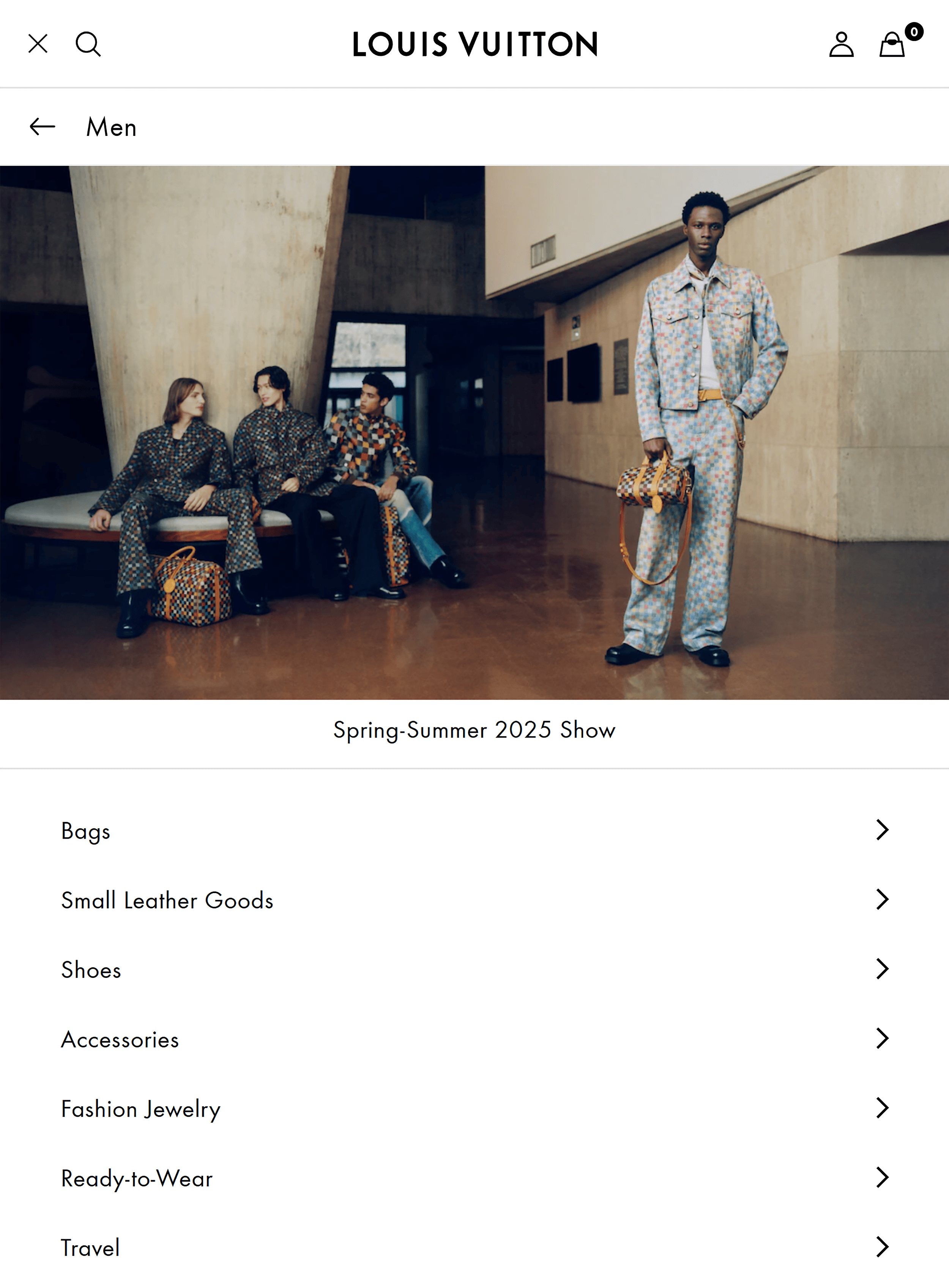
Louis Vuitton’s mobile site keeps the same smooth, refined experience.
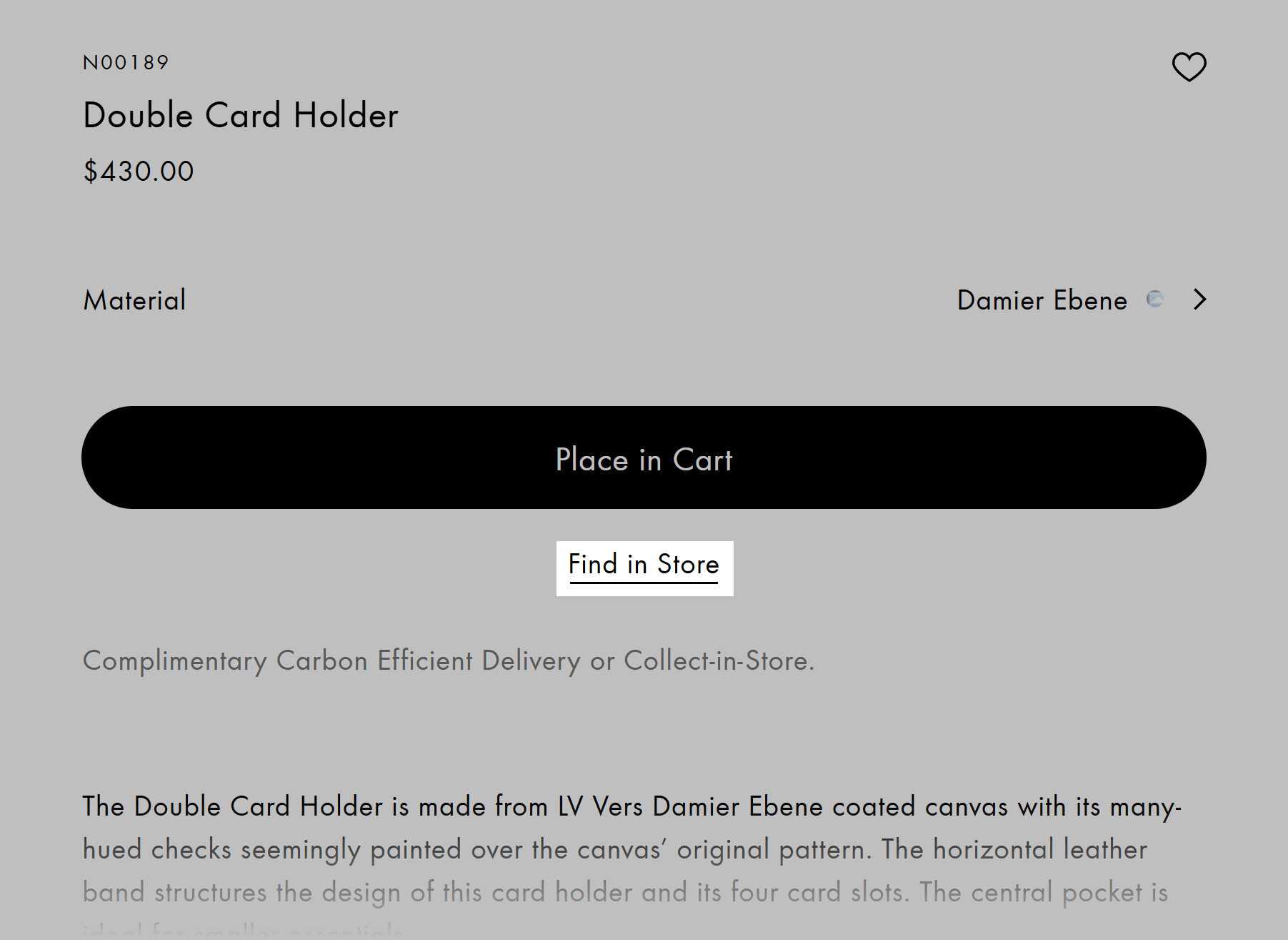
For example, the “Find in Store” option is easily accessible.
And search works just as beautifully as it does on desktop.
Predictive search offers instant results that make browsing fast and easy.
Takeaways
- Create a great search experience: Use predictive search or quick links to trending products. These can make browsing easier and more engaging.
- Offer omnichannel flexibility: Add features like “Find in Store” to improve user experience. These give customers more control over how they shop, which helps increase sales.
Subscription-Based Sites
Subscription ecommerce sites have one job:
Convince people to pay every month.
Tough business.
To do that, they must clearly show value and build trust.
Key elements include clear pricing, smooth signups, and risk-free trials.
The goal? Make it feel easy to start and enticing to stay.
8. HelloFresh
HelloFresh is a major name in the meal kit delivery space.
Its website has a clear focus:
Stand out in a crowded market.
Here’s how they do this.
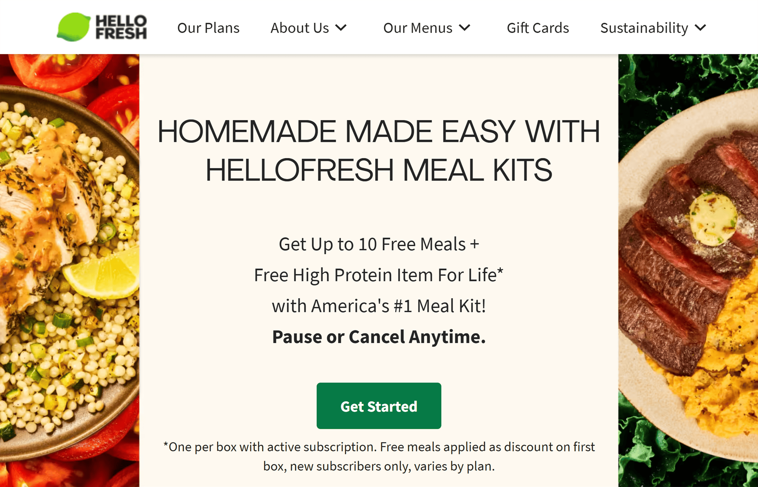
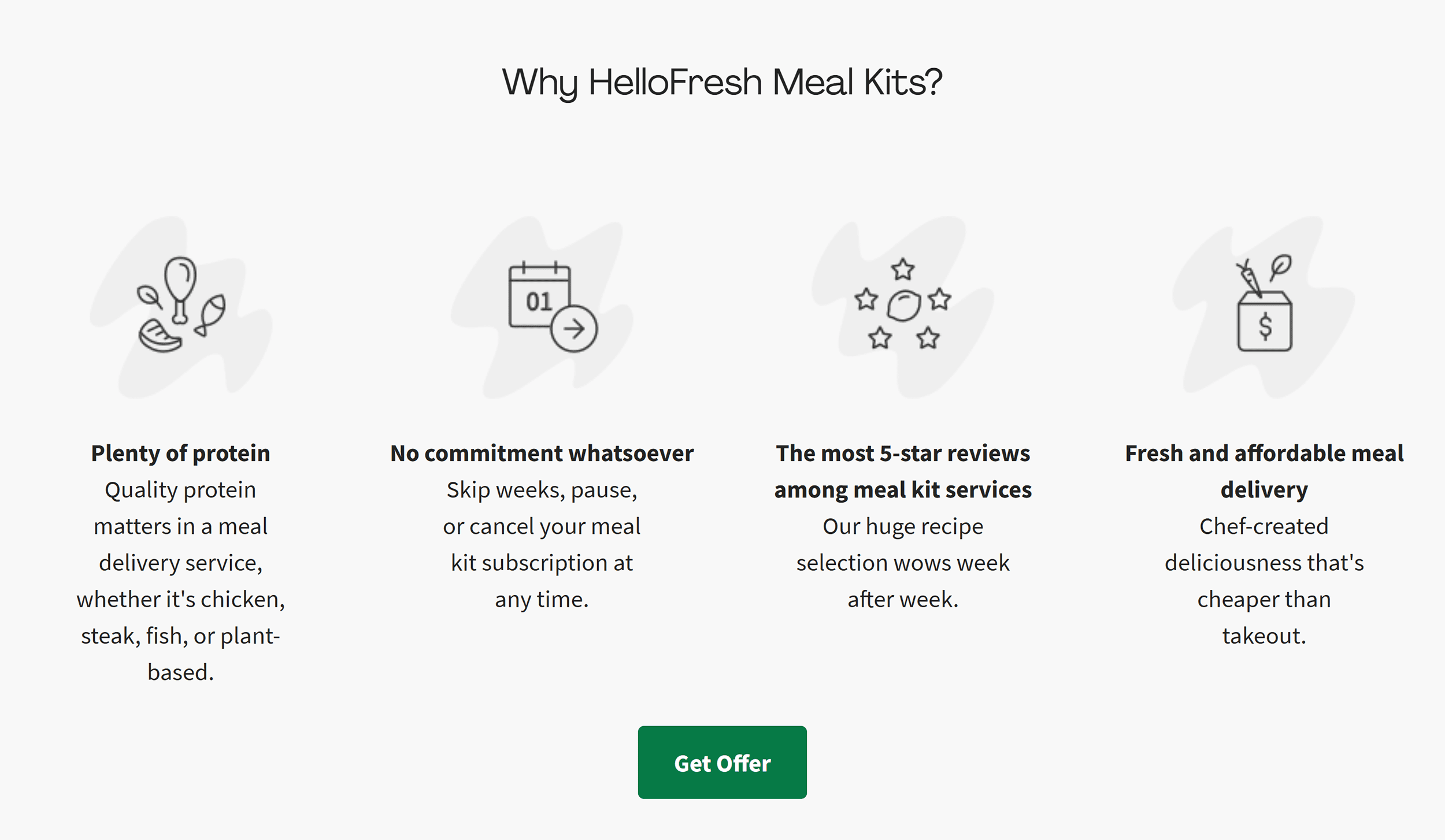
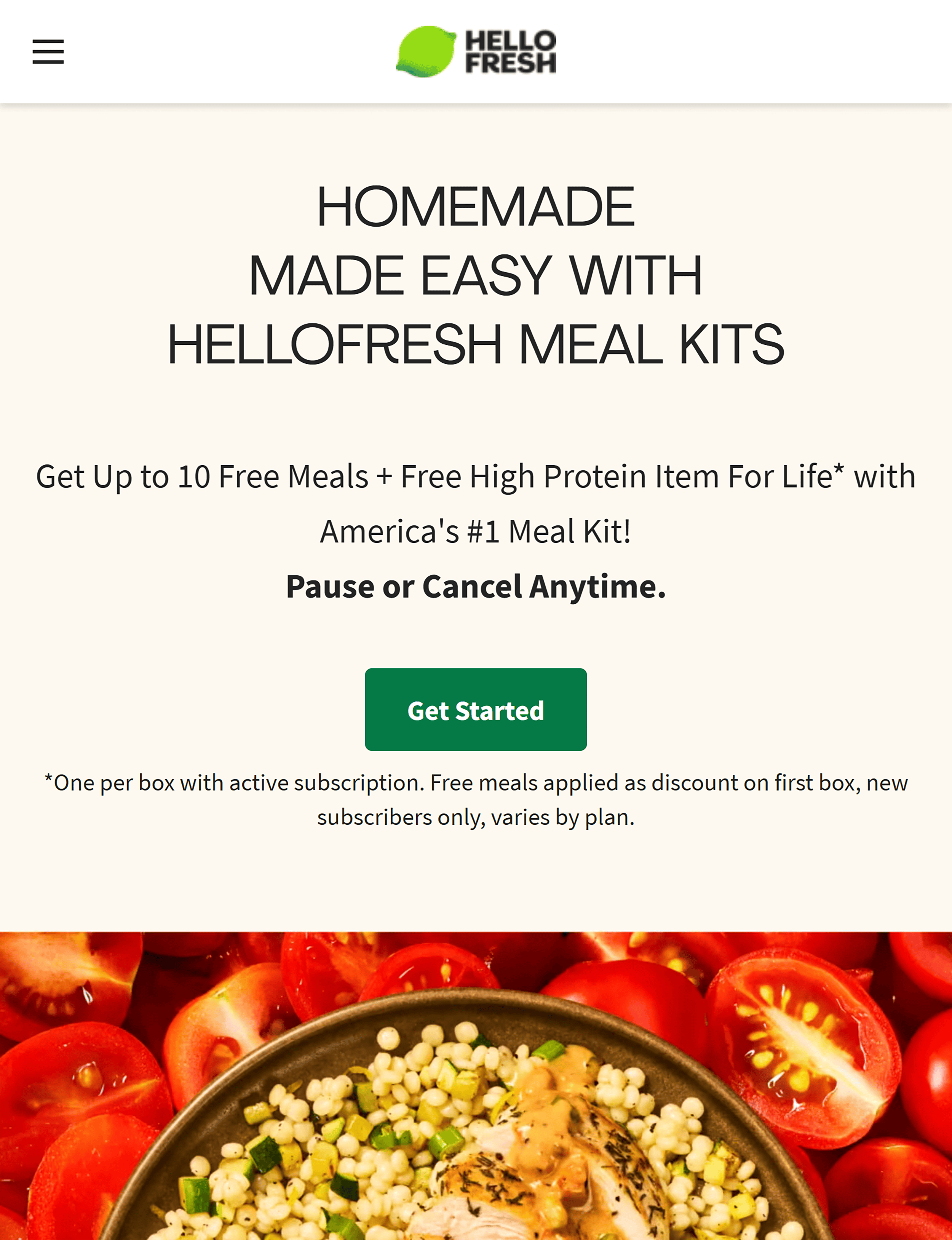
The homepage makes their unique selling points clear.
It starts with a bold value proposition for why visitors choose them:
- 15-minute meals (for people looking for speed and convenience)
- America’s #1 meal kit (social proof)
- Up to 10 free meals + free breakfast for life (attention-grabbing incentives)
The “Get Started” CTA is perfectly placed for warm visitors ready to buy.
And the image next to it isn’t just eye candy—it’s functional.
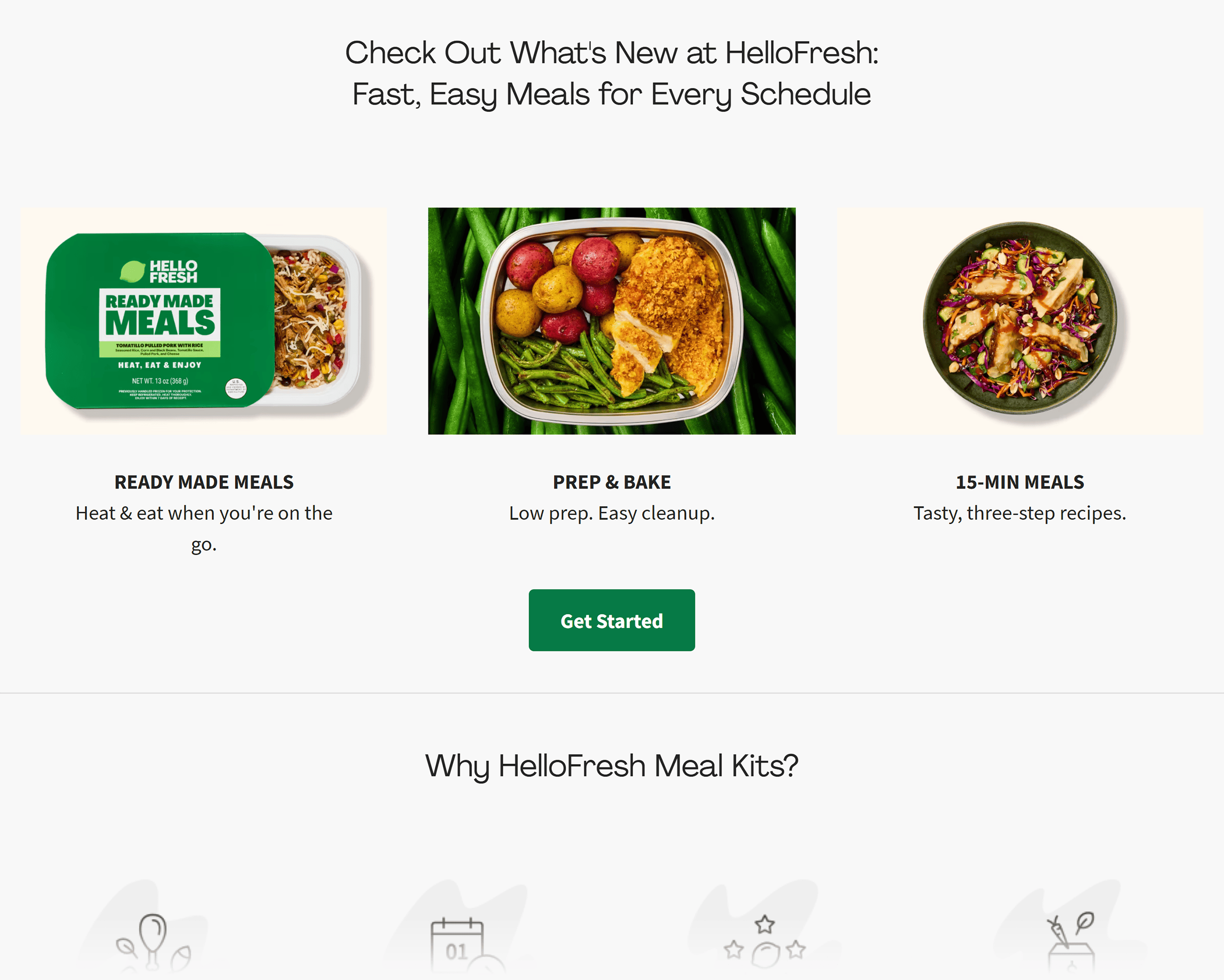
Each image is paired with text, making it easy for visual scanners to find key information.
Plus, to make the subscription even more appealing, HelloFresh emphasizes control and choice.
For example, customers can browse menus before committing.
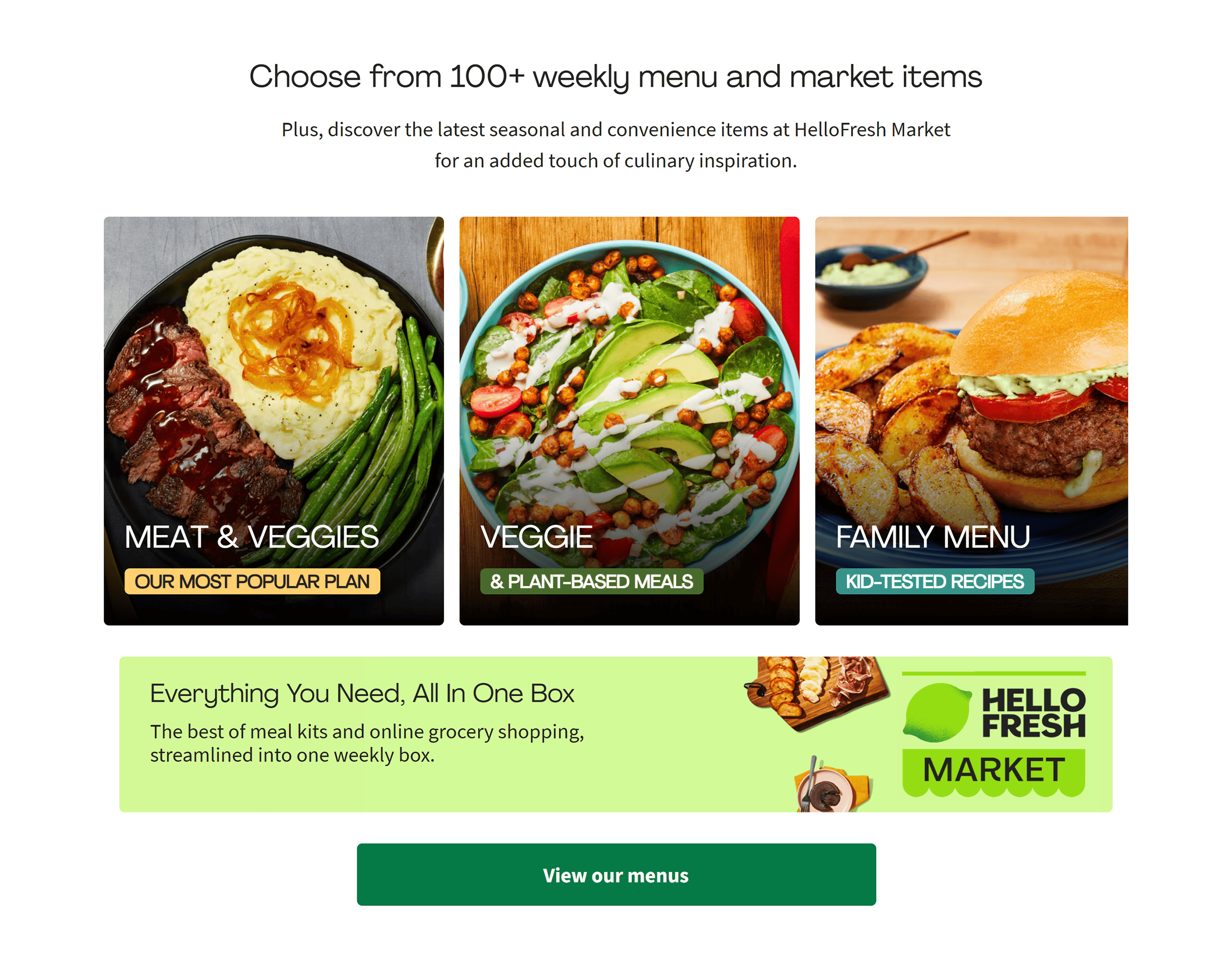
This makes the process feel flexible and low-pressure.
Plus:
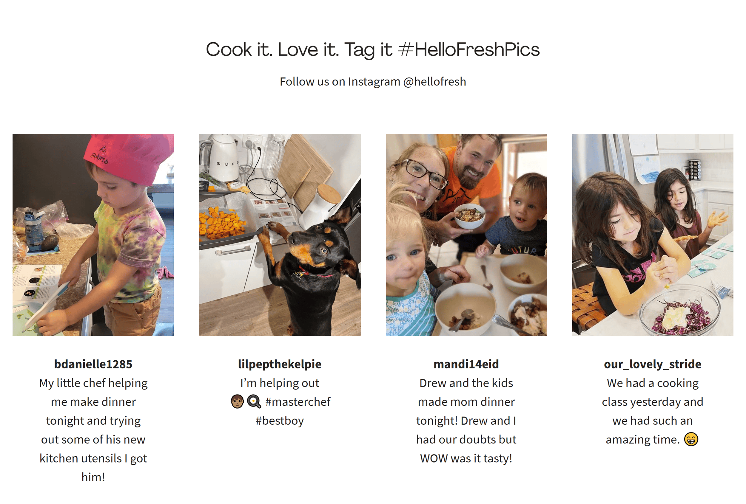
Key features and benefits are clear throughout the site.
You’ll see images that show just how easy the meals are to prepare—kids can even get involved.
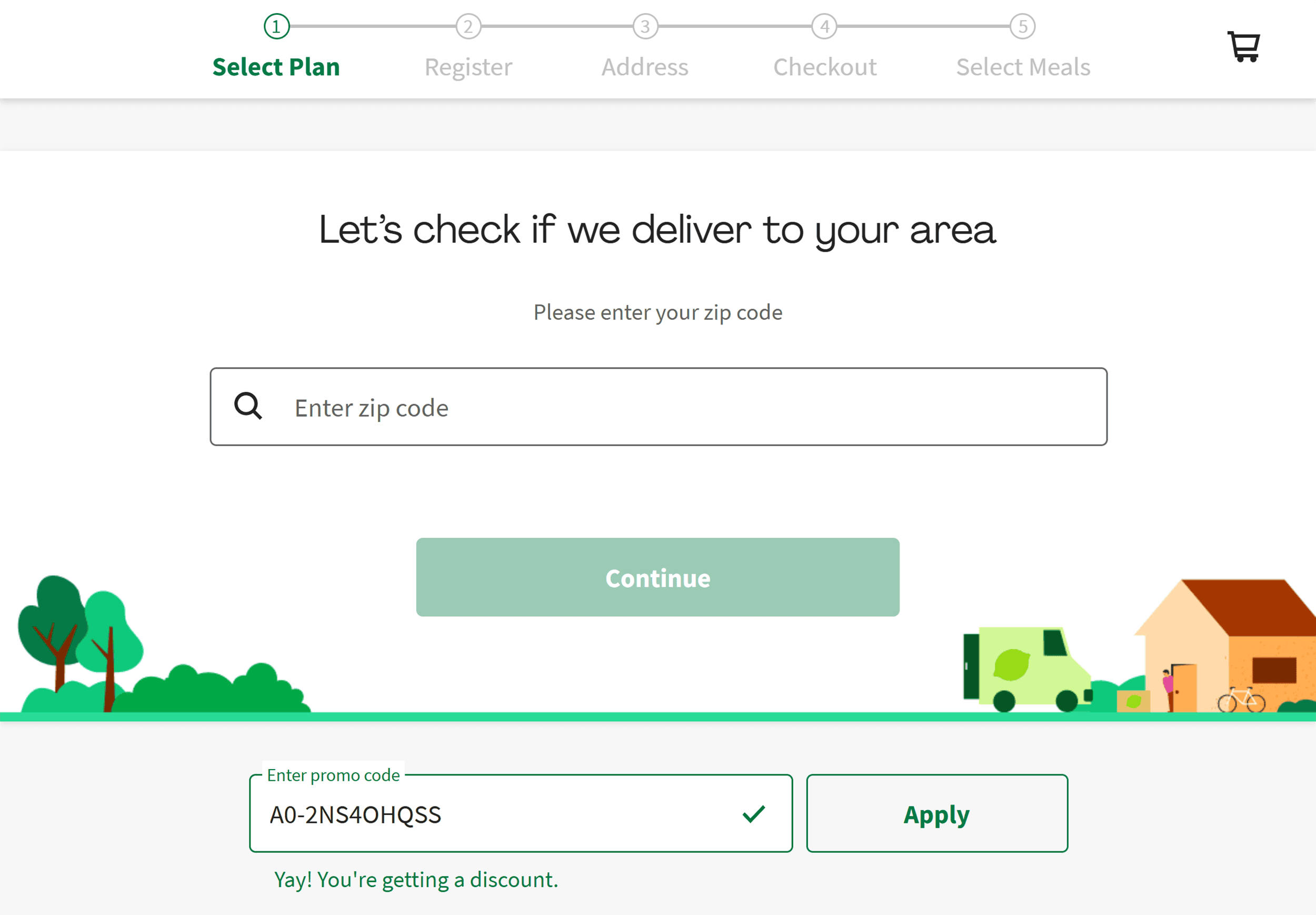
And the onboarding process?
It’s friction-free.
The first step is simple: enter your zip code to confirm deliverability.
This way, customers immediately know if HelloFresh delivers to their area.
(So they don’t waste time going through the process only to find out it’s unavailable.)
From there, the entire process is busy-user-friendly, with minimal typing required.
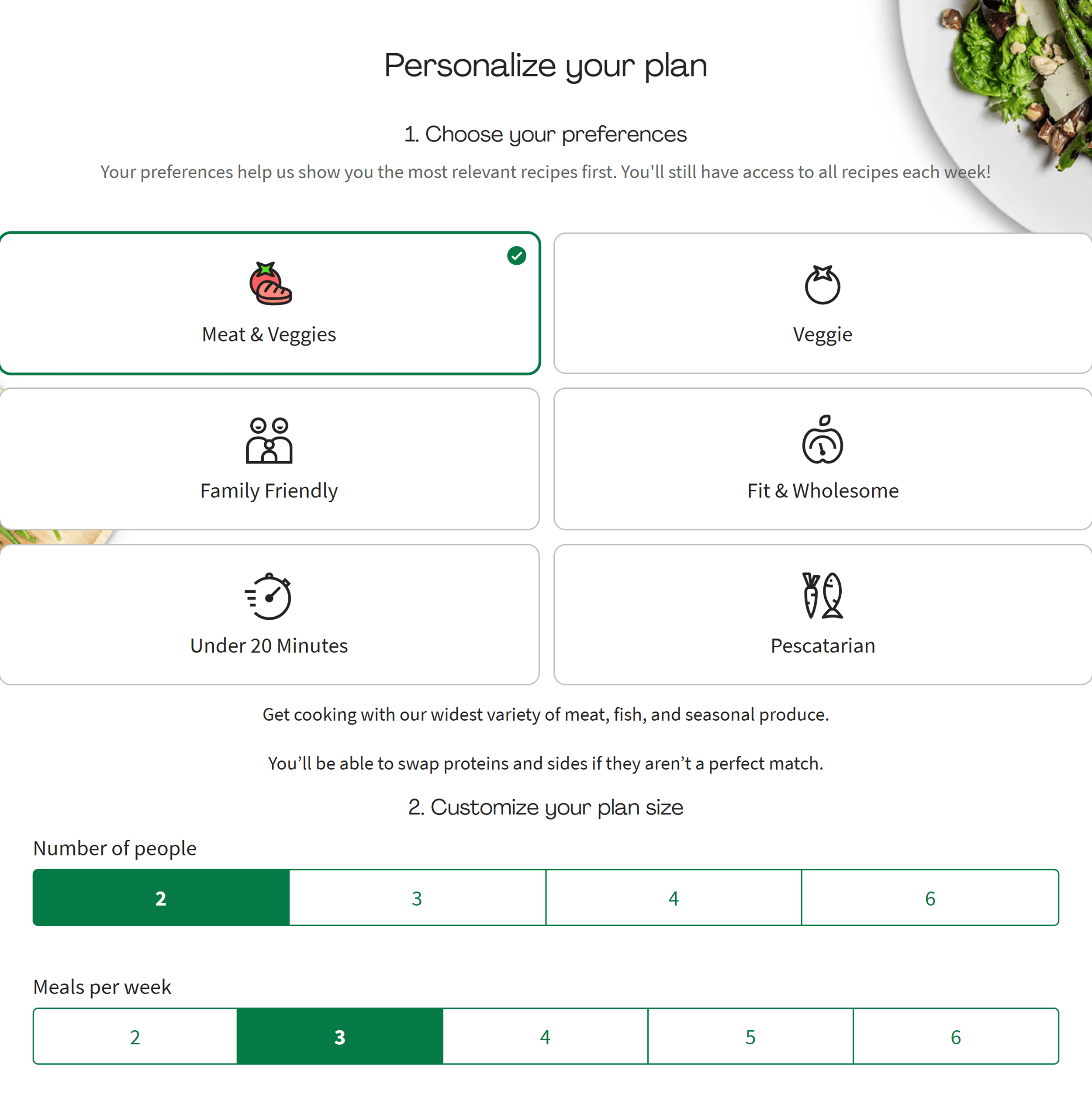
This keeps the experience effortless—exactly what customers want when signing up for a subscription.
How HelloFresh Looks on Mobile
Unfortunately, HelloFresh’s mobile site doesn’t match the sleekness of its desktop version.
For example, some text in the hero section of the homepage is hard to read.
One smooth aspect, however, is the signup process.
The same progress indicators show the steps you need to take.
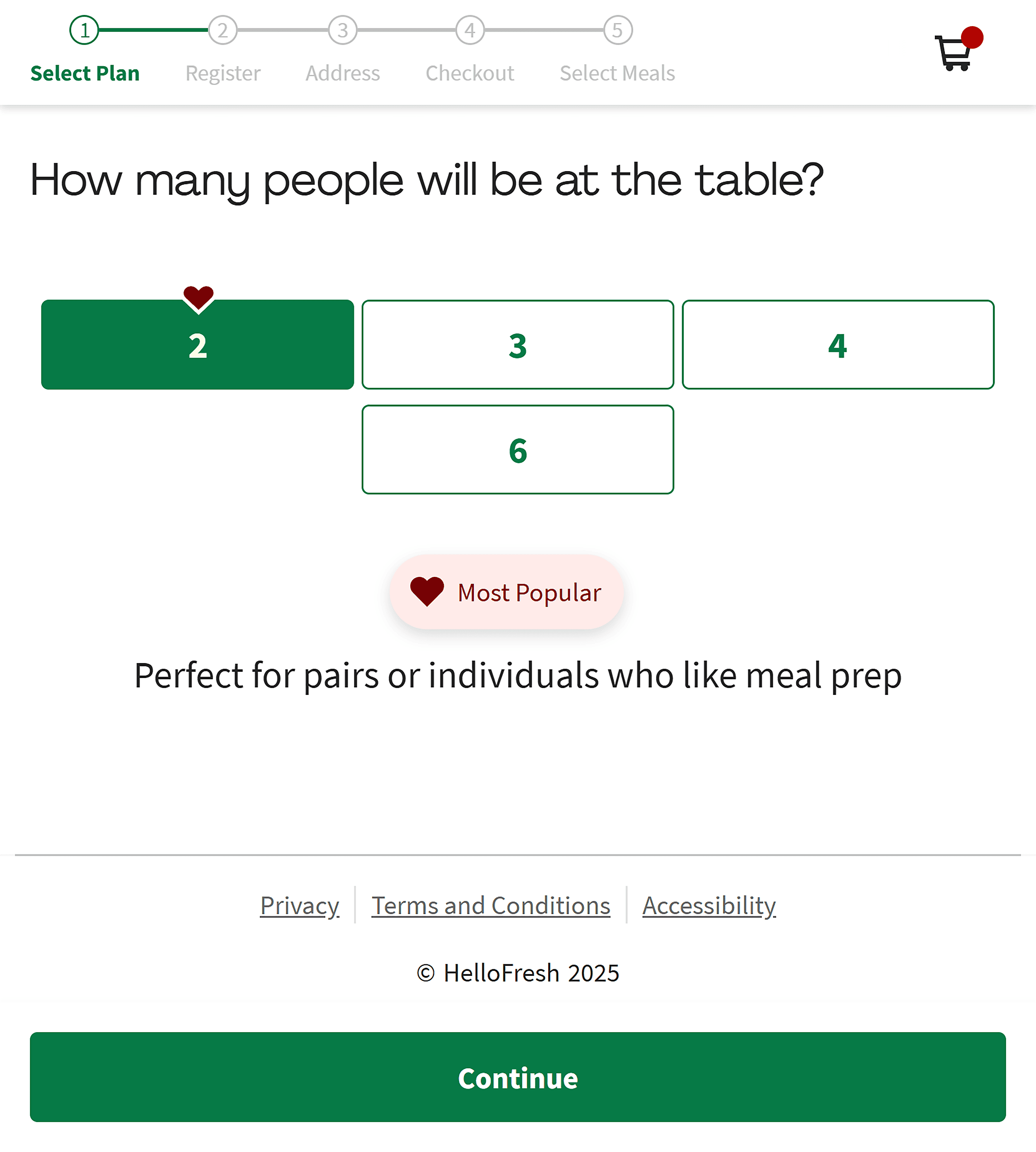
And moving from step to step feels intuitive and smooth.
It’s the kind of signup you can complete while watching a Netflix show on your couch.
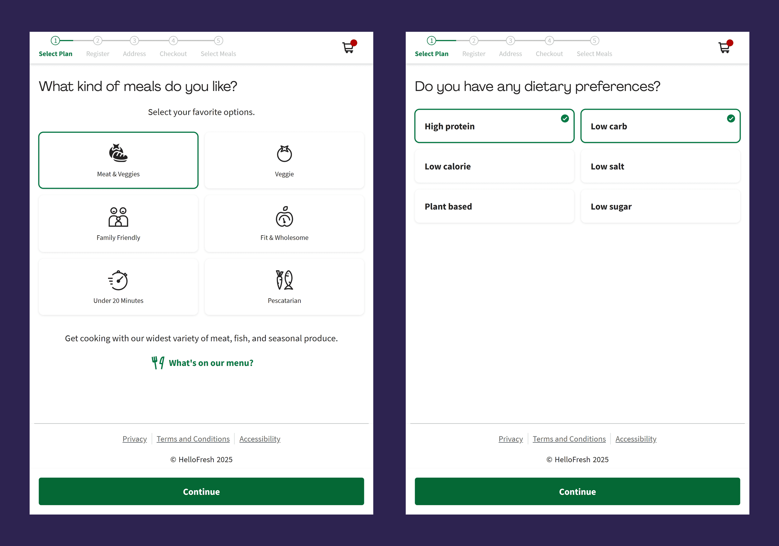
This low-friction process makes it so much easier to complete the signup process.
Takeaways
- Lead with your differentiators: Show visitors why you’re better than the competition as soon as they arrive.
- Don’t make signups a chore: When shoppers are ready to commit, make it quick and easy.
9. First Day
For our last ecommerce website example, let’s look at First Day—a store that sells supplements.
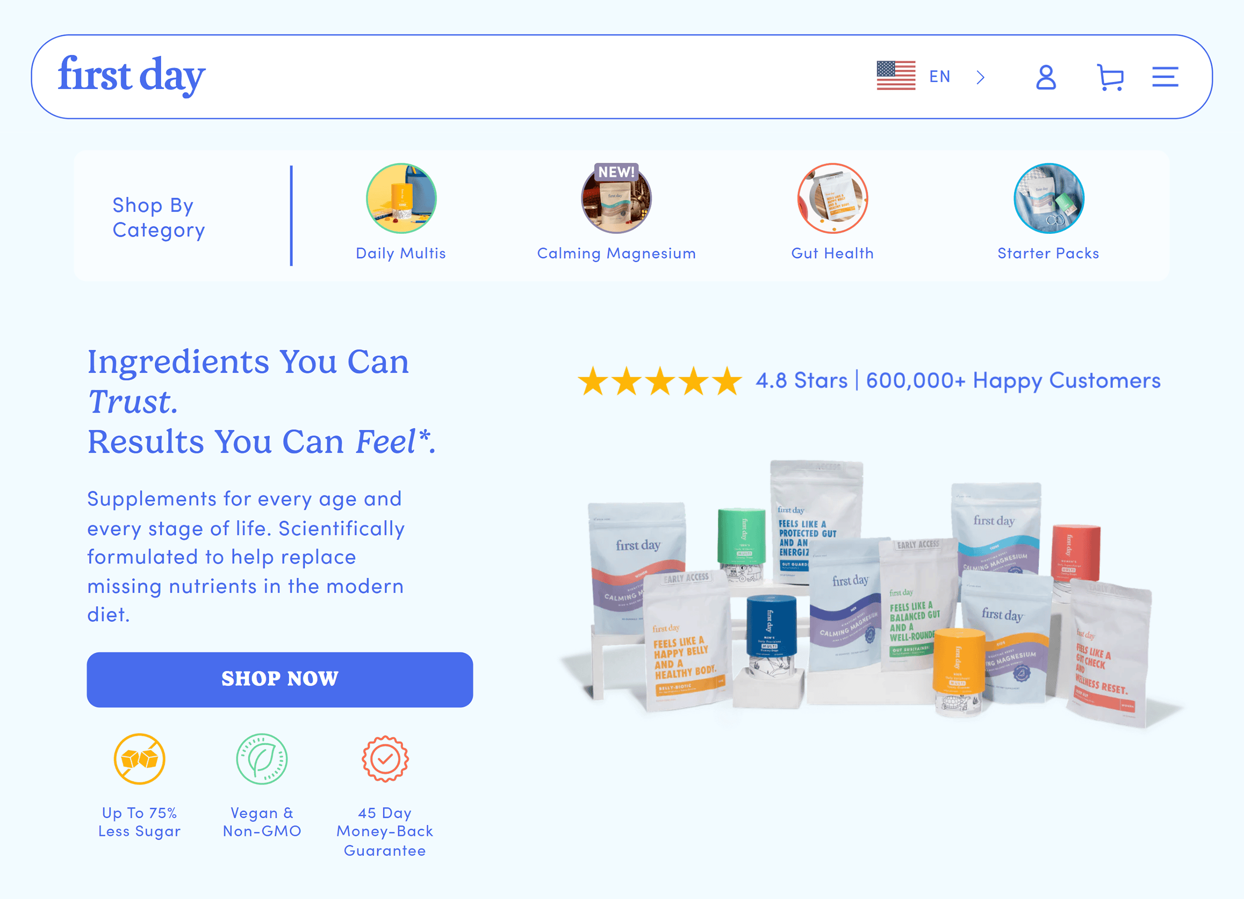
Unlike HelloFresh, they offer many products with both one-time payment and subscription options.
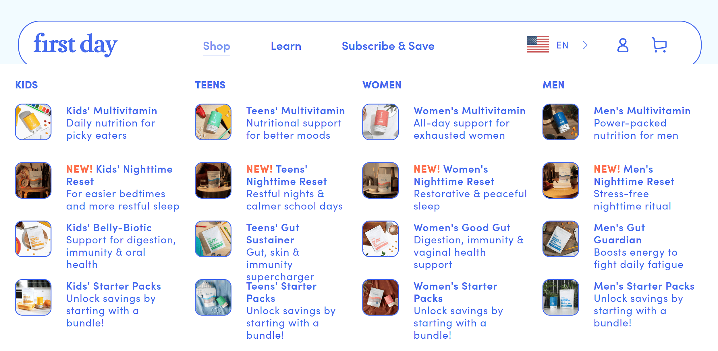
If you look closely, it’s clear that getting people to subscribe is a major focus.
The navigation menu, for example, includes only three links:
- Shop
- Learn
- Subscribe and Save

The “Subscribe & Save” link takes you to a dedicated page explaining a First Day subscription.
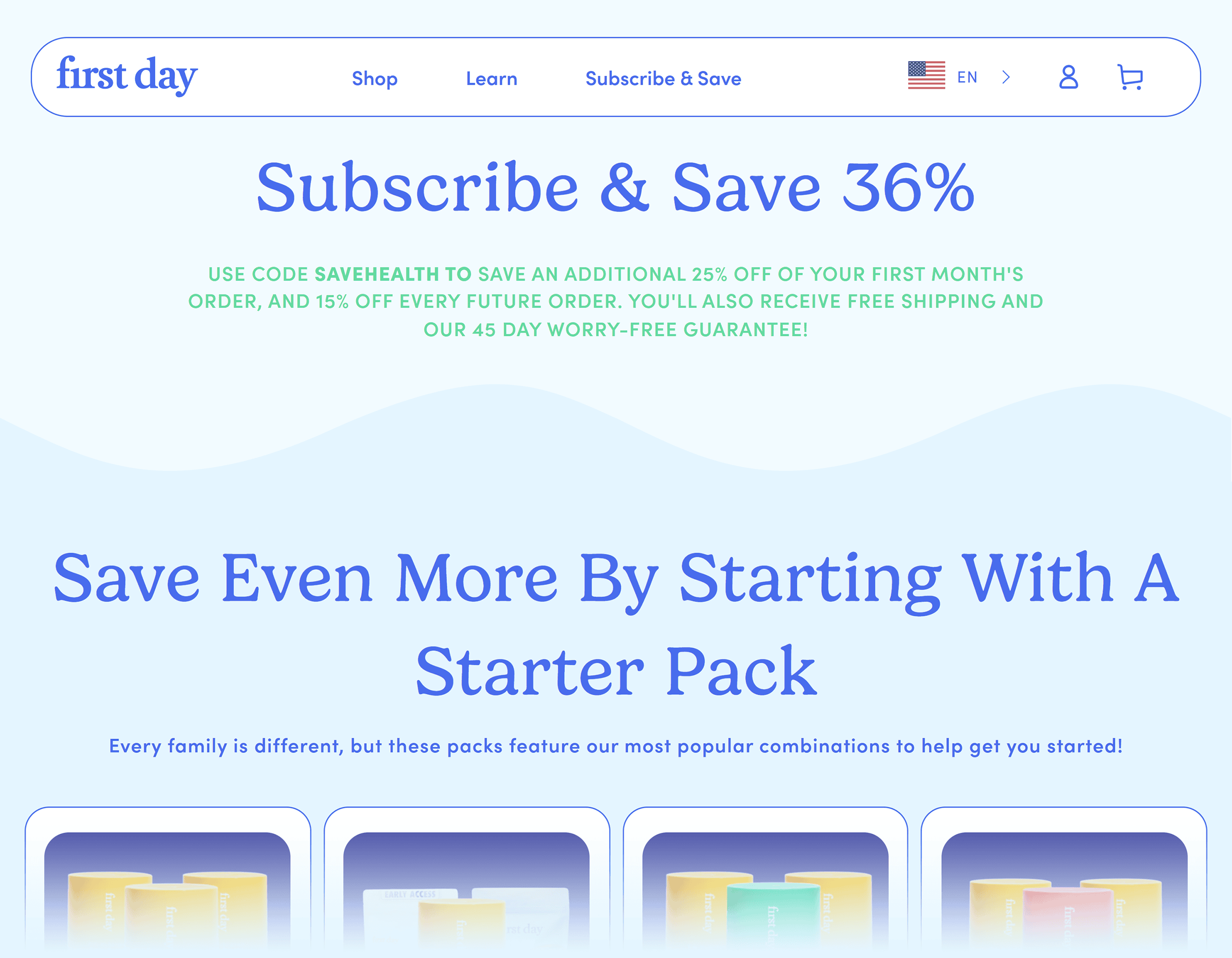
Giving the page its own spot in the nav bar underscores its importance.
But here’s the best part:
First Day doesn’t rely solely on this page to sell subscriptions.
Instead, they integrate subscription nudges throughout the site.
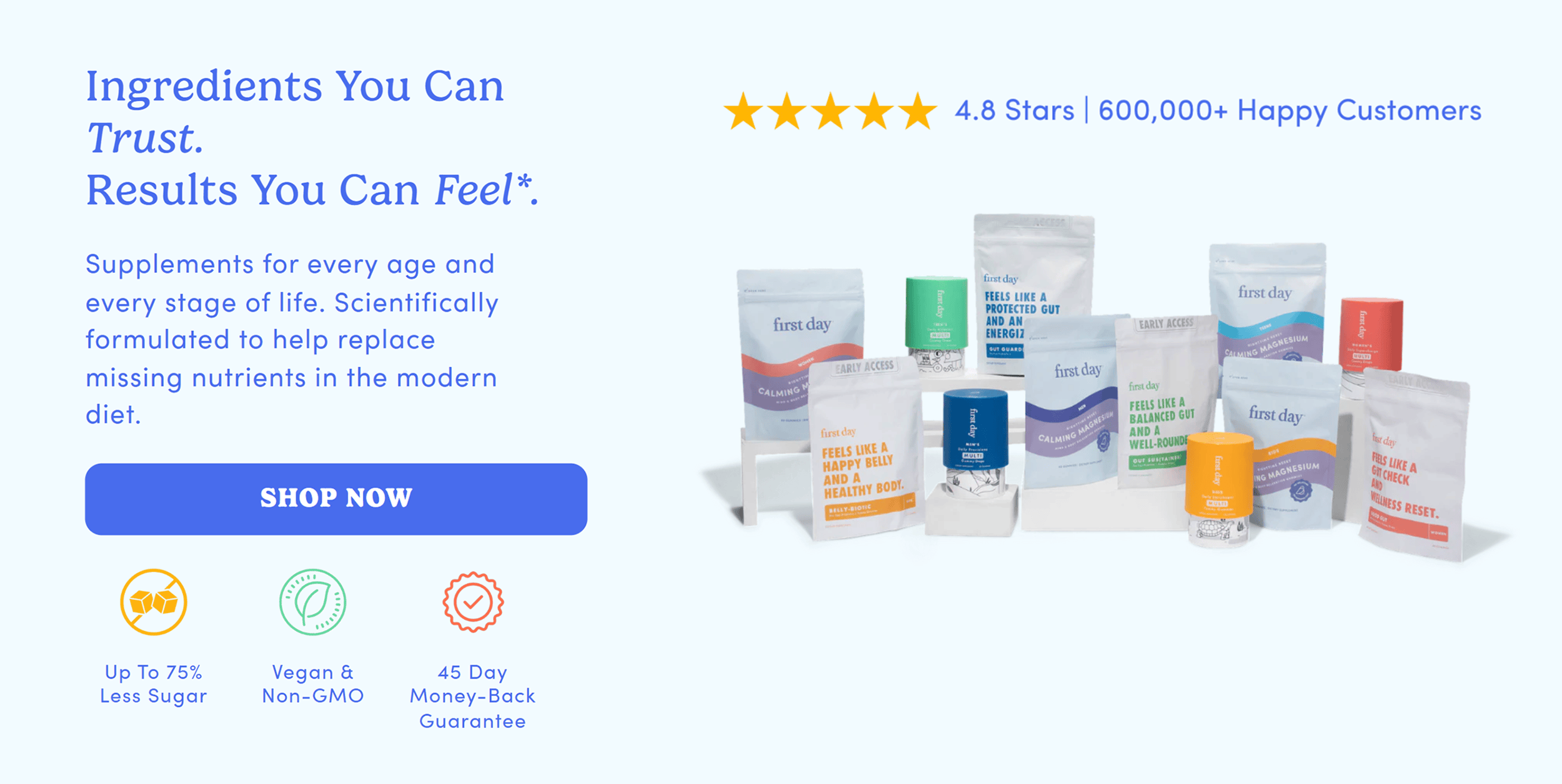
It’s on the hero section of the homepage, for example:
And the product pages also reinforce the subscription as the preferred option:
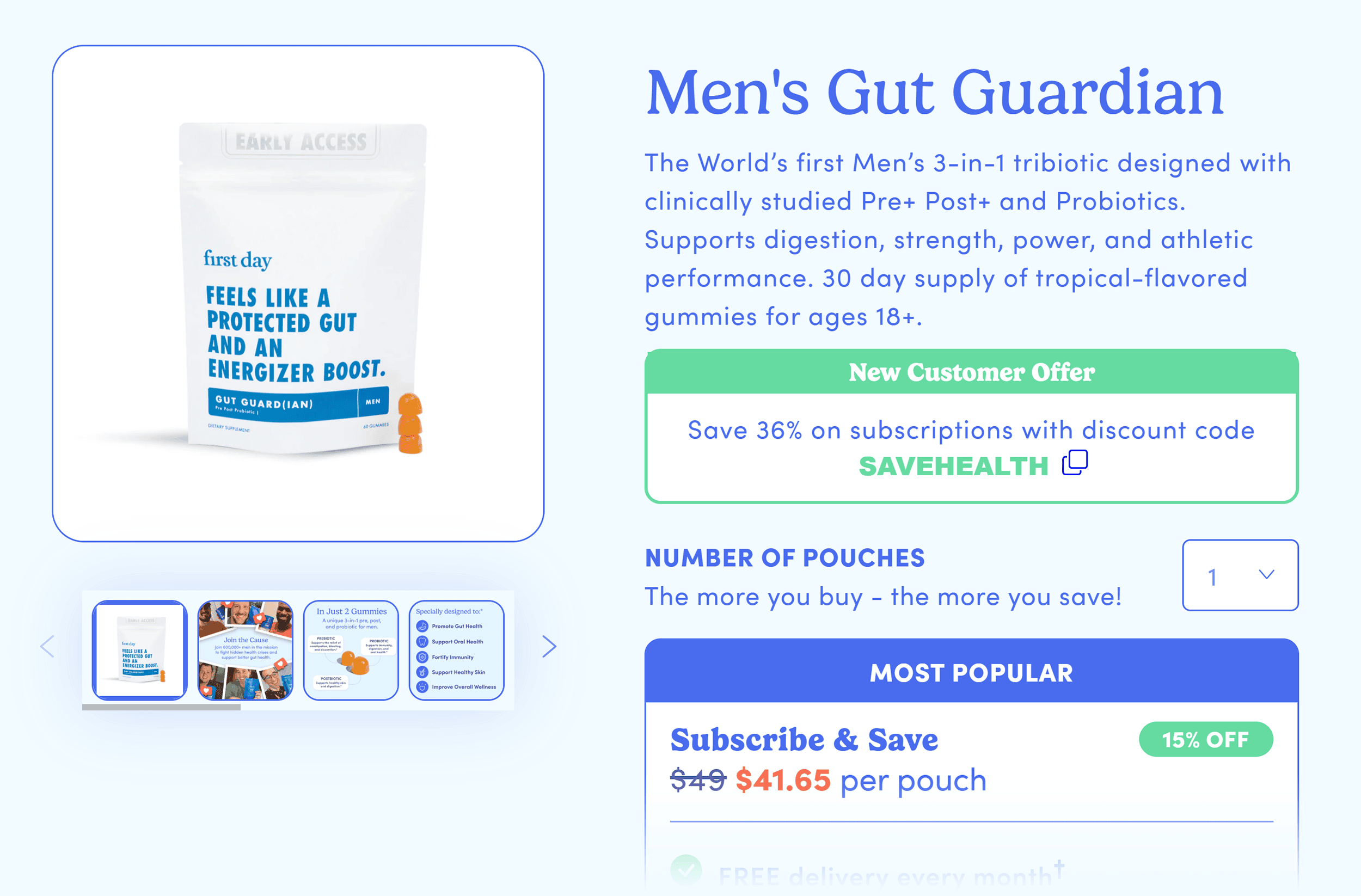
Yes, a “One-Time Purchase” is available. But it’s downplayed compared to the subscription.
Now, you might think all these subscription nudges would feel overwhelming or pushy.
But here’s the thing:
First Day’s site integrates them so naturally that they don’t ruin the shopping experience.
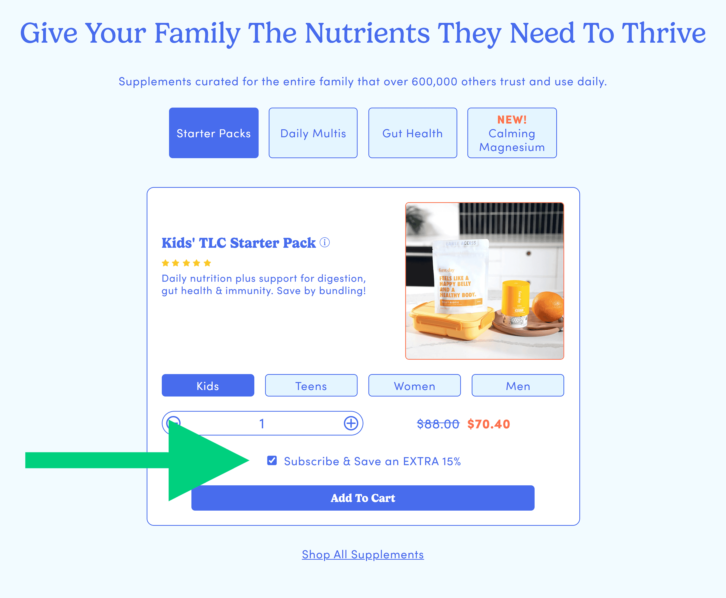
And that’s the key for subscription sites like this: aligning business goals with a user-friendly experience.
How First Day Looks on Mobile
First Day’s mobile site keeps the subscription focus.
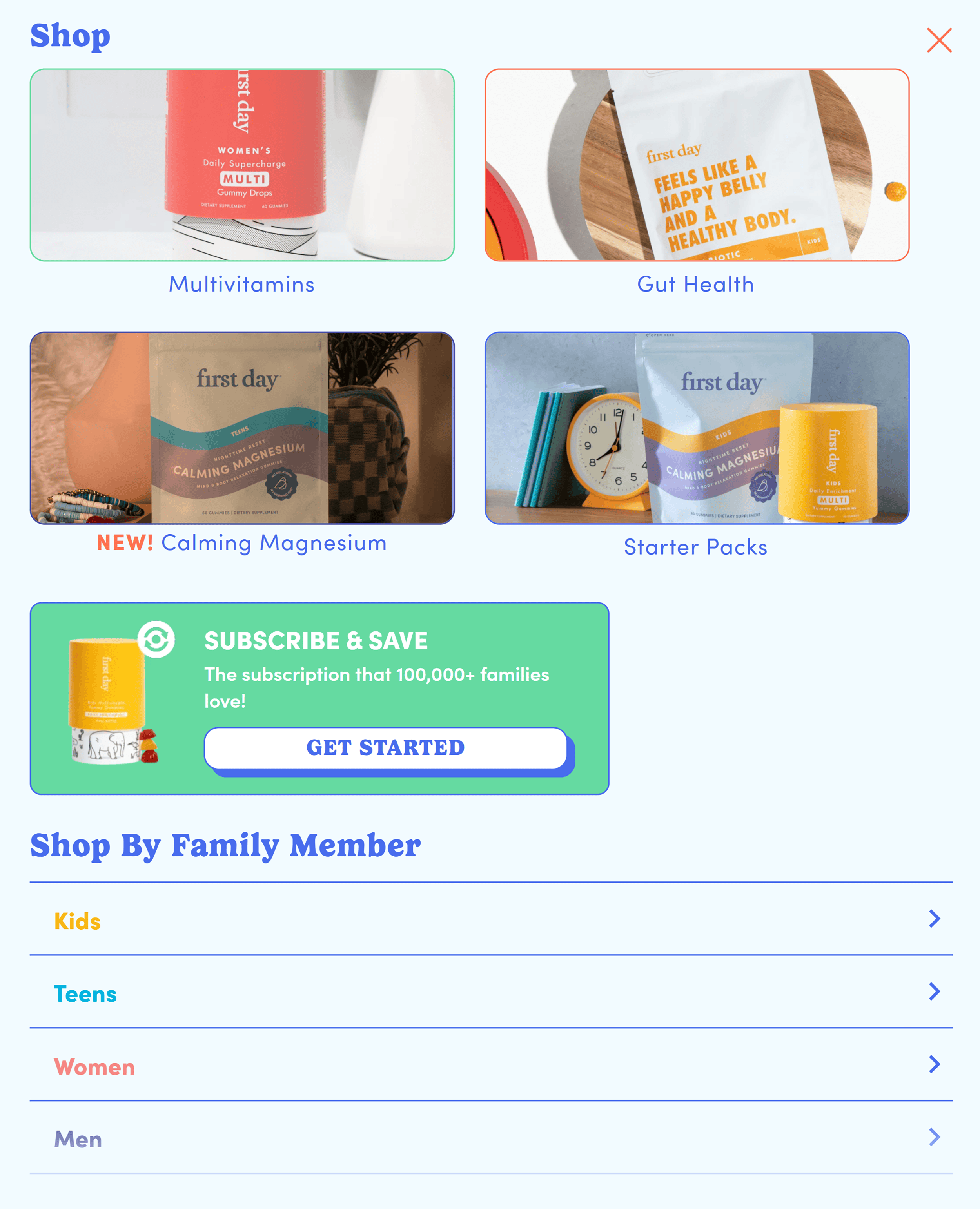
For example, when you click the navigation icon, the first button takes you to the “Subscribe & Save” page.
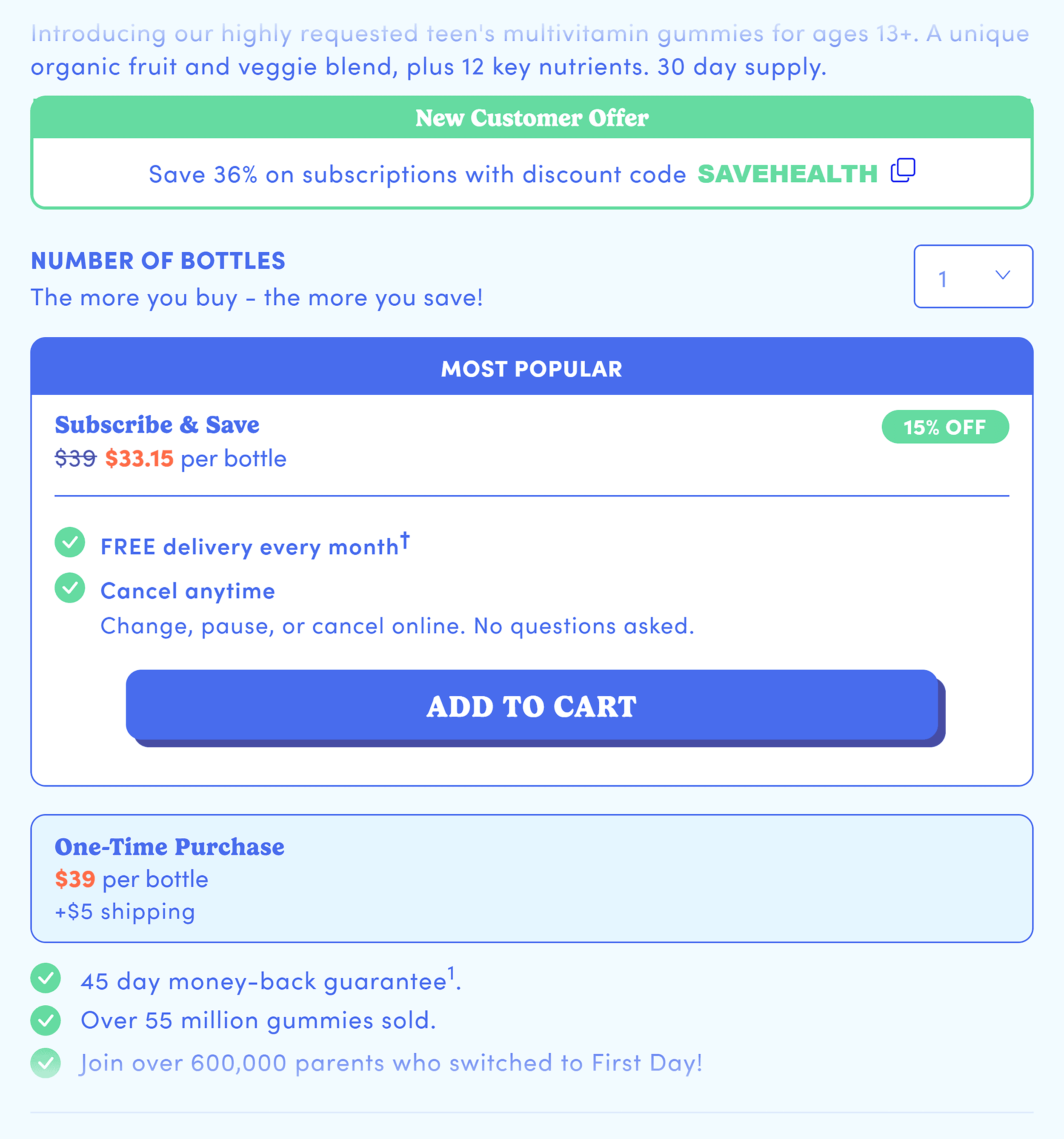
The product pages also maintain its emphasis on subscriptions as the preferred option.
But what’s even more impressive is how the site seamlessly integrates this focus.
For example, the product pages continue to use conversion-focused design best practices.
Look at the product descriptions. They’re laid out for easy scanning.
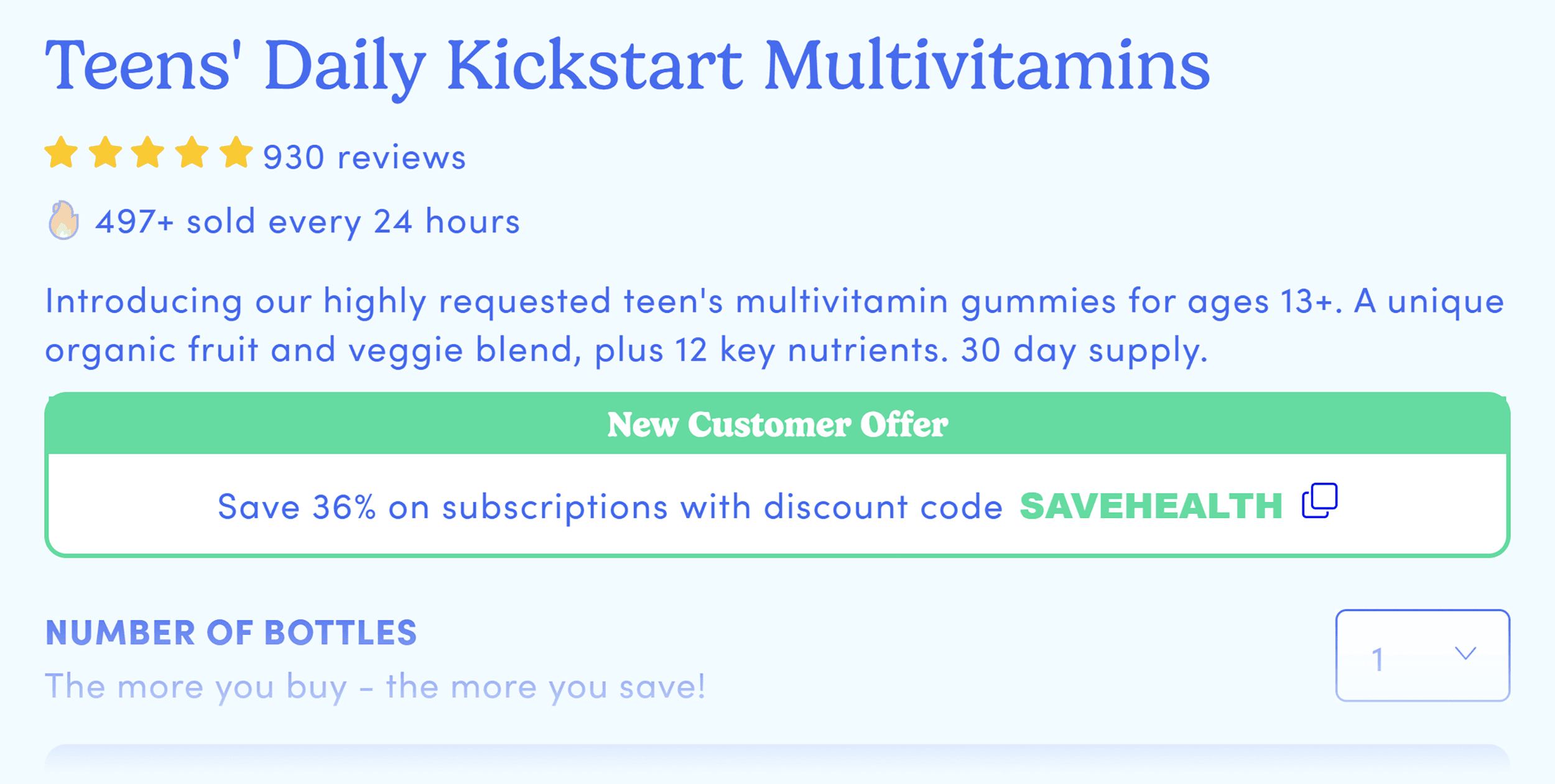
This helps users quickly absorb important information.
Plus, the site reinforces trust with credibility boosters.
You’ll see customer reviews all throughout, for example.
And there’s even a section for media mentions.

Together, these features create an experience that draws visitors in and keeps them informed.
And they’ve managed to do all this while consistently promoting their subscription option throughout.
The result?
Visitors have plenty of chances to see the value of subscribing—a must for any subscription website.
Takeaways
- Design with your subscription goals in mind: If your goal is to get more subscriptions, ensure visitors see the benefits clearly. And don’t be afraid to nudge them towards subscribing (naturally) across your site.
- Balance business goals with UX: Design your site to guide customers toward goals like subscribing or purchasing. But make sure it doesn’t ruin the shopping experience.
How to Create a Conversion-Focused Ecommerce Website
1. Optimize for User Experience
Make it easy for visitors to find what they came for, fast.
Here are some areas to prioritize:
- Simplify navigation so users can browse with ease
- Structure category pages to make product discovery simple
- Streamline the checkout process to reduce friction and speed up purchases
- Create persuasive product pages that highlight key benefits and drive action
- Design for a mobile-first experience
The key is to make the experience foolproof.
As the book Making Websites Win says:
2. Speed Up Your Site
Page speed affects everything: SEO, conversions, and brand perception.
And so speeding up your site is one of the most impactful changes you can make.
For example, Vodafone ran an A/B test focusing only on page speed improvements.
The results? As much as 8% increase in sales.
[VISUAL]
Faster pages can drive higher revenue. Period.
So you can’t afford to ignore it.
3. Match Pages to Visitor Needs
Visitors come to your site for different reasons.
Some are browsing. Some are comparing. And others are ready to buy.
Build a site that serves all of them.
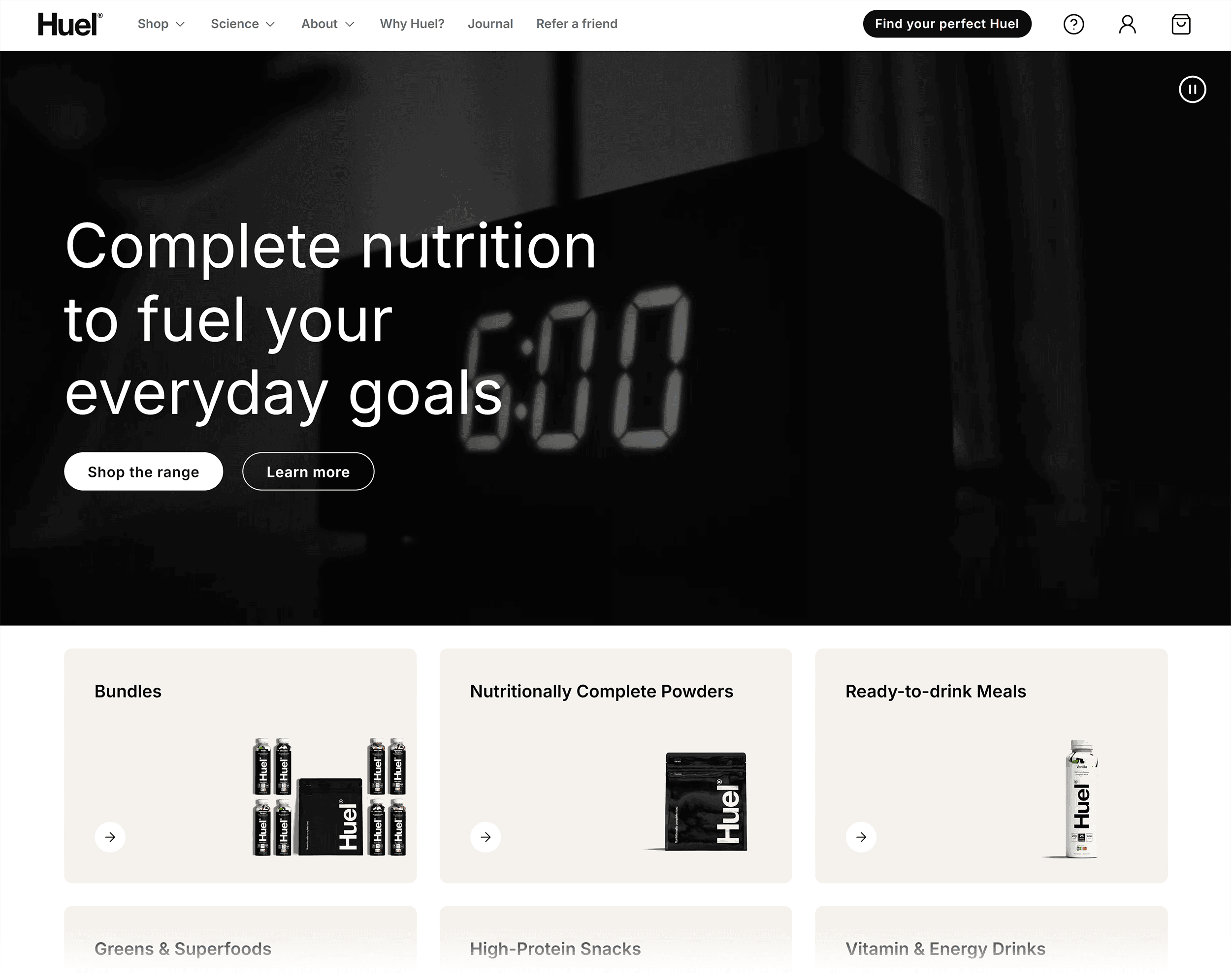
For example, on your homepage, visitors are usually in the browsing stage, so grab their attention quickly.
Introduce your brand and key offers and be clear about what makes your products different.
Like Huel’s homepage:
However, on product pages, visitors have different expectations.
They might be comparing products. Or are ready to buy.
Make it easy by including comparison tools and clear product details.
Give people what they need at each stage of their journey. And they’ll be more likely to click checkout.
Build an Ecommerce Site That Converts
The ecommerce website examples above show you how to design for conversions.
But even the most user-friendly site isn’t that great if no one visits.
Enter: ecommerce SEO.
It’s one of the best ways to get in front of ready-to-buy shoppers.
Learn how to do it right by checking out our ecommerce SEO guide for proven traffic-boosting strategies.
The post 9 Ecommerce Website Examples to Copy for Better Results appeared first on Backlinko.
این خبر را در ایران وب سازان مرجع وب و فناوری دنبال کنید
جهت دانلود و یا توضیحات بیشتر اینجا را کلیک نمایید
دیگر رسانه های کشور:
باشگاه خبرنگاران همسونیوز| آموزشگاه رسانه |ارتباط اقتصادی| ارتباط فردا|ارتباط فرهنگی|ارتباط ورزشی|تهران اقتصادی |تهران ورزشی|مرجع وب و فناوری|پایگاه خبری شباب |همسونیوز
